Categories
Planning

Comparing US City Street Orientations

City street network grid orientations, order, disorder, entropy, rose plot, polar histogram made with Python, OSMnx, OpenStreetMap, matplotlib.
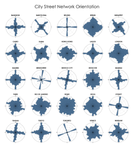
This post is adapted from this research paper that you can read/cite for more info. It analyzes and visualizes 100 cities around the world.

“We say the cows laid out Boston. Well, there are worse surveyors.” –Ralph Waldo Emerson. In 1960, one hundred years after Emerson’s quote, Kevin Lynch published The Image of the City, his treatise on the legibility of urban patterns. How coherent is a city’s spatial organization? How do these patterns help or hinder urban navigation? I recently wrote about visualizing street orientations with Python and OSMnx. That is, how is a city’s street network oriented in terms of the streets’ compass bearings? How well does it adhere to a straightforward north-south-east-west layout? I wanted to revisit this by comparing 25 major US cities’ orientations (EDIT: by popular request, see also this follow-up comparing world cities):

City street network grid orientations, rose plot, polar histogram made with Python, OSMnx, OpenStreetMap, matplotlib. Atlanta, Boston, Buffalo, Charlotte, Chicago, Cleveland, Dallas, Denver, Detroit, Houston, Las Vegas, Los Angeles, Manhattan, New York, Miami, Minneapolis, Orlando, Philadelphia, Phoenix, Portland, Sacramento, San Francisco, Seattle, St Louis, Tampa, Washington DC.

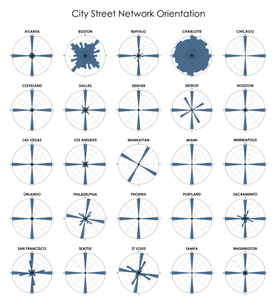
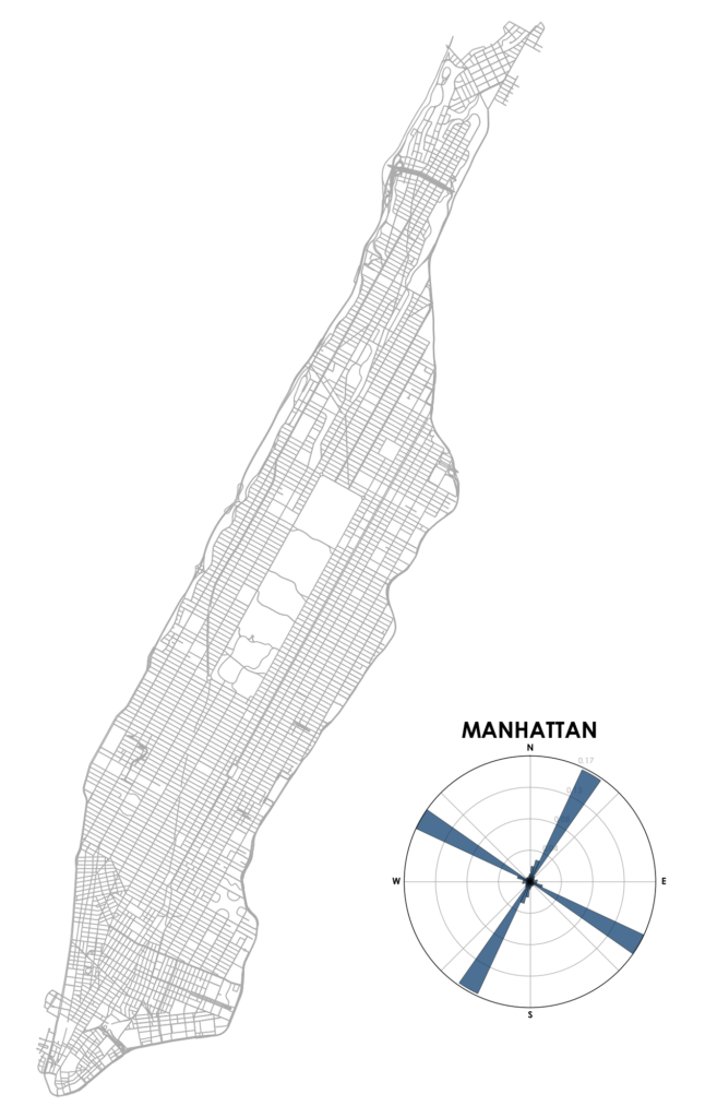
Each of the cities above is represented by a polar histogram (aka rose diagram) depicting how its streets orient. Each bar’s direction represents the compass bearings of the streets (in that histogram bin) and its length represents the relative frequency of streets with those bearings. For example, in Manhattan we can clearly see the angled, primarily orthogonal street grid in its polar histogram:

Manhattan, New York City, New York street network, bearing, orientation from OpenStreetMap mapped with OSMnx and Python

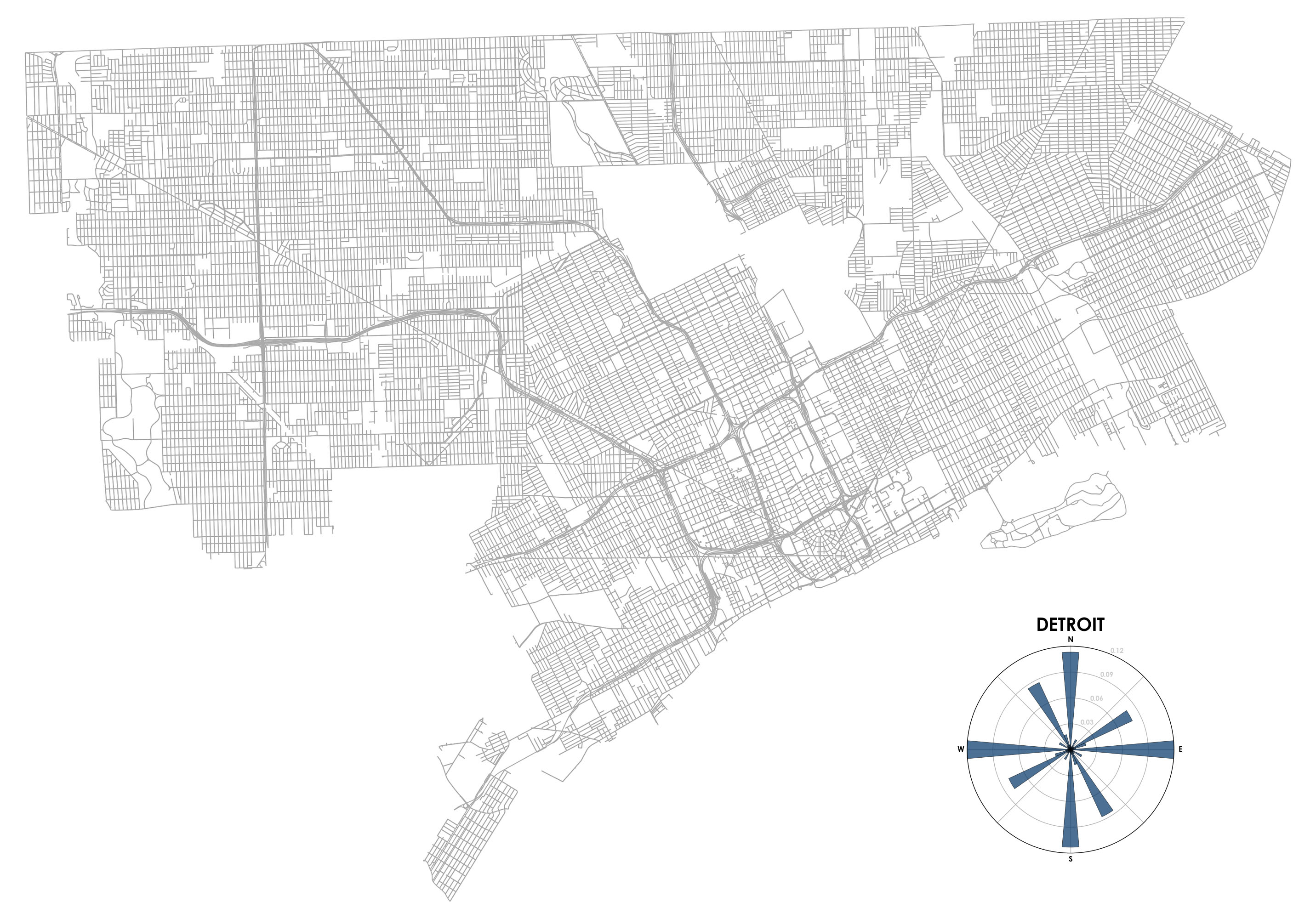
Similar orthogonal grids can be seen in the histograms of Chicago, Denver, Tampa, etc. Detroit is an interesting case, as it primarily comprises two separate orthogonal grids, one a slight rotation of the other:

Detroit, Michigan city street network, bearing, orientation from OpenStreetMap mapped with OSMnx and Python

Most cities’ polar histograms similarly tend to cluster in at least a rough, approximate way. But then there are Boston and Charlotte. Unlike most American cities that have one or two primary street grids organizing city circulation, their streets are more evenly distributed in every direction. For example, here’s Boston:

Boston, Massachusetts city street network, bearing, orientation from OpenStreetMap mapped with OSMnx and Python

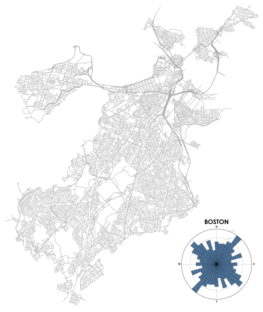
Although it features a grid in some neighborhoods like the Back Bay and South Boston, these grids tend to not be aligned with one another, resulting in a mish-mash of competing orientations. Furthermore, these grids are not ubiquitous and Boston’s other streets wind in many directions. If you’re going north and then take a right turn, you might know that you are immediately heading east, but it’s hard to know where you’re eventually really heading in the long run.

This makes it harder for unfamiliar visitors to navigate Boston than many other US cities. It does not adhere to a straightforward north-south-east-west pattern (or any other consistent, predictable pattern) that our brains adjust to in most places – not because Boston apocryphally paved over its cow paths, but because of its age, terrain, and annexation of various independent towns.

60 years ago, Kevin Lynch defined “legible” cities as those whose patterns lend themselves to coherent, organized, recognizable, and comprehensible mental images. These help us organize city space into cognitive maps for wayfinding and a sense of place. But what Boston lacks in legible circulation patterns, it makes up for in other Lynchian elements (paths, edges, districts, nodes, landmarks) that help make it an “imageable” city for locals and visitors. From Lynch:

A highly imageable city in this peculiar sense would seem well formed, distinct, remarkable; it would invite the eye and the ear to greater attention and participation… The concept of imageability does not necessarily connote something fixed, limited, precise, unified, or regularly ordered, although it may sometimes have these qualities. Nor does it mean apparent at a glance, obvious, patent, or plain. The total environment to be patterned is highly complex, while the obvious image is soon boring and can point to only a few features of the living world.

I find Boston’s street patterns illegible and difficult to navigate. But as a newcomer I can settle for the concomitant sense of wonder, bafflement, and inexplicable adventure that accompanies every simple right turn.

Want to see more cities? This post is adapted from this research paper that analyzes and visualizes 100 cities around the world, discussing these methods, entropy calculations, and images in more detail. And for more on OSMnx, see this post or this notebook to recreate the visualization. Finally, by popular request, here’s a follow-up comparing world cities:

City street network grid orientations, rose plot, polar histogram made with Python, OSMnx, OpenStreetMap, matplotlib. Bangkok, Barcelona, Beijing, Budapest, Cairo, Delhi, Dubai, Glasgow, Hong Kong, Lagos, London, Madrid, Melbourne, Mexico City, Moscow, Mumbai, Munich, Paris, Rio de Janeiro, Rome, Seoul, Sydney, Tehran, Toronto, Warsaw, Tokyo, Berlin, Venice

172 replies on “Comparing US City Street Orientations”

Geoff, very interesting work. I feel similarly about Boston, and am interested to hear your thoughts about how this pattern affects development patterns. On average in a district by district level analysis, which real estate on orientation of streets is most highly valued?

I suspect my adopted hometown of Cincinnati would prove more similar to Boston or Charlotte, would it be much work to input it to see?

That and for different reasons I’d love to see Columbus, which should probably look much like Detroit. Everything before 1900 was on a grid twelve degrees off center. Then they switched to NSEW. Now you can drive down one of the NS streets and the crossing street address drift as you go.

You don’t understand how bad Charlotte’s is. Cincinnati’s grids might not line up with each other, but they are still grid based. Charlotte had zero planning and let automobile based suburb developers build whatever they wanted with zero guidance.

This is SO cool. A quibble about naming, though — that’s not “New York”, it’s Manhattan (New York County, if you want to be technical). It would be great to see the polar histograms for all five boroughs — or at least Brooklyn and Queens, the two most populous ones (which are each more populous than most of the cities above).

Manhattan’s orientation seems orderly and obvious because it is one grid. What if you applied that software to Queens or Brooklyn, where there are grids intersecting with grids?

Charlotte? What’s up with Charlotte? (A city I’ve never visited.)

It’s not particularly old compared to other southeastern cities. Is there something weird about the underlying geography, I wonder?

Nope, Charlotte just had zero planning once Uptown (the absolute only recognizable grid in the entire city) was built out. Everything else was pasture, farm, trade route or gold mine, none of which connected to each other.

A major thoroughfare in Charlotte can change names 5-6 times as it goes across the city. Cow paths/game trails and Native American trails are probably the best explanation. Rapid growth with little planning.

@Ben: same is true for Boston (and its suburbs). Roads change names as the go across town lines. So North Main St in one town, becomes South Main St in the next town to the north, and maybe Washington St in the next town. The one saving trick is that Ashland St (for example) tends to lead towards Ashland. You’ll find this holds true for many towns. But you have to find a street sign first :-) (these tend to succumb to snow plows and intoxicated drivers, more quickly than they are replaced)

We in Massachusetts have always tended to be a bit non-conformist and independent, so it’s not unexpected that our streets also go their own ways. We are a bit jealous of Charlotte, whose streets seem to be even more randomly oriented than ours.

All I can say, is “thank $DEITY for GPS!”

Charlotte’s not quite as random as it might appear. The main downtown area is lined up along a grid pattern shifted around 45 degrees off the cardinal directions. Outside of the center city the main thoroughfares shoot out in a wheel and spoke pattern. Smaller streets connect these major arteries like the rings of a spider’s web. That’s why the chart for Charlotte appears so evenly distributed.

The other comments are also right. It’s can still be a tricky city to navigate. There are a handful of roads that intersect with themselves. And other roads that change names every mile or two.

My favorite intersection is the corner of Providence, Providence, Queens, and Queens.

What it looks like now gives us hints of what it looked like then. Separate settlements grow and that growth causes them to intersect. T-bone intersections are what happens to the roads when settlements collide. Same for the collisions of grids.

At some point, railway right of ways was given and kept. Those right of ways prevent highways and roads from continuing in straight lines. Those right of ways cause bridges to be built. Railways bend cities and in later cities provide the grid orientation of the city.

It’s interesting that cities with the widest spread of intersection orientations have lots of roundabouts… (Because they’re in Europe). Charlotte could definitely use more of those to make the commute a little less crazy. Intersections with 3 or give directions of travel should always have roundabouts!

It has a lot of creeks (thus, the roads with “Ford” in their names) and parts of Charlotte have really bad flooding issues. It’s also a boomtown so developers just built where they could get a large tract of land and put roads there.

Actually, Charlotte is relatively old, but its growth has come in spurts over the years and has not been controlled by the city (because those parts weren’t a part of the city). Charlotte Towne was incorporated in 1768 (and, before that, was a focal point of the Catawba Indian tribe). The four wards of what is today known as Uptown or Downtown Charlotte was laid out then in fairly traditional grids. Then gold was discovered 1799 which created its own not-so-neat impact until the miners mostly abandoned by 1849 (due a certain larger and more famous gold rush out west). Mix in a little Civil War (Confederate Navy Yard was located there the South lost the one in Norfolk. They thought hiding it from the US Troops in a landlocked city made sense). Post-Civil War (cotton processing) and WWI impacts (Camp Greene) further scattered development. And, then, the “new” part – banking and corporate explosion starting in the 1970’s which drew people to the city by the thousands. All those neighborhoods were planned individually and not controlled by the city, but have been absorbed since. Thus, the short conclusion is that there was no master plan and no coordination. It’s just a city that kept reinventing itself over the years.

I’d like to see Salt Lake City, Utah added to this list. It was designed on a grid from the very founding, I suspect it would have the most precise histogram on your list.

Miami is pretty much a straight forward grid. Probably even more than Salt Lake.

I’ve lived in Miami, Salt Lake, and Chicago. They’re all grids with nothing much to pick between, but if I had to pick a winner it’d be Salt Lake. Miami loses the plot a bit in Hialeah, and Chicago has (at least on the north side) Clark and Lincoln that don’t hew to N-S orientation. Salt Lake has no diagonal streets at all – Brigham Young was all about city planning on cardinal directions (plus he mandated that all main streets be wide enough for a 4-ox cart to pull a U turn).

Charlotte’s histogram appears slightly asymmetrical, and I haven’t spotted similar asymmetry in the others. What’s going on there? A preponderance of one-way streets running north, such that they’re not being counted as north-south streets?

Thank you! This is fascinating (though it feels as though Portland and Seattle got off easy!)

Nah, it’s just “organic” and “spontaneous” growth vs. planned growth. Charlotte’s a boomtown with a lot of creeks and some flood zones, and developer’s obviously try to develop in large tracts to maximize investment. Those things together mean that some of the roads get some pretty good curves to them, and developments spring up in different areas.

It has one-way streets, but they’re largely confined to Uptown, one of the only gridded areas in the city.

Nice diagrams!
As an European, Charlotte feels closest to home, since there are very few cities here with a grid.
What I find interesting: How did you measure orientation for non-straight (LGBT ;-) ) streets? (I guess by using the OSM lines? Did you count street elements or did you count miles?)

The municipal limits. The offset downtown grid has so few streets relative to the entire city that it’s nearly negligible in the histogram.

It *feels* like Seattle’s offset has a larger impact – perhaps because that’s a very dense part of the city. Or maybe it’s just my own confirmation bias.

This demonstrates the inherent abstraction of any visualization, the real world can be significantly misrepresented by assuming something is”nearly negligible” in the model. If more weight is given to perceived experience (confirmation bias?) a different visualization would result. Seattle drivers intuitively know this. Nice visualization.

I assume the same is true of Denver, where the original downtown is aligned along the river before someone decided everything should be NSEW.

The offset downtown grid(s) are so central to Seattle that they have a major impact on anyone moving through the city — a far bigger impact than ten times as many miles of road out at the fringes.

It’d be interesting to see a weighted histogram that linearly ramped up the weight from the city limits to the center, or weighted each block of road by its population density. Either of those would look very different for Seattle than the current plot, and maybe for lots of other cities.

(not to take away at all from what you’ve done here, of course! This is a fantastic idea, well-implemented and very thought provoking)

Seattle is beautifully oriented except the spots where the names of streets resume even as they are projected across the bodies of water and through land

What is the cause of the rotational asymmetry in some graphs? (Atlanta and Charlotte have North legs that are notably longer than their South legs, for instance). If it is one way roads, I’m surprised Boston isn’t more asymmetrical, although the closer i look, the more asymmetry i see.

It always makes me laugh how the silhouette of Brookline so sharply sticks out in visualizations where it’s featured. Given it’s centrality, and Boston’s habit of annexing, history suggests it should have been part of the Boston map. Now with borders settled and time to develop nearly independently, I wonder how the street orientations have diverged. For Boston’s influence on the streets of consumed townships, Brookline is almost like withheld testing data.
Word is that the town of Brookline was the boundary (or the brook line) where Bostonians would bring their cows over to graze. Perhaps this is where the apocryphal tale originated.

No, Brookline is named for the river of brook, the Muddy River, that forms the eastern border of Brookline with Boston. Brookline resisted annexation in the 1870s to remain a well to do upper class suburb without the negatives of being part of a large city. The major thoroughfares emanate from Boston though

“Although America developed a massive service of inland canals and river steamboats, they were not geared to the speeding wheels of the new industrial production. The railroad was needed to cope with mechanized production, as much as to span the great distances of the continent. The steam railroad as an accelerator proved to be one of the most revolutionary of all extensions of our physical bodies, creating a new political centralism and a new kind of urban shape and size. It is to the railroad that the American city owes its abstract grid layout, and the nonorganic separation of production, consumption, and residence.”
(Understanding Media: Chapter 10, “Roads and Paper routes”)

Rotate them (if necessary) so the main axis faces north. Change the colour tint by the degree of rotation (1° to 89°). But only subtly because how the city orients towards north is contingent, accidental, and not very important relative to the form of the polar histogram. Would make them easier to eyeball and compare without being distracted by cartographical orientation. Neat work though!

I just wonder how this method could work when it comes to a city full of hills and mountains,for example a city in China called Chongqing .

If you are doing such research, missing Chongqing(in China) is a big mistake, which would eclipse all cities above.

Yes! The first thing that I thought when I saw this is that I’d like to see New Orleans. It would be pretty difficult since some streets start out heading southwest, turn to head due west, then turn again and head northwest, etc. How would you model every different direction of a road in Nola?

Probably because I was born Boston and have lived in the area for a long time, the streets have always made sense. For visitors it is confusing particularly for those traveling by car. I recommend walking and public transportation.

Pittsburgh has 3 grids collide. Would’ve liked to see that. Then again, depending on the limits you use, it also has foothills.

I came here to beg for Pittsburgh too, I went to college there.

Then I moved to eastern Massachusetts. Boston is the only place I’ve driven around in a circle without knowing it. One way streets and paved cow paths can’t be beat. Bring a navigator. Preferably a native.

Pittsburgh, where two parallel streets (5Av and 6Av) cross at a right angle. And downtown (the Golden Triangle, to natives) is the sane part of the street grid. But don’t let grids define sanity. Canton Avenue in the Beechview neighborhood looks great on a street grid, but in reality, it’s the steepest street in North America with a 37% grade.

Very cool viz, thanks for introducing me to polar histograms! QQ: what do you do about streets that aren’t straight lines (serpentine streets)?

I’ve always heard that Pittsburgh is bad. I’d like to see what that looks like.

These are really neat thought.

could you do New Orleans? It would be intretesting to see a comparison of French vs Spanish vs British Cities using this tool.

Indiana is a public land state. Most streets in Indianapolis are aligned along (or parallel to) the north-south and east-west lines surveyed in the 1800s by the United States Public Land Survey System (PLSS), a survey system created in 1785 by the Congress of the Confederation. It was created to survey the lands then known as the Northwest Territory — lands lying northwest of the Ohio River that the United States had acquired after the Revolutionary War under the terms of the Treaty of Paris of 1783. We know this area today as the states of Illinois, Indiana, Michigan, Ohio, Wisconsin, and part of Minnesota.

The PLSS surveys divided the lands into square parcels 6 miles square known as Congressional Townships. Each congressional township consisted of 36 “sections,” each one mile square. Roads were frequently laid out along section lines.

Wikipedia:
https://en.wikipedia.org/wiki/Public_Land_Survey_System
https://en.wikipedia.org/wiki/Section_(United_States_land_surveying)

Also see:
http://tmn-cot.org/Newsletters/USPLSS-November-2009.pdf
http://txmn.org/cradle/files/2010/07/downloadCAEW91QP.pdf
http://txmn.org/cradle/files/2010/07/download114.pdf
http://tmn-cot.org/Newsletters/Forty_Acres.pdf

That’s absolutely fascinating, and your comments on imageability definitely align with my own experience of moving from Philadelphia to Boston, when I had to change my idea of a map from a grid of streets to a network of nodes.

(I would love to see the histogram in some way account for the relative length of streets. I suspect that another thing that makes Boston challenging for non-locals is that its streets tend to be very short.)

The Manhattan street plan goes back to the early 1800’s. Lower Manhattan is named streets and then it goes to numbers with a few exceptions like Broadway. This was all planned for in the early 1800s when only lower Manhattan was settled and everything above Greenwich Village was farmland.

I’m not sure if they took inspiration from an existing city, but this was genius. Avenues run north/south and streets east/west. Addresses start at 1 midway between 5th and 6th avenues and increase in number with east or west added on depending on the direction. Very easy to navigate.

The other boroughs are a mishmash because NYC was 5 separate cities until around 1898 when they united.

Great visualizations of the different cities. But what does it tell us? Can you test for differences? Why do Philadelphia’s diagonal streets not lie exactly on the diagonal but with a slight shift? Are there prominent boarders/edges that determine the streets that do not have cardinal orientations. According to Image of the City boarders and edges should be important. And in the end we want to understand mental maps. Previous research has shown that people who live in cities with grid-like patterns are more likely to use cardinal directions when giving/asking for directions. And we show that people who live in urban areas tend to use landmarks more than cardinal directions… I just want to understand where you plan to go from here with the visualisation. Also I think it would be good to visualise the orientation of streets with absolute values, not just relative, or add additional information to the graphs. Because London looks harmless compared to Charlotte but London is considered one of the most difficult cities to navigate. I would imagine that this is in part the total size but also the number of streets relative to its size.

The slight shift is due to the histograms’ use of ‘buckets’ 10 degrees wide which begin centered on the primary compass directions. The upshot is that no bucket is centered on any of the 4 secondary compass directions (NE, NW, SW, SE), since those are offset from the primaries by 45 degrees. (Goeff if you plan a revision of these truly awesome charts, you might consider using 9-degree-wide buckets so that both primary and secondary directions would be centered, thus avoiding this somewhat confusing quantization artifact).

The answer to your question “Are there prominent borders/edges that determine the streets that do not have cardinal orientations?” is yes! These borders are the rivers on either side of the original plat of the town. It was a grid meant to connect those two rivers, not meant to align with cardinal directions.

Philadelphia’s central north-south street is arranged to be roughly parallel to the Delaware and Schuylkill rivers in the center of the city. That makes it run something like eleven degrees east of north. The remainder is derivative until one gets above the fall line where topography determines the street directions.

Apocryphal? Boston’s waterfront was filled in after the “cow paths” to the harbor were already established roads, requiring a new set of roads leading from them to the new waterfront. That was only one of many historic changes contributing to the layout of Boston’s streets, annexation of towns and villages was another.

Did you consider Pittsburgh? It can be as confusing as Boston because it’s mostly made up of micro-grids following the Y-shaped river valleys. Even downtown is two river-following grids meeting (awkwardly) at an angle in the middle of a triangular landmass. I’d be curious to see if a secondary pattern emerged, like Detroit’s separate shore-aligned and cardinal grids, or it would turn out more chaotic like Boston and Charlotte.

Very intresting topic. Wanna try something more challeging? Try Chongqing China, one of the most fascinating cities on earth.

Super cool. Love the simplicity of the diagrams and the cogency of your explanations. (Also, now that I’ve read the comments, I’m curious about Chonqing!) Agree with others that it would be great to see some sort of topographic overlay.

Note that the primary orientation of Boston streets is Northeast / Southwest. I’d suggest this is a design feature for when the winter Nor’Easters hit.

Detroit’s case is interesting in that the US Geological Survey starts to take effect. While early settlers/city planners built the road work to conform to the Detroit River, the USGS mandated a North-South-East-West layout for future road works. The USGS started taking effect in Ohio and Michigan first. The “baseline” for the Detroit Survey is known as “8 Mile Road” in the city of Detroit, but also as “Baseline Road” further west. The Street of “Van Dyke” is the “meridian” for the USGS. Also know as Michigan Route 53. The intersection of these two streets is point 0 for the USGS Detroit Survey, and all land descriptions using Range and Township are oriented off of this intersection.

Historically, before the USGS, the unit used for property description was the parish. Parishes were problematic in that they often used rivers and creeks as boundaries. This features can change or move over time… sometimes artificially. :)

In your description of Detroit’s street grid you are referring to the United States Public Land Survey System (PLSS), a survey system created in 1785 by the Congress of the Confederation. It was created to survey the lands then known as the Northwest Territory — lands lying northwest of the Ohio River that the United States had acquired after the Revolutionary War under the terms of the Treaty of Paris of 1783. We know this area today as the states of Illinois, Indiana, Michigan, Ohio, Wisconsin, and part of Minnesota.

The PLSS surveys divided the lands into square parcels 6 miles square known as Congressional Townships. Each congressional township consisted of 36 “sections,” each one mile square. Roads were frequently laid out along section lines. In the Detroit area these roads were called “mile roads.”

Wikipedia:
https://en.wikipedia.org/wiki/Public_Land_Survey_System
https://en.wikipedia.org/wiki/Section_(United_States_land_surveying)

Also see:
http://tmn-cot.org/Newsletters/USPLSS-November-2009.pdf
http://txmn.org/cradle/files/2010/07/downloadCAEW91QP.pdf
http://txmn.org/cradle/files/2010/07/download114.pdf
http://tmn-cot.org/Newsletters/Forty_Acres.pdf

I’m curious how these map out, if you compare the age of each city.

Are we getting more and more organized in making our cities, over time?

New Orleans would be an interesting case, because though there are grids, especially in the oldest part (the French Quarter), a lot of these grids follow the contour of the Mississippi River. Outside the urban areas, you can still see vestiges of the layouts of the plantations in the area. I don’t think French/Spanish control would have a direct effect of orientation, except in the time frame of expansion affecting which segment of the river they were following.

Having lived for a while in Atlanta, I’m surprised to see that it has such a strong grid. But then I looked at a map and realized that the grid is just hidden by the fact that the major thoroughfares — which are what I drove on most — meander so much. I’m guessing those existed for centuries as well-worn trails that eventually became major roads, while the infill of development over time adhered to a grid.

This is super interesting! One thing I would be interested in is the difference between towns with fairly straight roads (Manhattan, Philadelphia) and those without. I say this because according the your histogram, it seems like Atlanta would be a city that makes sense. As someone who grew up there, I was also surprised to see it look so “organized,” especially since I lived in Charlotte and found that city easier to navigate. Having lived in Philadelphia, where the streets are actually straight (and numbered), Atlanta feels much much less navigable.

Having lived in and around Atlanta on-and-off for 20 of the past 30 years, I’m also surprised how neat the graph makes us appear. It makes me question the validity (or completeness) of the OpenStreetMap data you sampled. Some roads meander so much as to give rise to the urban legend that we just paved the paths where the cows would wander. I’d also guess this doesn’t give too much weight to one-way streets, which are so loved by downtown Atlanta. I’m also wondering if it is the city proper, or the metro. It would make more sense in the context of the political city limits.

I see several requests here for New Orleans, which would undoubtedly make for an interesting study. It would be particularly fascinating to see an animated histogram tracking New Orleans’ streets over its long history. As the city expanded along the Mississippi River, each new neighborhood (or “fauxbourg”) was aligned with the curve of the river. In the 20th Century, new suburbs were also aligned with the shores of Lake Pontchartrain to the north and, as a result, much of the suburb of Metairie is laid-out in an unusual parallelogram grid.

Being a Boston tour guide and lifelong mass resident, I can say that we get around almost entirely by landmarks. Most major streets are over 200 years old and link different nodes around the region. Once you figure out which node you’re heading towards it makes sense. Street names also are important to learn. Major streets are often named for where they lead to.

This is a good point. I’ve lived near Boston, not in it, and after learning some of the basic connectors to the “nodes” (good term!) I frequented, that was often good enough. Later on, I remember checking a map for some place I needed to get to and while the unfamiliar road, I suddenly found myself in a familiar node. And thus my web grew!

Also, I sold my biggish car for a VW subcompact while I was there. Beacon Hill became fun to drive through.

Bafflement is par for learning Boston streets. I took a job as a delivery driver when I moved here and it made me learn my way fast. I don’t use my GPS in Boston anymore, though I know long-time locals who rely on it.

No sense in trying to make a nodal network fit arbitrary “cardinal” directions. Knowing, for example, that Porter Square and Union Square are connected by Somerville Ave, or that the route from Somerville to Jamaica Plain is one hop to Union Square, one to Central, one across the Charles to Brookline (or Fenway) and then onto Jamaica Way, will get you farther than a compass ever will here.

Go drive for Uber or Lyft, man ;-)

I’m native to Charlotte & Vicinity, so for me the road system is old hat. With the growth the city has experienced in the last 30 years in particular, some old roads have been subsumed to help make other roads. Harris Boulevard is a great example. The route, most of which is now part of NC Highway 24 and runs from the Northlake area to Independence Boulevard, is comprised of stretches of old roads, including all or portions of Delta, Newell-Hickory Grove, Reames, and Vance roads. The resulting road is a combination surface street, arterial, and expressway that is among the most frustrating roads in this city because of varying widths and speed limits. And as other posters here said, roads can frequently change names. What starts out as Tyvola Road on the west side of town becomes, as it heads east, Fairview Road, Sardis Road, Rama Road, and finally Idlewild Road.

Another interesting feature of this city is Interstate 277, the city’s Inner Loop freeway circling downtown which after many years of wrangling was finally finished in 1989, and also changes names. (It honors late former Charlotte mayors John Belk and Stanford Brookshire). The loop itself is only about two miles around, but it effectively confines downtown within it. As such, some roads have been cut off from some of their legacy segments outside the belt.

Hello, it’s really interesting. Believe me, when you take a look at Chongqing, a major city in southwest China, you will crazy about its special street orientation. Is’s survival mode for every one :)

It’d be interesting to see more old American cities to compare to the new ones.
Like New Orleans or Atlanta

So, if you’re looking for a dwelling or a place to build a dwelling that conforms to the recommendations of Maharishi Vastu Architecture, based on a revival of Sthapatya Veda, these charts will be very helpful. A Vastu home faces East or North. When we looked for a place to retire, Joe evaluated a number of cities, including Portland and Vancouver. But when we looked for houses, there were vastly more with good orientation in Portland than across the Columbia in Vancouver.

hey,dude,wanna try to analyze Chongqing China?It’s a city built upon mountains.When you go out of a 8th floor room,you may find you’re facing another crowded street.It’s totally crazy!Find a destnation half mile away could take you nearly one hour in Chongqing.

Fun thing to see!

I think intuitively, we can make sort of such a map of a city mentally in our brains, but it is nice to see it quantified.

I do have a couple of remarks and questions. These are very probably based on the fact that I am European (Netherlands) and not from North America, although I have spent some time traveling Canada and the US so I have seen some of the North American cities and their build-up up close.

– Can you make any histogram, compared to the others, say anything about the age and early/later development/growth speed of the city involved?
It would be fabulous if you could determine those characteristics to a certain degree from ‘reverse analysis’ (not a scientific term) of these histograms.

To clarify, older cities will initially have been built around a landmark like a river crossing or an easily accessible natural harbour with a coast line. These will not have a linear structure, there was no heavy machinery available at the time and therefore, building streets and houses would have been aligned with these natural occurring features.
Cars would not have been around, therefore traveling was limited to horse (and maybe cart) and if so, only for the privileged. Many people would never have left their town/city, maybe not even the neighbourhood in which they were born. That means there was no real need to have geographical knowledge outside of their habitat.
Street names were often derived from their function as workmen from the same trade (like rope makers) would cluster and ‘their’ street would get named after this, even way before many street signs or house numbers were put in place.
If you lived there you would simple possess that kind of knowledge up to to the point you needed to know to live and survive within your area.
Also, older cities will be inclined to be more compact and therefore more circular in outer boundary because having an outer border as short as possible meant that defending a city would have been easier and the walls would be as short and therefore as cheap as possible. This also meant that when expanding a city beyond its walls, the new expansions would be built very close to the existing walls. Some cities have built several outer wall stuctures when they saw fit to also protect these expansions that way.
(Warfare was pretty much manual labour back then. Sometimes conquerors needed to siege for months simply they could not breach the barriers and needed to starve the opposition. If you are interested, Dutch history has a lot on this. And if you are not interested, Dutch history still has a lot on this).
Cities that are founded in a later period (like most of the North American ones), would probably not have been bothered with this consideration, because of meanwhile improved weaponry.

– You can easily and not dismissably count this towards my own descent, cultural and geographical bias, but personally I like cities with curved and dented streets with ‘real’ names (as opposed to just numbered streets and avenues) because I feel that provides so much more character to a city.
The fact that I am used to non-linear street layouts may be the reason that makes it a lot easier for me to navigate unknown cities just by walking/cycling around without having to check my map/satnav all the time.
I do acknowledge that a certain structured layout will help you navigate a city much more easily (cars with compasses inside them are still a bit of a rarity over here) and apparently also are maintained more easily (reference to the USGS), but to me it just feels like every other town could just be more of the same.

By the way, I also find that cities that have been planologically layed out with a forced (non-natural) non-linear structure may be even more of a challenge to navigate without help. Prime example for me: Zoetermeer (Netherlands). I hate it, I always got lost there, even though the inhabitants say there is a lot of logic to it. But that ‘logic’ only exists when you live there…

Even where I live now, Delft (obviously also Netherlands), used to be pretty linear because of hand-dug canals and somehow, in the 1970’s, in one of the outer expansions, they did something similar to Zoetermeer and has the same gruesome effect on me.

On the other hand, if you are used to it, it may just provide you with a feeling of recognition that could make you feel at home in way more places than just your home town.

Great analysis. Thanks.
As en European too, I’m wondering why new American cities are this way. What was in the mind of the urban planners? They wanted to ease the construction of roads and networks (sewage, etc.)? the wayfinding for inhabitants? the speed of travel by cart or car? all of this? other reasons?

What intrigues me as a Bostonian is that, yes, the streets are all over the place, and Americans from away LOVE to complain about how hard it is to get around the city because it’s not like most other American cities. Yet Boston, like European cities, has roads that go where they go, they cross where they cross, you can walk in the downtown quite comfortably and there’s always something new or old to discover. Americans never complain about Paris or Rome being confusing, they revel in the mystery of the places, yet in Boston they can’t stop whining about it’s “unnavigability” as if that’s a bad thing. Bostonians can’t get lost in Boston, we know where things are, that’s just how the city is, how most cities in the world are. Grids are boring, live a little, learn to find things, be excited by discovery.

In flatlands, urban planners can draw street plans based on boundaries. In real terrain, thoroughfares and small streets happen or are planned based in large part on topography. In hilly areas, roads provide travel along ridges and paths with tolerable slopes, often (in)adequately separated from the courses of streams.

For good reason, google maps pedestrian mode shows the amount of elevation up and down to be traversed for each route. Personally, I don’t care about down, but I will take a longer route to avoid a lot of up.

Question: How does the analysis handle details about streets that curve?

Disclaimer: I grew up in the Waltham Highlands outside Boston, then in non-flat parts of Boston. As an adult I lived between the Watchung Mountains, and now in hilly Jerusalem.

Buffalo NY and Washington DC were both designed as radiants from a central point. How do they work under this analysis?

Having grown up in New England, I don’t find Boston (or Providence) very hard to navigate. But I do it by landmarks, not the compass.

Very valuable summary.
Here, in Budapest, Hungary, Central Eastern Europe we have more complicated geography. But this post helps for future developments.

This is awesome. I’m surprised at how little effect the occasional offset sections have on the histogram for Portland, Oregon (Ladd’s Addition is built on a rose pattern, and downtown streets are rotated 15-20° with respect to northwest).

I would love to see maps Haifa, Israel, which is just about the most confusingly laid-out large city I’ve ever spent time in… thanks in no small part to its extremely mountainous topography.

[…] “Metes and bounds” method of describing legal property boundaries has been much derided, but new archival research from American colonial period suggests its benefits then were greater and costs lower than might appear [Maureen (Molly) Brady, SSRN, forthcoming Yale Law Journal] Just for fun: street grid orientation (or lack thereof) in major cities expressed as polar charts [Geoff Boeing] […]

Great visualisation project!
Just out of curiosity, mainly because of my researcher background, I’d be interested in some methodological issues. (Sorry if they were clarified somewhere, I read through the above post and the comments below and could not find the answer – might be my fault as well.)

■ First of all, how have you dealt with curvy streets? Have you used a starting point and an end point, and a straight vector between them, no matter how many curves the road has? Or what?
(A special case: many European cities tend to have so-called ‘rings’ around them, in order to provide a faster alternative route to those who don’t want to go to the often overcrowded inner cities. But a ring-road like this has no ‘vectorial’ direction, because being a circle, it has no starting point and end point, and obviously, it does not have any specific direction either (or it has infinite directions, if you like). Not that it would significantly change the statistics (even if it is not uncommon in Europe to have more than one concentric rings around the city centres), I am only interested how your methodology coped with it.)

■ What happened to streets having more than one names? E.g. if an avenue has 4 segments with 4 individual names, have they been counted 4 times (yielding some over-representation of the given direction the actual street heads to)? (Of course, one street does not make much change in the stats but if in a particular city there is a systematic habit of splitting up streets to give them individual names, then it can lead to a significant bias.)

■ If I understand it correctly, the visualisation’s ground was a merely quantitative counting (how many streets point to what directions). I think it would be interesting to improve/refine the data by some qualitative variables, because they would tell more about the cities. For example, it might be a relatively simple refining to take into account the streets’ lengths and weigh the data by this extra information. (Obviously, when we are examining a city’s orientation/structure, lengths of cardinal streets do matter. On a diagram length clusters (i.e. deciles) could be indicated by different colours, which could yield quite awesome radar diagrams. In extreme cases, like in case of a city built in a valley, the ratio of short and long streets might be rather spectacular. (Watch out: streets’ name variations/changes must be dealt with for this analysis!))
A more sophisticated approach could be if the weighing takes place on the basis of the importance of the streets (backbone streets, number of lanes, traffic load etc.) – of course, it requires more manual classification labour and it is highly subject to data availability.
Elevation vs. topography might also result in very interesting diagrams.

I am particularly interested in these because this project and its visualisations are really beautiful but I have the feeling that there is more in it to dig out.
I.e. I am originally from Budapest, Hungary — a city, a topology of which is heavily determined not only by its geography (Danube river splits the city into two and the Buda side is hilly whereas the Pest side is flat) but also by its history of about 1900 years, roughly 90% of which were lacking any kind of urban planning, so the city (actually, the cities – as Budapest was unified as late as 1873 only) developed in an ‘organic’ way. Not to mention those effects that cultural peculiarities had on the city’s structure: in the 19th century, when Budapest’s main (and way to messy) structure started to form, there were two main influences (two main political-cultural centres) in the continental Europe: Paris and Vienna. For some reasons, city planners of Budapest thought that it would be a nice idea to feature some similarities to these two leading cities, so they borrowed Paris’s radial avenues and Vienna’s rings – resulting a completely impossible city structure with many circular sectors… (Impossible to widen streets to fit the modern ages’ motorisation and traffic load or to carry out any real estate development without taking into account the triangular circular sector structure of the inner city.) Add the very curvy hillside roads on the Buda side and the 4 main rings (none of which are complete circles though) to the radial avenues and the little streets parallel to them and to the rings, and you’ll see it immediately why a merely quantitative description of the orientation of streets hides a lot of information about a city’s basic layout, cognitive mapping and ability for inhabitants/visitors to navigate within. And these are all exciting possibilities to mine out for advanced visualisation! ;)

Your visualisations are absolutely fantastic!! Will be great visuals for teaching urban geography.

Is the code to make the maps with the polar graph on them available somewhere?

Hi Geoff. I am an architecture student in Hong Kong. I find your research so interesting that I am wondering if you mind I translating your research and maybe use the same method (or with some adaptation) to research on more Asian cities. I am thinking of posting the result in my social account. Of course, I will definitely specify your name and your website. Is that ok for you?

For most of my life I have lived in London (you can’t miss that on maps!) and Chobham (small village – you need a magnifying glass to find it). In each case the roads are perfectly logically organised: “that’s the route to XXX, avoiding the big tree, over the stream – we built the bridge where the stream was narrowest – going round the church – it’s been there for a thousand years, and we can’t move it – and the river’s useful, and that hill’s a bit steep, and….”
In other words – organically. Yes, it can be confusing for non-locals – but the vast majority of the people using a city are the locals, who know it.
And I, as a Londoner, love the variability and change of views, and I am rather disappointed in the non-magical linear patterns of USA cities.

Be really interested in results for Pittsburgh. The triangular nature of things as defined by the rivers make it the only place I’ve lived where three rights don’t make a left.

Really really fun and appealing way to visual city streets :) My friend showed me this recently, and it occurred to me that it would be really interesting to see the individual neighborhoods of New Orleans, where I live, as they wrap around the river. I combined the notebook code with your example for how to load a shapefile, and have put the result here: https://github.com/mradamcox/osmnx-street-compass.

A lot of people have asked about seeing New Orleans and its neighborhoods, and you can find these images at the link above.

Thanks a bunch for making all of this available, and especially for osmnx, which I discovered though this article…

As someone who’s lived in Boston for 30+ years and still gets lost, I love this. So, as a token of my thanks, I’ll share a bit of Boston trivia I learned only a few years ago: Whenever a street crosses Washington Street, it changes its name. Winter becomes Summer, Water becomes Milk, Stuart becomes Kneeland, etc. Or vice versa, of course. All in tribute to Our First President. Or, as some locals I know say, to confuse the British.
Welcome, good luck, and buy a map! I love my phone, but sometimes you just need to see it on paper.

I grew up in Amarillo, TX where streets almost always run straight north/south or east/west. Then I moved and went to school in Boston. Now when I go back to Amarillo to visit family it feels very boring driving around.

In Boston (and a lot of New England for that matter) roads wind around in all different directions. I love it. There’s plenty of interesting architecture to see. Outside the city, with the beauty of the hills and mountains, rivers and ponds and the woods that are everywhere and in between, it’s very scenic.

And I fully agree with Louise Kennedy. Buy a map and look at where you’re going before you start out. GPS can often be too slow to follow when you’re having to make a lot of back-to-back sudden turns in the city.

And Santa Fe, NM would probably look the same as Boston if you analyzed it. Anyway what an interesting project you’ve got going here.

This is interesting, but I feel it’s not very representative of how the cities “feel”, especially in downtown areas. When you visit a city, you often spend a larger amount of time in downtown areas, which more commonly have off-axis grids. I would love to see these graphs weighted according to proximity to the city center. Denver, Seattle, and DC are some that I think would look quite a bit different when weighted towards the city center.

Why not Austin or San Antonio which were laid out via Spanish survey rules? Also, they are bigger than half of those cities.

This is effing brilliant. My ex boyfriend had a book about urban planning that described a lot of this stuff, but I’ve never seen such a unique visual depiction of it. This geek is in awe. 😄

If anyone is wondering about Charlotte, the pattern is because this is not an urban city. Charlotte has a small urban core (that is very much a grid) and then a whole lot of suburban neighborhoods with curvy streets.

Would love to see Manchester! There are a lot grids embedded in an organic urban fabric

[…] Comparing US City Street Orientations (Geoff Boeing, August 2018): See also Urban Spatial Order: Street Network Orientation, Configuration, and Entropy (academic paper, may be under paywall) […]

Hey Professor,

Thanks for sharing this amazing work and the notebook.

I tried to run it without success.

——
TypeError: Geometry must be a shapely Polygon or MultiPolygon. If you requested graph from place name or address, make sure your query resolves to a Polygon or MultiPolygon, and not some other geometry, like a Point. See OSMnx documentation for details.
——-
It seems that Ox to Phoenix is returning a Point instead of a Polygon
“`
17 -111.917346 33.608587 33.288587 -112.237346 POINT (-112.0773456 33.4485866) Phoenix, Maricopa County, Arizona, 85003, USA
“`

Just because I live there, I feel like the data on Minneapolis is off. All of downtown sits at about a 45 degree angle to line up with the Mississippi River, but your graphic states that basically no streets do so. Granted the city limits cover a much larger area than downtown, but they should still be a notable data point. Are the graphics logarithmic?

I love how I was able to pick Philadelphia out without even looking — “Those big spokes are the main city, that set is probably Fishtown and Port Richmond, and I bet those spokes there are West Philly and Germantown … ” Sure enough …

The similarity between it and Melbourne makes me feel like I’d be able to find my way around there.

The concept of “grid” is intrinsic to a Cartesian (x y or NS vs EW) domain. Some cities (like Rome) are instead built around a radial pattern. Those cities will show as a lack of organization in the Cartesian domain, but an analysis looking at the “radial” and “tangential” components would allow to visualize the true pattern.

What about British and Australian cities??? Have you looked at their histograms??

Leave a Comment