I recently published an article in Transfers Magazine with Billy Riggs questioning some of the received wisdom about one-way streets and efficiency. This builds on our recent research published in JPER modeling vehicle distance traveled before and after hypothetical one-way to two-way street conversions.
Tag: san francisco
Two-Way Streets and Network Efficiency
I have a new article out now in the Journal of Planning Education and Research with Billy Riggs, in which we examine how two-way street conversions impact street network efficiency. Most of the efficiency literature looks at the benefits of one-way streets for signalization and vehicular throughput. We took a different approach, considering how one-way streets inherently increase travel distances.
Rental Housing Spot Markets
My new article, “Rental Housing Spot Markets: How Online Information Exchanges Can Supplement Transacted-Rents Data,” with Jake Wegmann and Junfeng Jiao is now published in the Journal of Planning Education and Research (download free PDF).
How much does it cost to rent a typical apartment in your city? Answering this basic housing question can be surprisingly difficult. Consider the case of San Francisco in early 2018.
Urban Street Network Orientation
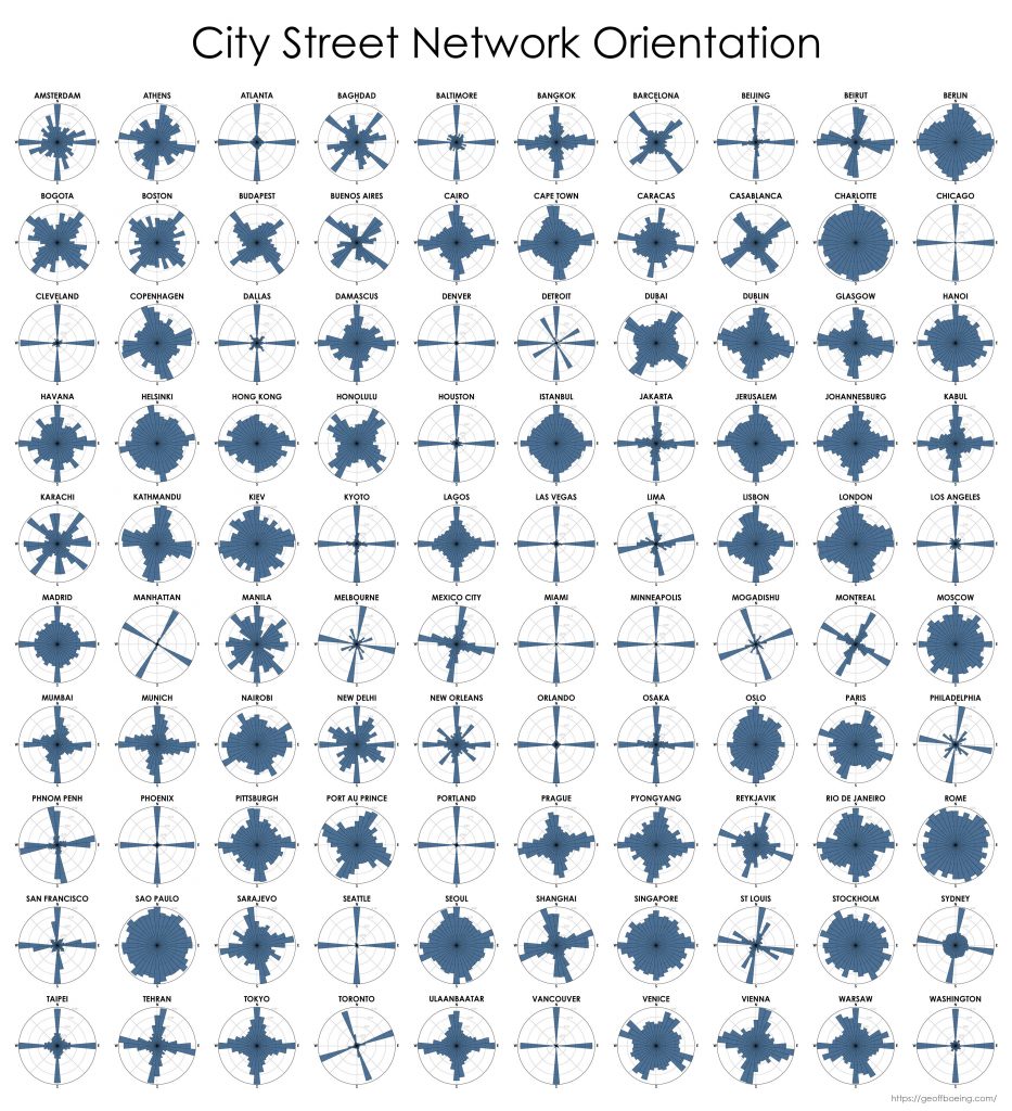
My new article, Urban Spatial Order: Street Network Orientation, Configuration, and Entropy, has just been published in one of my favorite journals: Applied Network Science (download free PDF). This study explores the spatial signatures of urban evolution and central planning. It examines street network orientation, connectivity, granularity, and entropy in 100 cities around the world using OpenStreetMap data and OSMnx for modeling and visualization:
So, who’s got a grid and who doesn’t? Each of the cities above is represented by a polar histogram (aka rose diagram) depicting how its streets orient. Each bar’s direction represents the compass bearings of the streets (in that histogram bin) and its length represents the relative frequency of streets with those bearings. The cities above are in alphabetical order. Here they are again, re-sorted from most-ordered/gridded city (Chicago) to most-disordered (Charlotte):
Comparing US City Street Orientations
This post is adapted from this research paper that you can read/cite for more info. It analyzes and visualizes 100 cities around the world.
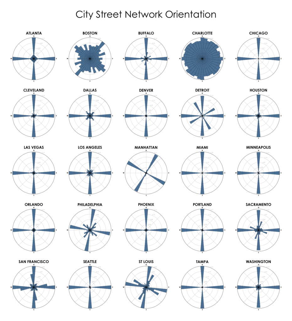
“We say the cows laid out Boston. Well, there are worse surveyors.” –Ralph Waldo Emerson. In 1960, one hundred years after Emerson’s quote, Kevin Lynch published The Image of the City, his treatise on the legibility of urban patterns. How coherent is a city’s spatial organization? How do these patterns help or hinder urban navigation? I recently wrote about visualizing street orientations with Python and OSMnx. That is, how is a city’s street network oriented in terms of the streets’ compass bearings? How well does it adhere to a straightforward north-south-east-west layout? I wanted to revisit this by comparing 25 major US cities’ orientations (EDIT: by popular request, see also this follow-up comparing world cities):
Estimating Daytime Density in RSRS
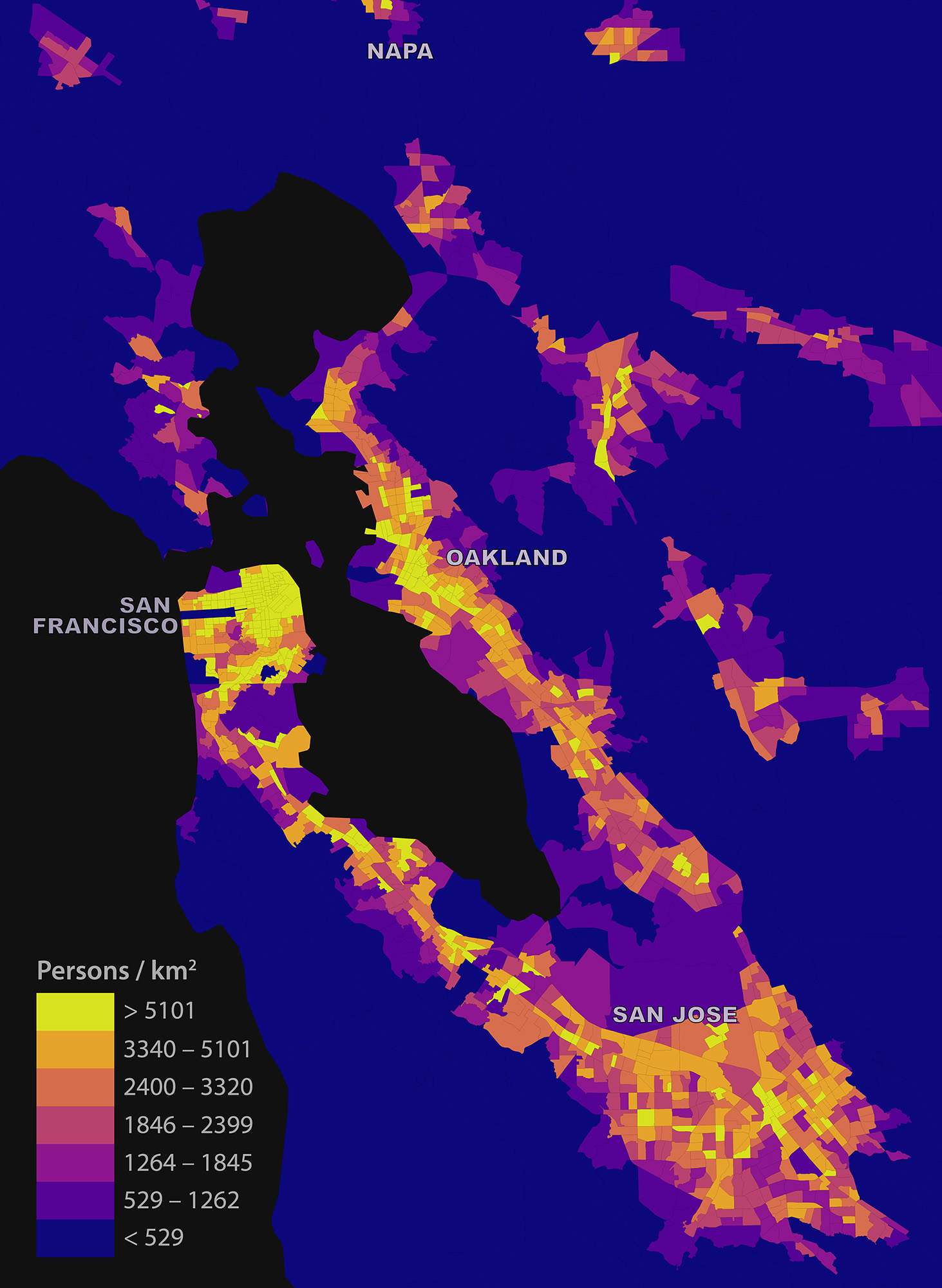
My short article “Estimating Local Daytime Population Density from Census and Payroll Data” is out now in the latest issue of Regional Studies, Regional Science. I discuss a method for estimating local daytime density across a metropolitan area using US Census and LEHD LODES data, and dig into some limitations and biases. I look at the San Francisco Bay Area as a case study:
Urban Form Figure-Ground Diagrams
Check out the journal article about OSMnx.
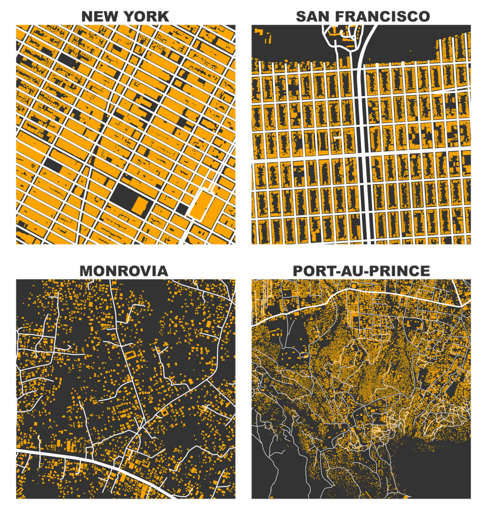
I previously demonstrated how to create figure-ground square-mile visualizations of urban street networks with OSMnx to consistently compare city patterns, design paradigms, and connectivity. OSMnx downloads, analyzes, and visualizes street networks from OpenStreetMap but it can also get building footprints. If we mash-up these building footprints with the street networks, we get a fascinating comparative window into urban form:
Square-Mile Street Network Visualization
Check out the journal article about OSMnx. All figures in this article come from this journal article, which you can read/cite for more.
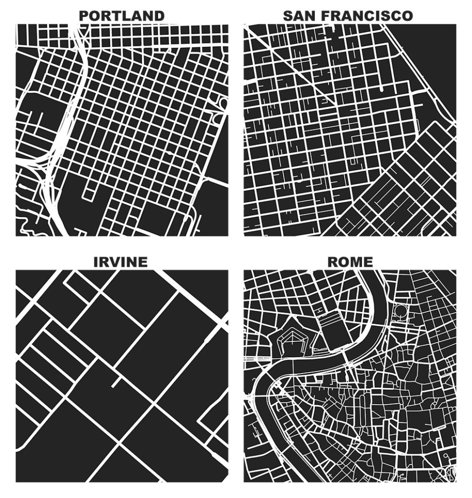
The heart of Allan Jacobs’ classic book on street-level urban form and design, Great Streets, features dozens of hand-drawn figure-ground diagrams in the style of Nolli maps. Each depicts one square mile of a city’s street network. Drawing these cities at the same scale provides a revealing spatial objectivity in visually comparing their street networks and urban forms.
We can recreate these visualizations automatically with Python and the OSMnx package, which I developed as part of my dissertation. With OSMnx we can download a street network from OpenStreetMap for anywhere in the world in just one line of code. Here are the square-mile diagrams of Portland, San Francisco, Irvine, and Rome created and plotted automatically by OSMnx: