 This post is adapted from this research paper that you can read/cite for more info. It analyzes and visualizes 100 cities around the world.
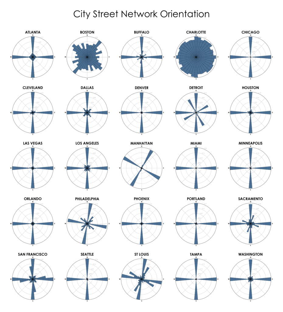
“We say the cows laid out Boston. Well, there are worse surveyors.” –Ralph Waldo Emerson. In 1960, one hundred years after Emerson’s quote, Kevin Lynch published The Image of the City, his treatise on the legibility of urban patterns. How coherent is a city’s spatial organization? How do these patterns help or hinder urban navigation? I recently wrote about visualizing street orientations with Python and OSMnx. That is, how is a city’s street network oriented in terms of the streets’ compass bearings? How well does it adhere to a straightforward north-south-east-west layout? I wanted to revisit this by comparing 25 major US cities’ orientations (EDIT: by popular request, see also this follow-up comparing world cities):
