Big Data in Urban Morphology
My new article “Spatial Information and the Legibility of Urban Form: Big Data in Urban Morphology” has been published in the International Journal of Information Management (download free PDF). It builds on recent work by Crooks et al, presenting workflows to integrate data-driven and narrative approaches to urban morphology in today’s era of ubiquitous urban big data. It situates this theoretically in the visual culture of planning to present a visualization-mediated interpretative process of data-driven urban morphology, focusing on transportation infrastructure via OSMnx.
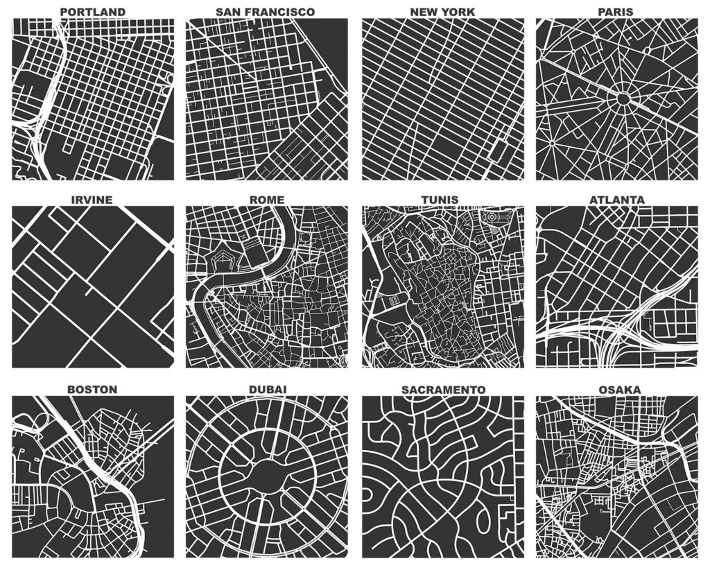
Above, we see one square mile figure-ground diagrams from 12 cities around the world. At the top-left, Portland, Oregon and San Francisco, California typify the late 19th century American orthogonal grid. Portland’s famously compact, walkable, 200-foot × 200-foot blocks are clearly visible but its grid is interrupted by the Interstate 405 freeway which tore through the central city in the 1960s. In the middle-left, the business park in suburban Irvine, California demonstrates the coarse-grained, modernist, auto-centric form that characterized American urbanization in the latter half of the 20th century.
In stark contrast, Rome has a more fine-grained, complex, organic form that evolved over millennia of self-organization and urban planning. Representing each of these street networks here at the same scale—one square mile—it is easy to compare the qualitative urban patterns in these different cities to one another. Contrast the geometric order of the 19th century orthogonal grid in San Francisco and the functionalist simplifications of 20th century Irvine to the messy, complex, lively mesh of pedestrian paths, passageways, and alleys constituting the circulation network in the ancient center of Rome.
At the top- and middle-right, we see New York, Paris, Tunis, and Atlanta. Midtown Manhattan’s rectangular grid originates from the New York Commissioners’ Plan of 1811, which laid out its iconic 800-foot × 200-foot blocks approximately 29 degrees off true North. Broadway weaves diagonally across it, revealing the path dependence of the old Wickquasgeck Trail’s vestiges, which Native American residents used to traverse the length of the island long before the first Dutch settlers arrived.
At the center of the Paris square mile lies the Arc de Triomphe, from which Baron Haussmann’s streets radiate outward as remnants of his massive demolition and renovation of 19th century Paris. The spatial signatures of Haussmann’s project can be seen quantitatively through the redistribution of betweenness centralities and block sizes. At the center of the Tunis square mile lies its Medina, with a complex urban fabric that evolved over the middle ages. Finally, Atlanta is typical of many American downtowns: coarse-grained, disconnected, and surrounded by freeways.
The figure’s bottom row shows square miles of Boston, Dubai, Sacramento, and Osaka. The central Boston square mile includes the city’s old North End – beloved by Jane Jacobs for its lively streets, but previously cut-off from the rest of the city by the Interstate 93 freeway. This freeway has been undergrounded as part of the Big Dig megaproject to alleviate traffic and re- knit the surface-level urban fabric. The Dubai square mile shows Jumeirah Village Circle, a master-planned residential suburb designed in the late 2000s by the Nakheel corporation, a major Dubai real estate developer. Its street network demonstrates a hybrid of the whimsical curvilinearity of the garden cities movement and the ordered geometry of modernism. The Sacramento square mile depicts its residential suburb of Arden-Arcade and demonstrates Southworth and Ben-Joseph’s “warped parallel” and “loops and lollipops” design patterns of late 20th century American urban design.
Finally, the Osaka square mile portrays Fukushima-ku, a mixed-use but primarily residential neighborhood first urbanized during the late nineteenth century. Today, the freeway we see in the upper-right of this square mile infamously passes through the center of the high-rise Gate Tower Building’s fifth through seventh floors. This arose when transportation planners were forced to compromise with private landowners seeking to redevelop their property, despite the prior designation of the freeway’s alignment.
To qualitatively compare urban spatial forms in different kinds of places, these visualizations depict a mix of modern central business districts, ancient historic quarters, 20th century business parks, and suburban residential neighborhoods. The cities they represent are drawn from across the United States, Europe, North Africa, the Arabian Peninsula, and East Asia. Yet street network patterns also vary greatly within cities: Portland’s suburban east and west sides look different than its downtown, and Sacramento’s compact, grid-like downtown looks different than its residential suburbs—a finding true of many American cities.
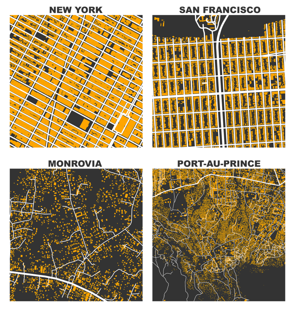
In the image above, we use OSMnx to visualize street networks along with building footprints. At the top-left, we see the densely built form of Midtown Manhattan, with large buildings filling most of the available space between streets. Within this square mile, there are 2,237 building footprints with a median area of 241 square meters. At the top-right, we see the medium-density perimeter blocks of San Francisco’s Richmond district, just south of the Presidio. Here the building footprints line the streets while leaving the centers of each block as open space for residents. Within this square mile, there are 5,054 building footprints with a median area of 142 square meters.
The bottom two images reveal an entirely different mode of urbanization by visualizing the slums of Monrovia, Liberia and Port-au-Prince, Haiti. These informal settlements are much finer-grained and are not structured according to the centralized planning of the American street grids in the top row. Monrovia’s square mile contains 2,543 building footprints with a median area of 127 square meters. Port-au-Prince’s square mile contains 14,037 building footprints with a median area of just 34 square meters.
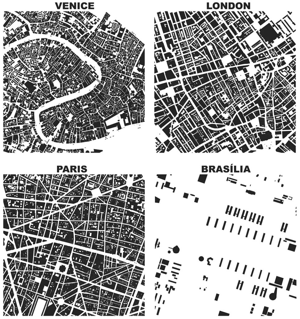
Visualizing spatial information can also reveal the state assertion of power and modernism’s inversion of traditional urban spatial order. In pre-industrial cities, the figure dominates the ground (only scattered open space between buildings) as seen in the image above. But in modernist cities, the ground dominates the figure as only a few scattered buildings are positioned as sculptural elements across the landscape’s void. The modernist paradigm sought to open up the dense, messy, and complex urban fabric with towers-in-the-park, spacing, highways, and functional simplicity.
This phenomenon is clearly seen in Brasília, the modernist capital of Brazil, designed as a planned city in the 1950s by Lúcio Costa, Oscar Niemeyer, and Roberto Burle Marx. The structural order of the city also suggests “an ordering of social relations and practices in the city” (to quote Jim Holston). These figure-ground diagrams provide a spatial data-driven method to in turn qualitatively interpret the urban form and circulation networks that structure human activities and social relations.
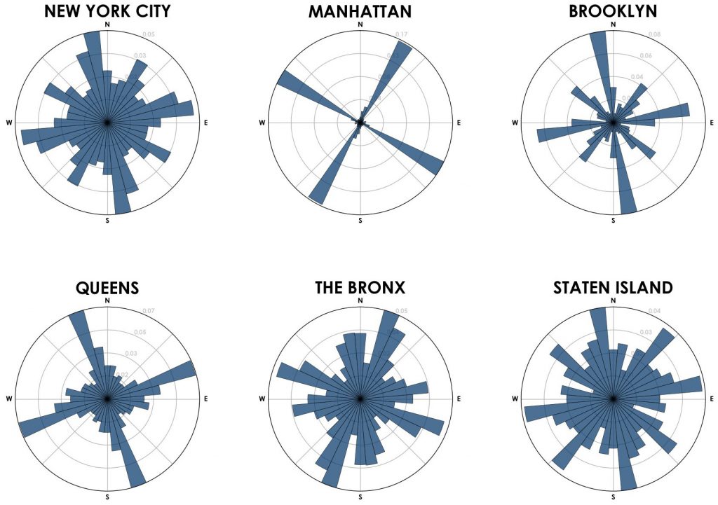
The rose diagrams above offer another perspective on visualizing this structural ordering of the city, in this case New York City. Each visualizes the orientation (compass bearing) of the borough’s street segments, with bins representing 10-degrees around the compass and bar lengths representing relative frequency (for complete methodological details and theoretical development see here). For example, in Manhattan’s rose diagram we can see the spatial order produced by its dominant orthogonal grid as its street bearings are primarily captured in four bins, offset from true North. The other boroughs have higher entropy street orientations, not adhering as strictly to the ordering logic of a single grid.
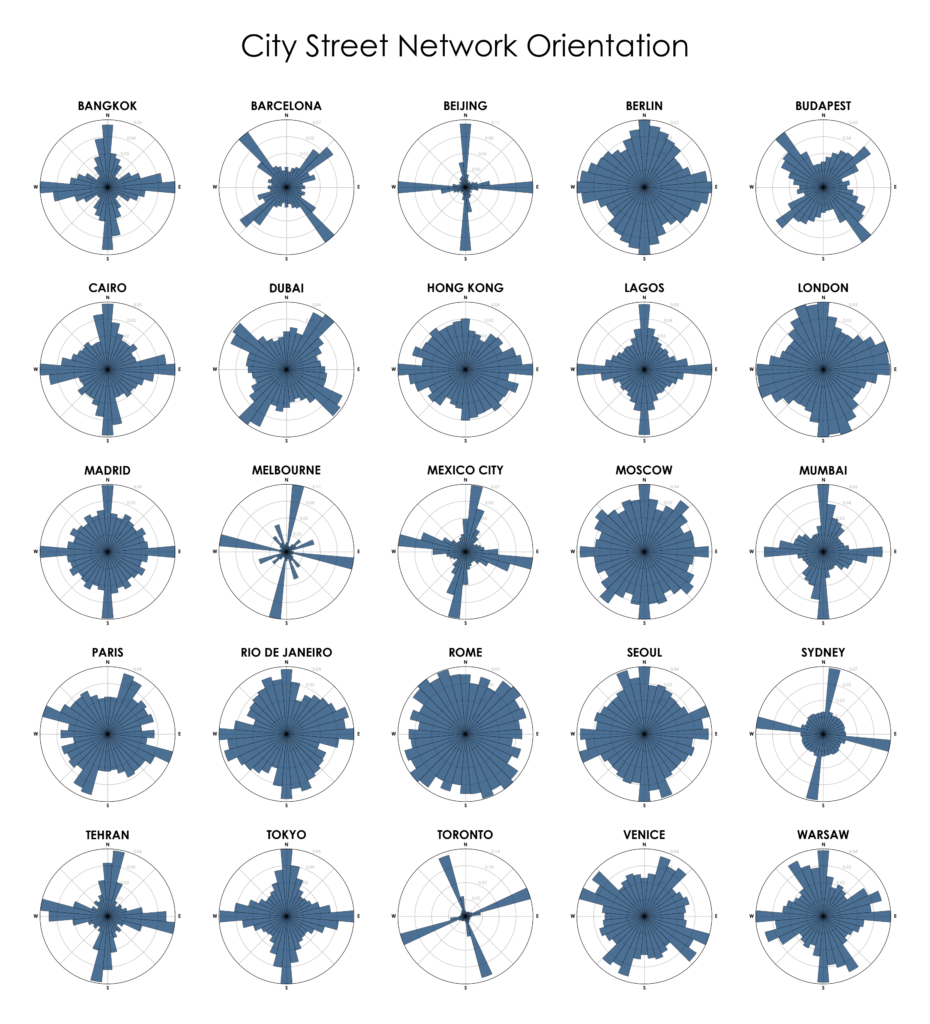
In the image below, we see rose diagrams of 25 cities (municipalities) around the world. This study scale aggregates heterogeneous neighborhoods into a single analytical whole, but offers the benefit of capturing the scale of city planning jurisdiction to tell us about the spatial ordering that the circulatory system provides. While some street networks in modern cities in Canada, Australia, and China demonstrate similar low-entropy grids, far more of these cities show higher entropy. That is, their streets are oriented more evenly in all compass directions rather than following the spatial ordering logic of one or two consistent grids.
The spatial signature of the grid is clearest here in cities like Toronto and Beijing, while cities like Rome and Rio de Janeiro demonstrate more-organic and less-orthogonal patterns. The patterns in Beijing are interesting as they deviate from many of its Asian neighbors, instead conforming more to the rationalist, centrally planned gridirons of Western cities like Toronto, Melbourne, and Manhattan and suggesting a certain spatial logic undergirding its massive and rapid urbanization in recent years.
Data-driven urban morphology explores urban form by modeling spatial data to trace histories, configurations, and orientations in physical space—but it requires interpretation to reveal the nuance of local context and history. The urban historian Spiro Kostof once said: “Form, in itself, is very lamely informative of intention. We ‘read’ form correctly only to the extent that we are familiar with the precise cultural conditions that generated it… The more we know about cultures, about the structure of society in various periods of history in different parts of the world, the better we are able to read their built environment.” Urban spatial data must be contextually interpreted to become meaningful information about form and its evolution.
For more, check out the article itself in IJIM.