Visualizing a Gmail Inbox
Google Takeout lets you download an archive of your data from various Google products. I downloaded my Gmail archive as an mbox file and visualized all of my personal Gmail account traffic since signing up back in July 2004. This analysis excludes work and school email traffic (as well as my other Gmail account for signing up for web sites and services), as I have separate dedicated email accounts for each. It also excludes the Hangouts/chats that Google includes in your mbox archive. So, this analysis just covers personal communication.
This also demonstrates working with time series in Python and pandas. All of my code is on GitHub as an IPython notebook. You can re-purpose it for your own inbox - just download your Gmail archive then run my code.

First I loaded my Gmail archive, which contained 164,959 messages. I filtered out the non-emails (chats) and any messages without timestamps, then plotted the email volume per day (above). The traffic varies considerably by date, but there are clear peaks (late 2010-late 2011) and troughs (the holiday seasons concluding 2007, 2009, and 2011).
My total email volume also seems to have dropped off somewhat in the past couple of years. This isn’t surprising. I increasingly use social media to communicate at the expense of traditional email. To make these broader trends clearer, I aggregated the data by month and visualized volume:

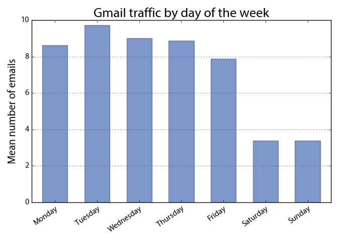
Next I grouped the data by day of the week and calculated averages. Here’s the mean email volume by the day of the week:

Again this is just my personal email inbox, so the daily traffic is fairly low. It doesn’t include the hundreds of emails flowing through my school, work, and junk accounts each day. It also includes years of observations from before I used Gmail regularly. Still, it’s clear that the majority of my personal email traffic occurs during the work week.
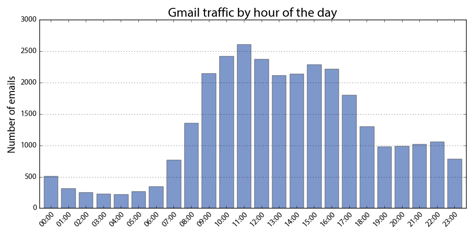
Next I grouped the data by hour of the day to see when most of the email traffic occurs throughout the day:

In other words, I don’t get much in or out before 9:00am as a rule of thumb. One of the nice things about this data set is that its size let’s you dig into some pretty fine-grain trends. To add nuance (or obfuscation?) to this bar chart, I calculated my email volume by the minute of the day and plotted it:

There’s significant variation within each hour, which might be smoothed out with more observations. The spike at 10:00 pm is particularly interesting. Without sifting through messages for clues, I’m guessing that it’s due to auto-scheduled messaging because the spike occurs precisely at 10:00. Not likely when normal humans are responsible for the traffic.
If you want to re-create or extend this analysis, all my code is on GitHub. Just download your Gmail archive then run my code.