Animated 3-D Plots in Python
In a previous post, I discussed chaos, fractals, and strange attractors. I also showed how to visualize them with static 3-D plots. Here, I’ll demonstrate how to create these animated visualizations using Python and matplotlib. All of my source code is available in this GitHub repo. By the end, we’ll produce animated data visualizations like this, in pure Python:
Getting Started
In my previous discussion on differentiating chaos from randomness, I presented the following two data visualizations. Each depicts one-dimensional chaotic and random time series embedded into two- and three-dimensional state space (on the left and right, respectively):
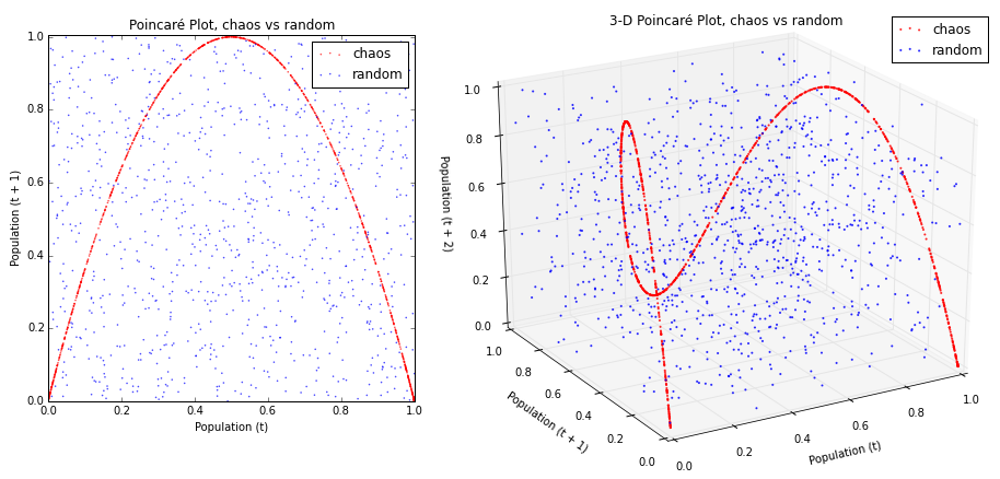
I noted that if you were to look straight down at the x-y plane of the 3-D plot on the right, you’d see an image in perspective identical to the 2-D plot on the left. This can be kind of hard to picture in your mind without a visual demonstration, so let’s animate that 3-D plot to pan and rotate and reveal its structure.
Our basic workflow for creating animated data visualizations in Python starts with creating two data sets. Then we’ll plot them in 3-D using x, y, and z-axes. Next we’ll pivot our viewpoint around this plot several times, saving a snapshot of each perspective. Finally we’ll compile all of these static images into an animated GIF.
First we need to import the necessary Python libraries:
import pandas as pd, numpy as np, random
import matplotlib.pyplot as plt, matplotlib.cm as cm
from mpl_toolkits.mplot3d import Axes3D
import IPython.display as IPdisplay
import glob
from PIL import Image as PIL_Image
from images2gif import writeGif
We’re importing pandas and numpy to work with our data, and random to create the random time series. Next we import pyplot and cm from matplotlib to create our plots and produce sets of colors. Axes3D will be used to render our 3-D plots. IPython.display will display our animated GIFs inline in the IPython notebook. The last three libraries - glob, PIL, and images2gif - are used to grab files in a directory, handle images, and compile a set of images into an animated GIF.
Example 1: Chaos vs Randomness
Now, we’ll create two time series, one chaotic and one random. The chaotic data set is produced using the logistic map for 1,000 generations with a growth rate of 3.99, as I describe in detail here. Then I merge the two series together into a single pandas DataFrame called pops and display its final five rows:
chaos_pops = logistic_model(generations=1000, growth_rate_min=3.99,
growth_rate_max=4,
growth_rate_steps=1)
random_pops = pd.DataFrame([random.random() for _ in range(0,1000)], columns=['value'])
pops = pd.concat([chaos_pops, random_pops], axis=1)
pops.columns = ['chaos', 'random']
pops.tail()
Next we supply a filename for our animated GIF. This will also serve as the name of a working directory in which we’ll save each snapshot of our plot. Then we call the function to create a 3-D phase diagram (or Poincaré plot), described in detail here, of our data set:
gif_filename = '3d-phase-diagram-chaos-vs-random'
fig, ax = get_pdiagram_3d(pops, color=['r', 'b'], xlabel='Population (t)',
ylabel='Population (t + 1)', zlabel='',
legend=True, legend_bbox_to_anchor=(0.94, 0.96))
Notice what we’re passing into this function: the pops data set, the colors red and blue (to differentiate the chaotic data set from the random data set), axis labels (but only for the x- and y-axes for now), and details for placing the plot’s legend.
Next we’ll define the initial viewpoint perspective for our 3-D plot. In matplotlib, every viewpoint is defined by three attributes: elevation, azimuth, and distance. Elevation is the height above the bottom plane, azimuth is the 360-degree rotation around the plot, and distance is how far away the viewpoint is from the center. These three combine to define a point in 3-D space from which our “camera” will be trained at the center of the plot:
ax.elev = 89.9
ax.azim = 270.1
ax.dist = 11.0
As discussed earlier, we want to start our animation by looking straight down at the x-y plane, so we set the elevation to 90 (high above the plot) and the azimuth to 270 (in line with the z-axis). I offset each of these by 0.1 units because matplotlib axes get a little funky when viewing them perfectly straight-on.
If we were to stop now and save our plot, here’s what it would look like:
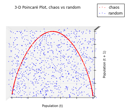
There are our x- and y-axes (Population t and Population t+1, respectively), and you can just barely see the z-axis extruding up toward us. The chaotic time series is depicted by red points and the random series by blue points. If you scroll back up to the original 2-D plot, you’ll see that it looks just like this one, other than some slightly different axis scaling.
But we don’t want to stop here. We want to reproduce this snapshot from a range of different perspectives that pan and rotate around the plot to reveal the attractor’s structure. To do this, we’ll create 100 frames (or snapshots of our plot) to combine into an animated GIF. Every good movie needs a good script that defines its action. Here’s ours:
for n in range(0, 100):
    if n >= 20 and n <= 22:
        #don't show axis labels while we move around, it looks weird
        ax.set_xlabel('')
        ax.set_ylabel('')
        ax.elev = ax.elev-0.5

    #start by panning down slowly
    if n >= 23 and n <= 36:
        ax.elev = ax.elev-1.0

    #pan down faster
    if n >= 37 and n <= 60:
        ax.elev = ax.elev-1.5
        ax.azim = ax.azim+1.1

    #pan down faster and start to rotate
    if n >= 61 and n <= 64:
        ax.elev = ax.elev-1.0
        ax.azim = ax.azim+1.1

    #pan down slower and rotate same speed
    if n >= 65 and n <= 73:
        ax.elev = ax.elev-0.5
        ax.azim = ax.azim+1.1

    #pan down slowly and rotate same speed
    if n >= 74 and n <= 76:
        ax.elev = ax.elev-0.2
        ax.azim = ax.azim+0.5

    #end by panning/rotating slowly to stopping position
    if n = 77:
        #add axis labels at the end, when the plot isn't moving around
        ax.set_xlabel('Population (t)')
        ax.set_ylabel('Population (t + 1)')
        ax.set_zlabel('Population (t + 2)')

    fig.suptitle(u'3-D Poincaré Plot, chaos vs random', fontsize=12, x=0.5, y=0.85)
    plt.savefig('images/' + gif_filename + '/img' + str(n).zfill(3) + '.png', bbox_inches='tight')
This movie script is a big for loop, with one loop per frame of animation - i.e., 100 in total. Let’s unpack it. From n=0 to n=19, we do nothing. This will display the first frame statically for a couple of seconds to give the viewer a chance to soak it in. From n=20 to n=22, we start panning down slowly by reducing the elevation by 0.5 in each time step. Notice that we also removed the axis labels. We’ll keep them turned off until we’re done moving the viewpoint around because they look a bit odd while things are in motion.
From n=23 to n=36, we pan down faster by reducing the elevation by 1.0 in each time step. Then, from n=37 to n=60, we pan down faster still and start to rotate the perspective by increasing the azimuth by 1.1 in each time step. From n=61 to n=64, we pan down slowly while maintaining the same rate of rotation. From n=74 to n=76, we slow down the panning and rotating further to apply the brakes as we reach the final resting position. You could also use an easing function to smooth the animation’s acceleration/deceleration.
When n=77, we add labels for all three axes. The perspective doesn’t change for the final 23 time steps, much like in the beginning, to give the viewer a chance to soak it in. Lastly, in each time step, we title the figure and save a snapshot of the plot to the working directory.
When the for loop ends, we compile all of these snapshots into an animated GIF and display it inline in our IPython notebook:
plt.close()
images = [PIL_Image.open(image) for image in glob.glob('images/' + gif_filename + '/*.png')]
file_path_name = 'images/' + gif_filename + '.gif'
writeGif(file_path_name, images, duration=0.1)
IPdisplay.Image(url=file_path_name)
The animation begins by looking straight down at the x-y plane. Then it starts rotating and panning, revealing the full 3-D structure of this state space. Notice that when we saved the GIF, we specified a duration of 0.1. That’s how long each frame is displayed in seconds. We produced 100 total frames, so the animated GIF runs for a total of 10 seconds.
Example 2: The Chaotic Regime
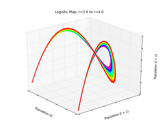
Let’s look at another example, with a more interesting data set and movie script. The previous animation revealed the difference between chaotic and random time series. This time, let’s look at 50 different time series from the logistic map’s chaotic regime, all in one plot:
pops = logistic_model(generations=4000, growth_rate_min=3.6, growth_rate_max=4.0, growth_rate_steps=50)
gif_filename = 'logistic-3d-phase-diagram-plot-chaotic-regime'
fig, ax = get_pdiagram_3d(pops, color='hsv', color_reverse=True)
Here, we’re running the logistic map for 4,000 generations across 50 growth rate parameters in the chaotic regime between r=3.6 and r=4.0. We give the GIF a filename and create the 3-D plot using a colormap called ‘hsv’, so each of the 50 growth rates gets its own color. Now we set up the initial viewing perspective:
ax.elev = 25.
ax.azim = 321.
ax.dist = 11.
Next, we’ll define the script for our animation. Once again we have 100 time steps, but this time we’ll start off by rotating very slowly from right to left. Then we’ll quickly whip around to the other side of the plot, pause briefly, and zoom into the center. Then we’ll pull back and pan up before finally ending by rotating very slowly. For each time step, we title the figure and save a snapshot to the working directory:
for n in range(0, 100):
    if n <= 18:
        ax.azim = ax.azim-0.2

    #begin by rotating very slowly
    if n >= 19 and n <= 29:
        ax.azim = ax.azim-10
        ax.dist = ax.dist-0.05
        ax.elev = ax.elev-2

    #quickly whip around to the other side
    if n >= 33 and n <= 49:
        ax.azim = ax.azim+3
        ax.dist = ax.dist-0.55
        ax.elev = ax.elev+1.4

    #zoom into the center
    if n >= 61 and n <= 79:
        ax.azim = ax.azim-2
        ax.elev = ax.elev-2
        ax.dist = ax.dist+0.2

    #pull back and pan up
    if n >= 80:
        #end by rotating very slowly
        ax.azim = ax.azim-0.2

    fig.suptitle('Logistic Map, r=3.6 to r=4.0', fontsize=12, x=0.5, y=0.85)
    plt.savefig('images/' + gif_filename + '/img' + str(n).zfill(3) + '.png', bbox_inches='tight')
Once we’ve got our 100 snapshots saved in the working directory, we’ll load up the images and save them as an animated GIF. Then we display our animation inline in the IPython notebook:
plt.close()
images= [PIL_Image.open(image) for image in glob.glob('images/'+gif_filename+'/*.png')]
file_path_name = 'images/' + gif_filename + '.gif'
writeGif(file_path_name, images, duration=0.1)
IPdisplay.Image(url=file_path_name)
In this animated plot, we have 50 different time series, one for each growth rate parameter value. Each of these 50 has its own color and forms its own curve through state space. The curves never overlap and no point ever repeats itself, due to the fractal geometry of strange attractors and the determinism of the logistic map. We can see this detail more clearly as we zoom in and pan around these curves in 3-D state space.
Wrap-Up
Python and matplotlib provide simple facilities for developing 3-D data visualizations and animating them. These animations can provide greater insight and understanding of the structure of a data set than can be gleaned from a simple static image. Check out this previous post if you’re interested in chaos theory, the logistic map, fractals, and strange attractors. Or check out this post for more on phase diagrams and differentiating chaos from randomness.
You can download/cite the paper here. All of the Python code that I used to run the model and produce these animated plots is available in this GitHub repo. Feel free to play around with it and create your own 3-D animations.