Categories
Planning

Square-Mile Street Network Visualization

Check out the journal article about OSMnx. All figures in this article come from this journal article, which you can read/cite for more.

The heart of Allan Jacobs’ classic book on street-level urban form and design, Great Streets, features dozens of hand-drawn figure-ground diagrams in the style of Nolli maps. Each depicts one square mile of a city’s street network. Drawing these cities at the same scale provides a revealing spatial objectivity in visually comparing their street networks and urban forms.

We can recreate these visualizations automatically with Python and the OSMnx package, which I developed as part of my dissertation. With OSMnx we can download a street network from OpenStreetMap for anywhere in the world in just one line of code. Here are the square-mile diagrams of Portland, San Francisco, Irvine, and Rome created and plotted automatically by OSMnx:
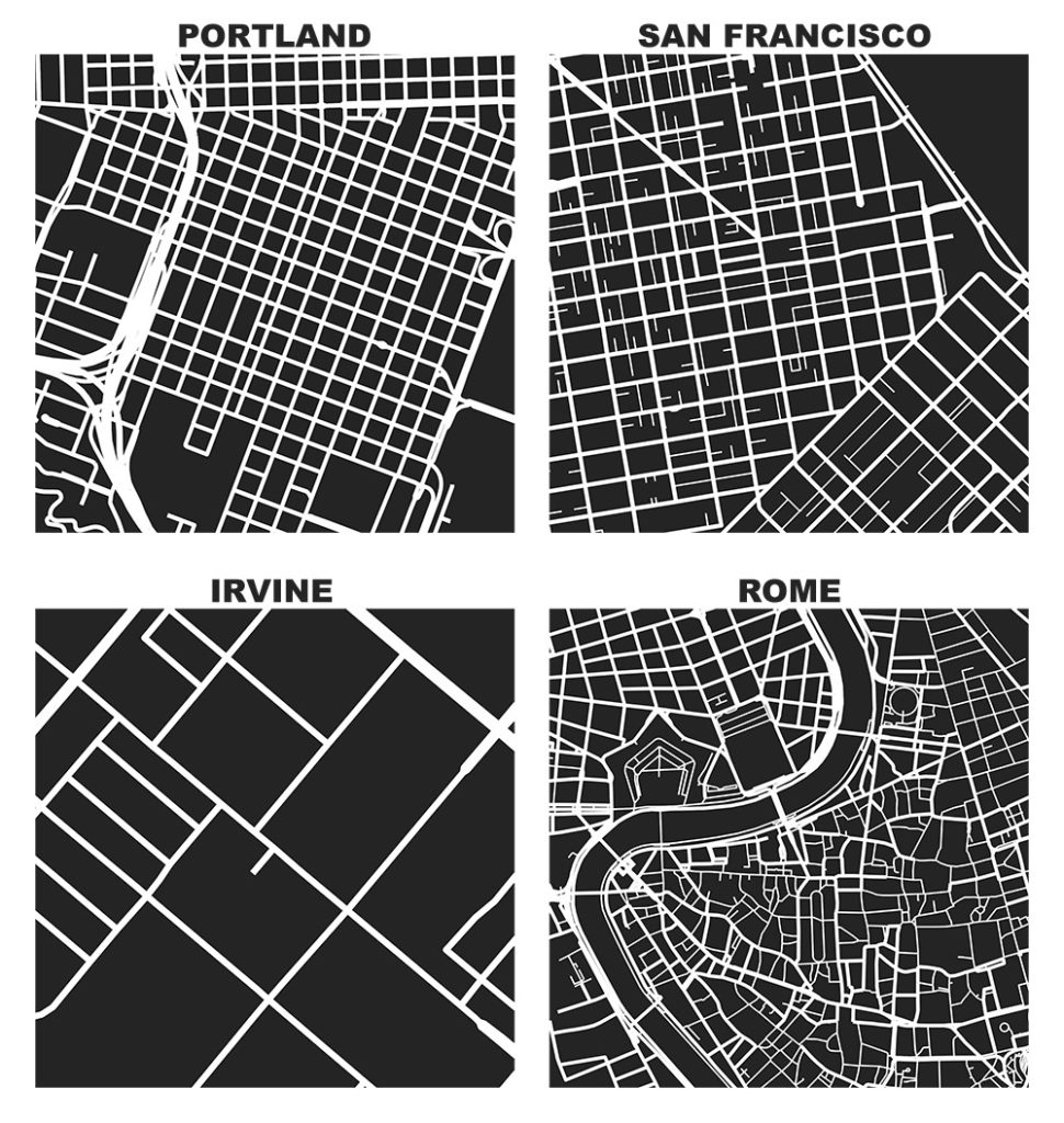
OSMnx: Figure-ground diagrams of one square mile of Portland, San Francisco, Irvine, and Rome shows the street network, urban form, and urban design in these cities

Categories
Data

R-tree Spatial Indexing with Python

r-tree spatial index with python geopandas: Thumbnail of Walnut Creek, California city boundary and street intersections inside and outside city limits Check out the journal article about OSMnx, which implements this technique.

A spatial index such as R-tree can drastically speed up GIS operations like intersections and joins. Spatial indices are key features of spatial databases like PostGIS, but they’re also available for DIY coding in Python. I’ll introduce how R-trees work and how to use them in Python and its geopandas library. All of my code is in this notebook in this urban data science GitHub repo.

Categories
Planning

How to Visualize Urban Accessibility and Walkability

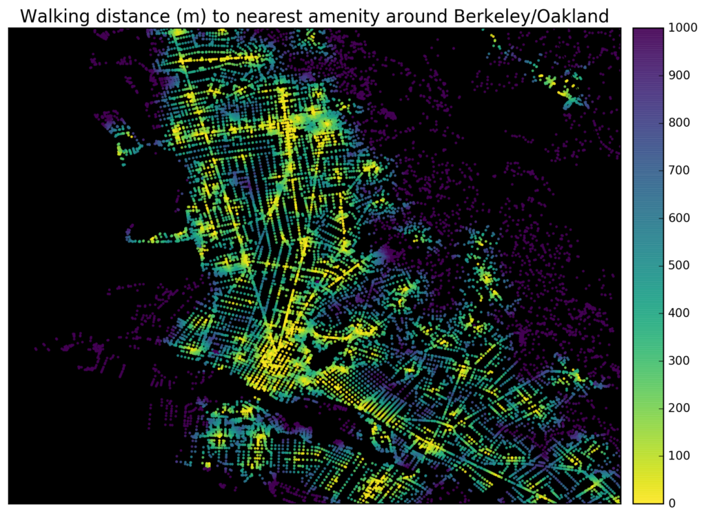
Tools like WalkScore visualize how “walkable” a neighborhood is in terms of access to different amenities like parks, schools, or restaurants. It’s easy to create accessibility visualizations like these ad hoc with Python and its pandana library. Pandana (pandas for network analysis – developed by Fletcher Foti during his dissertation research here at UC Berkeley) performs fast accessibility queries over a network. I’ll demonstrate how to use it to visualize urban walkability. My code is in these IPython notebooks in this urban data science course GitHub repo.

First I give pandana a bounding box around Berkeley/Oakland in the East Bay of the San Francisco Bay Area. Then I load the street network and amenities from OpenStreetMap. In this example I’ll look at accessibility to restaurants, bars, and schools. But, you can create any basket of amenities that you are interested in – basically visualizing a personalized “AnythingScore” instead of a generic WalkScore for everyone. Finally I calculate and plot the distance from each node in the network to the nearest amenity:

Berkeley Oakland California street network walking accessibility and walkability

Categories
Data

Mapping Everywhere I’ve Ever Been in My Life

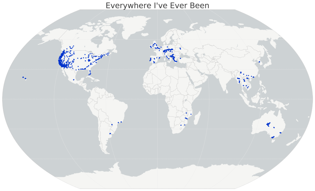
I recently wrote about visualizing my Foursquare check-in history and mapping my Google location history, and it inspired me to mount a more substantial project: mapping everywhere I’ve ever been in my life (!!). I’ve got 4 years of Foursquare check-ins and Google location history data. For everything pre-smart phone, I typed up a simple spreadsheet of places I’d visited in the past and then geocoded it with the Google Maps API. All my Python and Leaflet code is available in this GitHub repo and is easy to re-purpose to visualize your own location history.
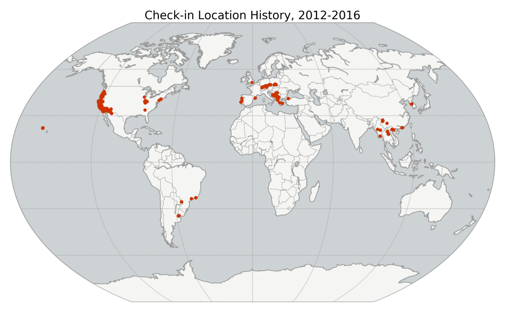
I’ll show the maps first, then run through the process I followed, below. First off, I used Python and matplotlib basemap to create this map of everywhere I’ve ever been:

Location History World Map, data from Foursquare and Google, made with Python matplotlib basemap

Categories
Data

Mapping Your Google Location History with Python

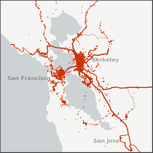
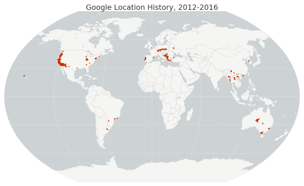
Small map of my Google location history data in the San Francisco Bay Area, 2012-2016I recently wrote about visualizing my Foursquare check-in history and it inspired me to map my entire Google location history data – about 1.2 million GPS coordinates from my Android phone between 2012 and 2016. I used Python and its pandas, matplotlib, and basemap libraries. The Python code is available in this notebook in this GitHub repo, and it’s simple to re-use to visualize your own location history.
Just download your JSON file from Google then run the code. First I load the JSON file and parse the latitude, longitude, and timestamp with pandas. Then I map my worldwide data set:

Map of my Google location history data worldwide, 2012-2016

Categories
Data

Analyzing Last.fm Listening History

Last.fm is a web site that tracks your music listening history across devices (computer, phone, iPod, etc) and services (Spotify, iTunes, Google Play, etc). I’ve been using Last.fm for nearly 10 years now, and my tracked listening history goes back even further when you consider all my pre-existing iTunes play counts that I scrobbled (ie, submitted to my Last.fm database) when I joined Last.fm.

Using Python, pandas, matplotlib, and leaflet, I downloaded my listening history from Last.fm’s API, analyzed and visualized the data, downloaded full artist details from the Musicbrainz API, then geocoded and mapped all the artists I’ve played. All of my code used to do this is available in this GitHub repo, and is easy to re-purpose for exploring your own Last.fm history. All you need is an API key.

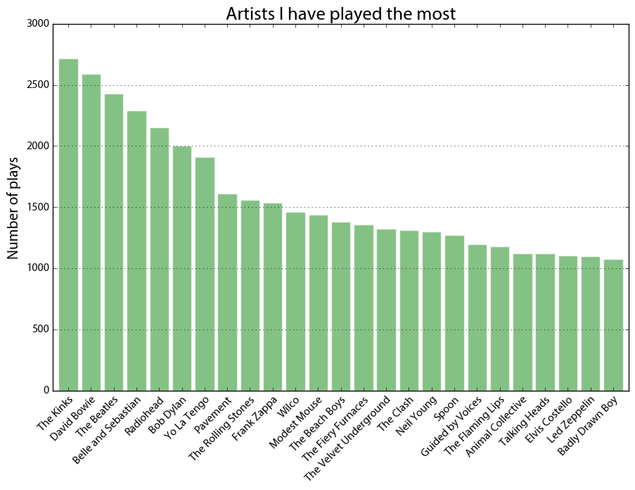
Last.fm artists played the most

First I visualized my most-played artists, above. Across the dataset, I have 279,769 scrobbles (aka, song plays). I’ve listened to 26,761 different artists and 66,377 different songs across 38,026 different albums from when I first started using iTunes circa 2005 through the present day. This includes pretty close to every song I’ve played on anything other than vinyl during that time.

Categories
Data

Visualize Foursquare Location History

I started using Foursquare at the end of 2012 and kept with it even after it became the pointless muck that is Swarm. Since I’ve now got 4 years of location history (ie, check-ins) data, I decided to visualize and map it with Python, matplotlib, and basemap. The code is available in this GitHub repo. It’s easy to re-purpose to visualize your own check-in history: you just need to plug in your Foursquare OAuth token then run the notebook.

First the notebook downloads all my check-ins from the Foursquare API. Then I mapped all of them, using matplotlib basemap.

Map of Foursquare Swarm check-in location history

Categories
Academia

Urban Informatics and Visualization at UC Berkeley

The fall semester begins next week at UC Berkeley. For the third year in a row, Paul Waddell and I will be teaching CP255: Urban Informatics and Visualization, and this is my first year as co-lead instructor.

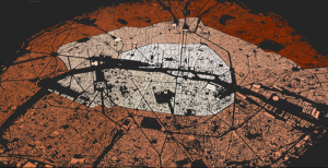
This masters-level course trains students to analyze urban data, develop indicators, conduct spatial analyses, create data visualizations, and build Paris open datainteractive web maps. To do this, we use the Python programming language, open source analysis and visualization tools, and public data.
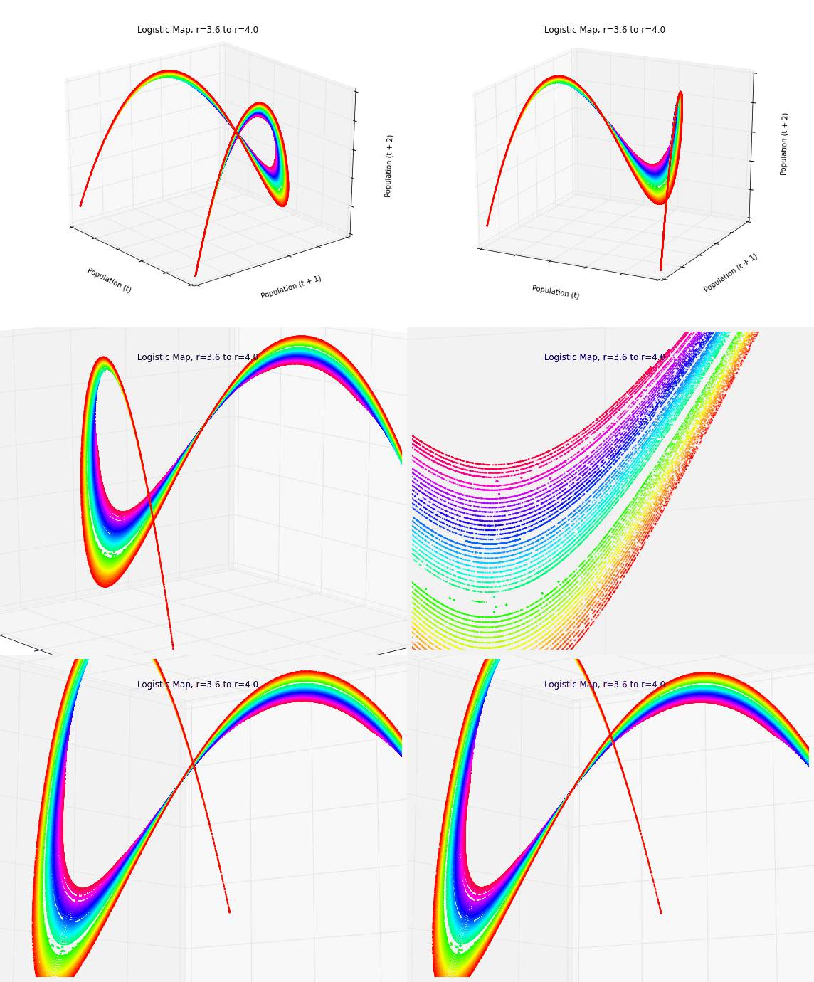
This course is designed to provide future city planners with a toolkit of technical skills for quantitative problem solving. We don’t require any prior programming experience – we teach this from the ground up – but we do expect prior knowledge of basic statistics and GIS.

Update, September 2017: I am no longer a Berkeley GSI, but Paul’s class is ongoing. Check out his fantastic teaching materials in his GitHub repo. From my experiences here, I have developed a course series on urban data science with Python and Jupyter, available in this GitHub repo.

Categories
Data

Animated 3-D Plots in Python

Download/cite the paper here!

In a previous post, I discussed chaos, fractals, and strange attractors. I also showed how to visualize them with static 3-D plots. Here, I’ll demonstrate how to create these animated visualizations using Python and matplotlib. All of my source code is available in this GitHub repo. By the end, we’ll produce animated data visualizations like this, in pure Python:

Animated 3-D Poincare plot of the logistic map's chaotic regime - this is time series data embedded in three dimensional state space

Categories
Data

Visualizing Chaos and Randomness

3-D Poincare plot of the logistic map's chaotic regime - this is time series data embedded in three dimensional state space

Download/cite the paper here!

In a previous post, I discussed chaos theory, fractals, and strange attractors – and their implications for knowledge and prediction of systems. I also briefly touched on how phase diagrams (or Poincaré plots) can help us visualize system attractors and differentiate chaotic behavior from true randomness.

In this post (adapted from this paper), I provide more detail on constructing and interpreting phase diagrams. These methods are particularly useful for discovering deterministic chaos in otherwise random-appearing time series data, as they visualize strange attractors. I’m using Python for all of these visualizations and the source code is available in this GitHub repo.