Categories
Data

Mapping Everywhere I’ve Ever Been in My Life

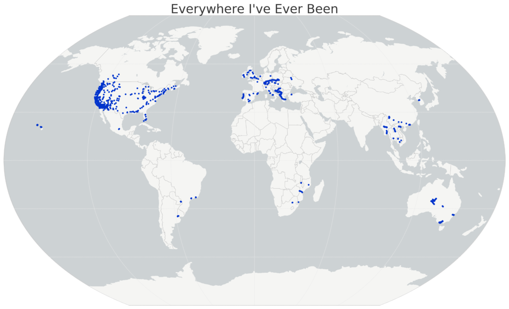
I recently wrote about visualizing my Foursquare check-in history and mapping my Google location history, and it inspired me to mount a more substantial project: mapping everywhere I’ve ever been in my life (!!). I’ve got 4 years of Foursquare check-ins and Google location history data. For everything pre-smart phone, I typed up a simple spreadsheet of places I’d visited in the past and then geocoded it with the Google Maps API. All my Python and Leaflet code is available in this GitHub repo and is easy to re-purpose to visualize your own location history.

I’ll show the maps first, then run through the process I followed, below. First off, I used Python and matplotlib basemap to create this map of everywhere I’ve ever been:

Location History World Map, data from Foursquare and Google, made with Python matplotlib basemap

Categories
Data

Mapping Your Google Location History with Python

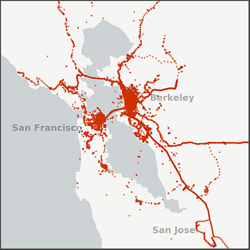
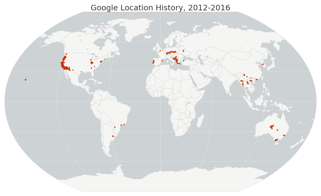
Small map of my Google location history data in the San Francisco Bay Area, 2012-2016I recently wrote about visualizing my Foursquare check-in history and it inspired me to map my entire Google location history data – about 1.2 million GPS coordinates from my Android phone between 2012 and 2016. I used Python and its pandas, matplotlib, and basemap libraries. The Python code is available in this notebook in this GitHub repo, and it’s simple to re-use to visualize your own location history.

Just download your JSON file from Google then run the code. First I load the JSON file and parse the latitude, longitude, and timestamp with pandas. Then I map my worldwide data set:

Map of my Google location history data worldwide, 2012-2016

Categories
Data

Analyzing Last.fm Listening History

Last.fm is a web site that tracks your music listening history across devices (computer, phone, iPod, etc) and services (Spotify, iTunes, Google Play, etc). I’ve been using Last.fm for nearly 10 years now, and my tracked listening history goes back even further when you consider all my pre-existing iTunes play counts that I scrobbled (ie, submitted to my Last.fm database) when I joined Last.fm.

Using Python, pandas, matplotlib, and leaflet, I downloaded my listening history from Last.fm’s API, analyzed and visualized the data, downloaded full artist details from the Musicbrainz API, then geocoded and mapped all the artists I’ve played. All of my code used to do this is available in this GitHub repo, and is easy to re-purpose for exploring your own Last.fm history. All you need is an API key.
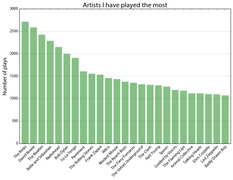
Last.fm artists played the most

First I visualized my most-played artists, above. Across the dataset, I have 279,769 scrobbles (aka, song plays). I’ve listened to 26,761 different artists and 66,377 different songs across 38,026 different albums from when I first started using iTunes circa 2005 through the present day. This includes pretty close to every song I’ve played on anything other than vinyl during that time.
Categories
Data

Visualize Foursquare Location History

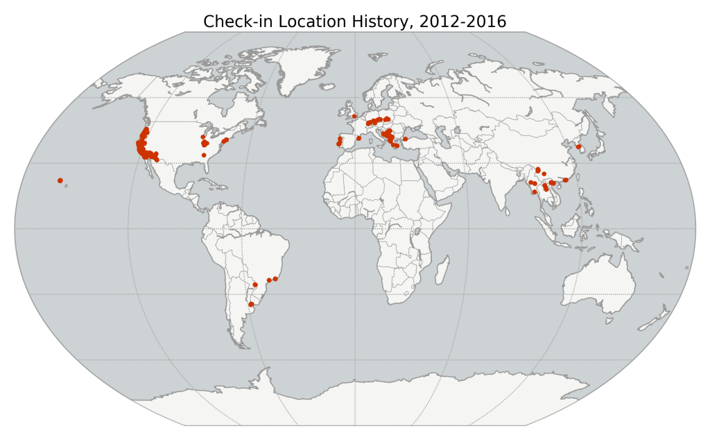
I started using Foursquare at the end of 2012 and kept with it even after it became the pointless muck that is Swarm. Since I’ve now got 4 years of location history (ie, check-ins) data, I decided to visualize and map it with Python, matplotlib, and basemap. The code is available in this GitHub repo. It’s easy to re-purpose to visualize your own check-in history: you just need to plug in your Foursquare OAuth token then run the notebook.

First the notebook downloads all my check-ins from the Foursquare API. Then I mapped all of them, using matplotlib basemap.

Map of Foursquare Swarm check-in location history

Categories
Data

Visualizing a Gmail Inbox

Google Takeout lets you download an archive of your data from various Google products. I downloaded my Gmail archive as an mbox file and visualized all of my personal Gmail account traffic since signing up back in July 2004. This analysis excludes work and school email traffic (as well as my other Gmail account for signing up for web sites and services), as I have separate dedicated email accounts for each. It also excludes the Hangouts/chats that Google includes in your mbox archive. So, this analysis just covers personal communication.

This also demonstrates working with time series in Python and pandas. All of my code is on GitHub as an IPython notebook. You can re-purpose it for your own inbox – just download your Gmail archive then run my code.

Visualizing Gmail inbox email traffic volume by day with Python, pandas, and matplotlib

Categories
Data

America’s College Football Stadiums

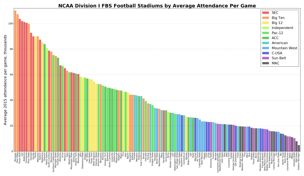
stadiums-fbs-conf-barAlso check out this follow-up analysis of stadium attendance.

The 2016 college football championship game between Clemson and Alabama was held at University of Phoenix Stadium, where the NFL’s Arizona Cardinals play. Interestingly, this NFL (ironic, given its name) stadium is considerably smaller than the home stadiums of either Clemson or Alabama. In fact every NFL stadium is considerably smaller than the largest college stadiums. Outside of North Korea, the 8 largest stadiums in the world are college football stadiums, and the 15 largest college football stadiums are larger than any NFL stadium.

Americans are obsessed with college football, but how much is too much? Today most athletic departments are subsidized by their schools. Public universities increased their annual football spending by $1.8 billion between 2009-2013 while racking up huge debts to finance stadiums with little chance of profit. This interactive map shows each NCAA Division I college football team’s home stadium: collectively they seat 8.5 million people. Click any point for details about stadium capacity and year built:

Categories
Data

World Population Projections

Batman and Robin: By 2050, 70% of the world's population...The U.N. world population prospects data set depicts the U.N.’s projections for every country’s population, decade by decade through 2100. The 2015 revision was recently released, and I analyzed, visualized, and mapped the data (methodology and code described below).

The world population is expected to grow from about 7.3 billion people today to 11.2 billion in 2100. While the populations of Eastern Europe, Taiwan, and Japan are projected to decline significantly over the 21st century, the U.N. projects Africa’s population to grow by an incredible 3.2 billion people. This map depicts each country’s projected percentage change in population from 2015 to 2100:

UN world population projections data map: Africa, Asia, Australia, Europe, North America, South America

Categories
Data

The Landscape of U.S. Rents

Which U.S. cities are the most expensive for rental housing? Where are rents rising the fastest? The American Community Survey (ACS) recently released its latest batch of 1-year data and I analyzed, mapped, and visualized it. My methodology is below, and my code and data are in this GitHub repo.

This interactive map shows median rents across the U.S. for every metro/micropolitan area. Click any one for details on population, rent, and change over time. Click “switch” to re-draw the map to visualize how median rents have risen since 2010:

Categories
Data

Exporting Python Data to GeoJSON

I like to do my data wrangling and analysis work in Python, using the pandas library. I also use Python for much of my data visualization and simple mapping. But for interactive web maps, I usually use Leaflet. There isn’t dead-simple way to dump a pandas DataFrame with geographic data to something you can load with Leaflet. You could use GeoPandas to convert your DataFrame then dump it to GeoJSON, but that isn’t a very lightweight solution.

So, I wrote a simple reusable function to export any pandas DataFrame to GeoJSON:

Categories
Data

Animated 3-D Plots in Python

Download/cite the paper here!

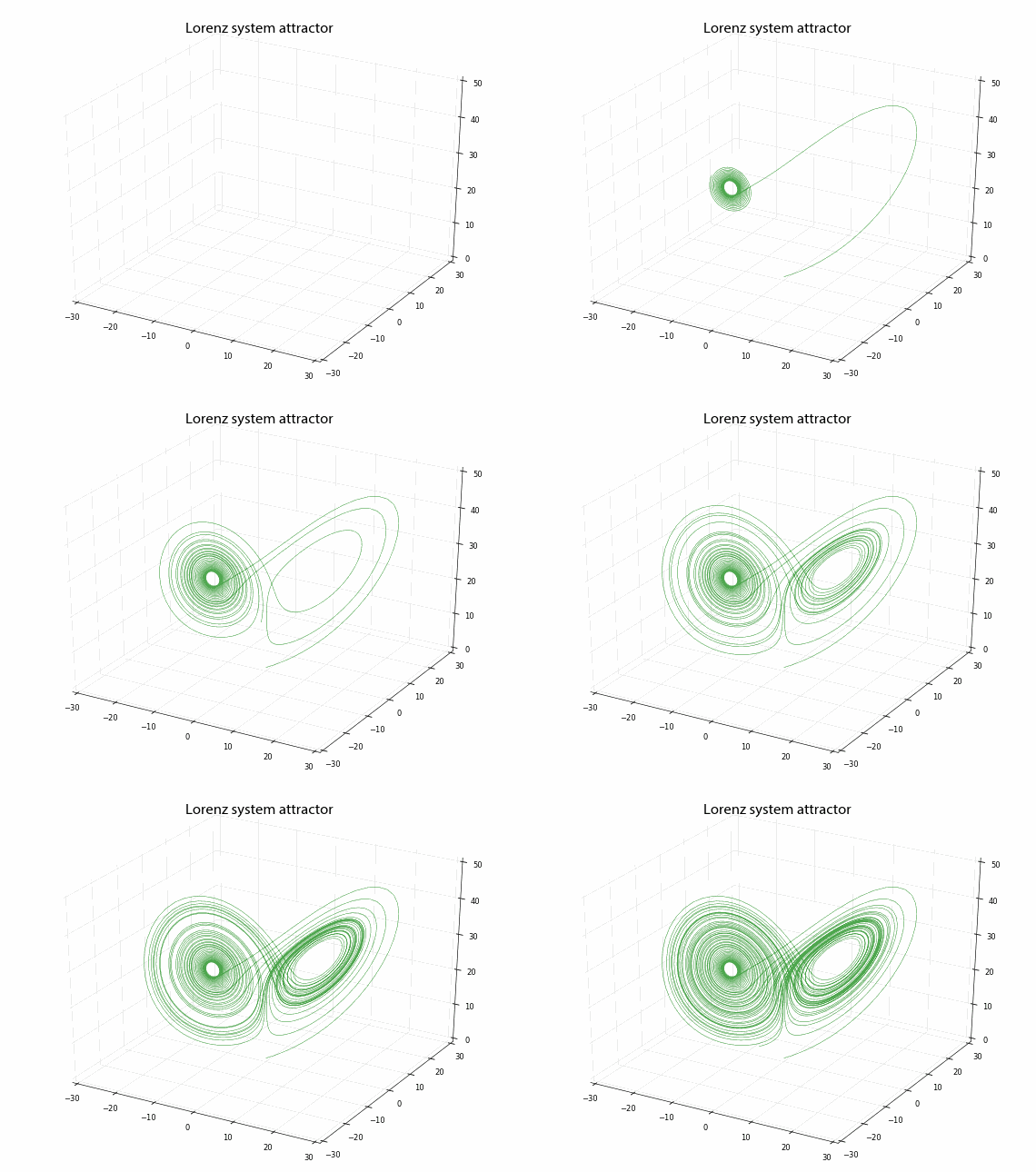
In a previous post, I discussed chaos, fractals, and strange attractors. I also showed how to visualize them with static 3-D plots. Here, I’ll demonstrate how to create these animated visualizations using Python and matplotlib. All of my source code is available in this GitHub repo. By the end, we’ll produce animated data visualizations like this, in pure Python:

Animated 3-D Poincare plot of the logistic map's chaotic regime - this is time series data embedded in three dimensional state space