Categories
Tech

Describing Cities with Computer Vision

What does artificial intelligence see when it looks at your city? I recently created a Twitter bot in Python called CityDescriber that takes popular photos of cities from Reddit and describes them using Microsoft’s computer vision AI. The bot typically does pretty well with straightforward images of city skylines and street scenes:

Some are even kind of wryly poetic, such as this description of Los Angeles:

Categories
Planning

Isochrone Maps with OSMnx + Python

Check out the journal article about OSMnx.

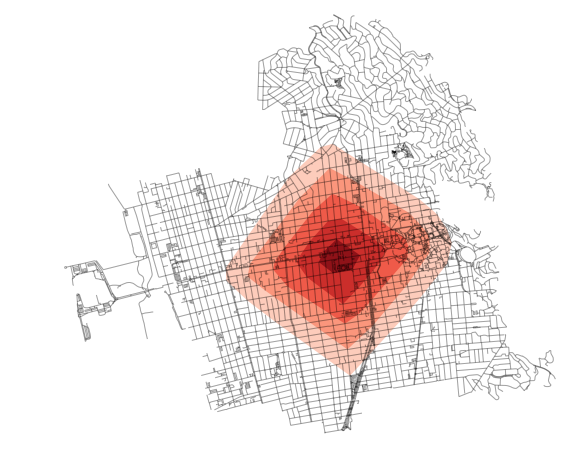
How far can you travel on foot in 15 minutes? Urban planners use isochrone maps to show spatial horizons (i.e., isolines) that are equal in time. Isochrones depict areas according to how long it takes to arrive there from some point. These visualizations are particularly useful in transportation planning as they reveal what places are accessible within a set of time horizons.

We can create isochrone maps for anywhere in the world automatically with Python and its OSMnx package:

OSMnx map of isochrone isolines in Berkeley California's street network

Categories
Planning

Craft Beer, Urban Planning, and Gentrification

I co-authored a chapter in the new book Untapped: Exploring the Cultural Dimensions of Craft Beer with the estimable Jesus Barajas and Julie Wartell. Our chapter is titled “Neighborhood Change, One Pint at a Time” and it explores the relationship between craft breweries, urban planning and policy, and gentrification.

We found that many cities have changed their zoning codes recently (and even offer subsidies) to make it easier to establish craft breweries and brewpubs, with the goal of economic development. There’s a strong narrative (and anecdotal evidence) of craft breweries “revitalizing” neglected neighborhoods. New breweries often seek inexpensive industrial spaces in close proximity to urban centers and residential districts. In turn, they serve as anchor institutions that appeal to whiter, wealthier, and more educated demographic groups. Many craft brewers explicitly see themselves as agents of neighborhood revitalization and “committed urbanists.” The brewers we interviewed uniformly stated that neighborhood character was an important or even primary reason for their location choice, and many referred to themselves as pioneers and catalysts in neglected historic neighborhoods.

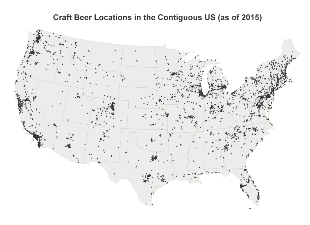
Locations of craft breweries and brew pubs across the United States. California, Colorado, Oregon, Washington, Michigan have the most craft beer locations.

Categories
Data

OSMnx and Street Network Elevation Data

Check out the journal article about OSMnx.

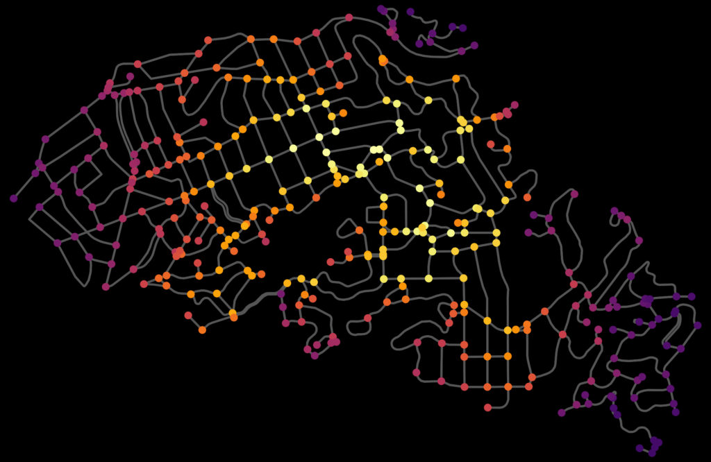
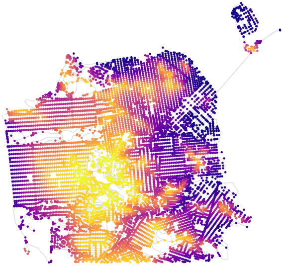
OSMnx can now download street network elevation data for anywhere in the world. In one line of code it downloads the elevation in meters of each network node, and in one more line of code it can calculate every street (i.e., edge) grade. Here is the complete street network of San Francisco, California, with nodes colored according to their elevation:

OSMnx street network elevation data for San Francisco, California to calculate street grade and steepness

Categories
Planning

Urban Form Analysis with OpenStreetMap Data

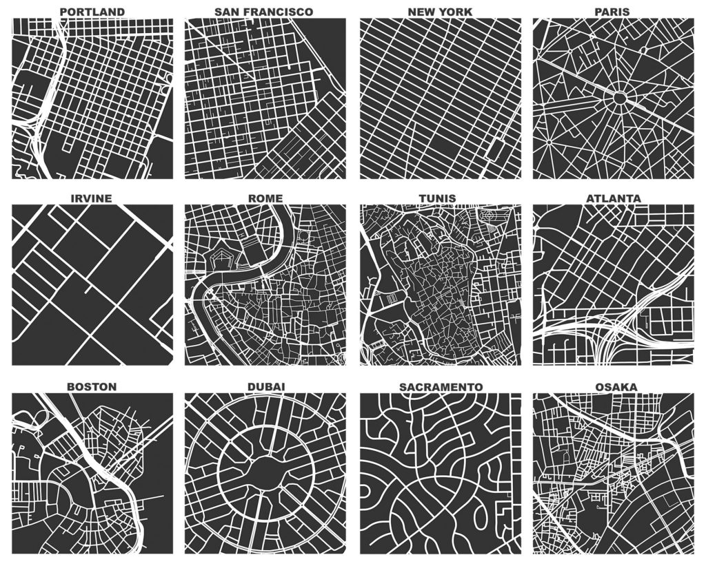
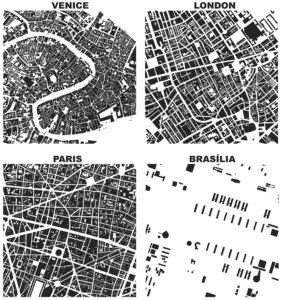
Figure-ground diagrams of urban form and building footprints in London, Paris, Venice, and Brasilia depict modernism's inversion of traditional spatial orderCheck out the journal article about OSMnx. This is a summary of some of my recent research on making OpenStreetMap data analysis easy for urban planners. It was also published on the ACSP blog.

OpenStreetMap – a collaborative worldwide mapping project inspired by Wikipedia – has emerged in recent years as a major player both for mapping and acquiring urban spatial data. Though coverage varies somewhat worldwide, its data are of high quality and compare favorably to CIA World Factbook estimates and US Census TIGER/Line data. OpenStreetMap imported the TIGER/Line roads in 2007 and since then its community has made numerous corrections and improvements. In fact, many of these additions go beyond TIGER/Line’s scope, including for example passageways between buildings, footpaths through parks, bike routes, and detailed feature attributes such as finer-grained street classifiers, speed limits, etc.

This presents a fantastic data source to help answer urban planning questions, but OpenStreetMap’s data has been somewhat difficult to work with due to its Byzantine query language and coarse-grained bulk extracts provided by third parties. As part of my dissertation, I developed a tool called OSMnx that allows researchers to download street networks and building footprints for any city name, address, or polygon in the world, then analyze and visualize them. OSMnx democratizes these data and methods to help technical and non-technical planners and researchers use OpenStreetMap data to study urban form, circulation networks, accessibility, and resilience.

Categories
Planning

OSMnx: Python for Street Networks

OSMnx: New York City urban street network visualized and analyzed with Python and OpenStreetMap dataIf you use OSMnx in your work, please cite the journal article.

OSMnx is a Python package to retrieve, model, analyze, and visualize street networks from OpenStreetMap. Users can download and model walkable, drivable, or bikeable urban networks with a single line of Python code, and then easily analyze and visualize them. You can just as easily download and work with amenities/points of interest, building footprints, elevation data, street bearings/orientations, and network routing. If you use OSMnx in your work, please download/cite the paper here.

In a single line of code, OSMnx lets you download, model, and visualize the street network for, say, Modena Italy:

import osmnx as ox
ox.plot_graph(ox.graph_from_place('Modena, Italy'))

OSMnx: Modena Italy networkx street network in Python from OpenStreetMap

Categories
Data

College Football Stadium Attendance

A few months ago, I wrote about the large investments that U.S. universities are making in their football stadiums. This also included a visual analysis of stadium capacity around the country. Outside of North Korea, the 8 largest stadiums in the world are college football stadiums, and the 15 largest college football stadiums are larger than any NFL stadium.

I received a few comments interested in further analysis of the actual attendance of games held in these stadiums. While capacity is interesting because it represents an expectation and sustained investment by the school, attendance represents the utilization of that investment. My stadium capacity data covered every NCAA division I football stadium in the U.S. as of the 2015 college football season. So, I downloaded the NCAA’s 2015 home game attendance data to compare. My data, code, and analysis are in this GitHub repo. First, I visualized the FBS attendance figures themselves:

NCAA college football teams' stadiums' 2015 average attendance per game

Categories
Planning

Craigslist and U.S. Rental Housing Markets

This is a summary of our JPER journal article (available here) about Craigslist rental listings’ insights into U.S. housing markets.

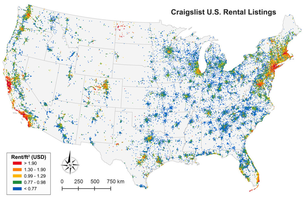
Small map of 1.5 million Craigslist rental listings in the contiguous U.S., divided into quintiles by each listing's rent per square footRentals make up a significant portion of the U.S. housing market, but much of this market activity is poorly understood due to its informal characteristics and historically minimal data trail. The UC Berkeley Urban Analytics Lab collected, validated, and analyzed 11 million Craigslist rental listings to discover fine-grained patterns across metropolitan housing markets in the United States. I’ll summarize our findings below and explain the methodology at the bottom.

But first, 4 key takeaways:

  1. There are incredibly few rental units below fair market rent in the hottest housing markets. Some metro areas like New York and Boston have only single-digit percentages of Craigslist rental listings below fair market rent. That’s really low.
  2. This problem doesn’t exclusively affect the poor: the share of its income that the typical household would spend on the typical rent in cities like New York and San Francisco exceeds the threshold for “rent burden.”
  3. Rents are more “compressed” in soft markets. For example, in Detroit, most of the listed units are concentrated within a very narrow band of rent/ft² values, but in San Francisco rents are much more dispersed. Housing vouchers may end up working very differently in high-cost vs low-cost areas.
  4. Craigslist listings correspond reasonably well with Dept of Housing and Urban Development (HUD) estimates, but provide up-to-date data including unit characteristics, from neighborhood to national scales. For example, we can see how rents are changing, neighborhood by neighborhood, in San Francisco in a given month.
Categories
Planning

How to Visualize Urban Accessibility and Walkability

Tools like WalkScore visualize how “walkable” a neighborhood is in terms of access to different amenities like parks, schools, or restaurants. It’s easy to create accessibility visualizations like these ad hoc with Python and its pandana library. Pandana (pandas for network analysis – developed by Fletcher Foti during his dissertation research here at UC Berkeley) performs fast accessibility queries over a network. I’ll demonstrate how to use it to visualize urban walkability. My code is in these IPython notebooks in this urban data science course GitHub repo.

First I give pandana a bounding box around Berkeley/Oakland in the East Bay of the San Francisco Bay Area. Then I load the street network and amenities from OpenStreetMap. In this example I’ll look at accessibility to restaurants, bars, and schools. But, you can create any basket of amenities that you are interested in – basically visualizing a personalized “AnythingScore” instead of a generic WalkScore for everyone. Finally I calculate and plot the distance from each node in the network to the nearest amenity:

Berkeley Oakland California street network walking accessibility and walkability

Categories
Academia

Urban Informatics and Visualization at UC Berkeley

The fall semester begins next week at UC Berkeley. For the third year in a row, Paul Waddell and I will be teaching CP255: Urban Informatics and Visualization, and this is my first year as co-lead instructor.

This masters-level course trains students to analyze urban data, develop indicators, conduct spatial analyses, create data visualizations, and build Paris open datainteractive web maps. To do this, we use the Python programming language, open source analysis and visualization tools, and public data.

This course is designed to provide future city planners with a toolkit of technical skills for quantitative problem solving. We don’t require any prior programming experience – we teach this from the ground up – but we do expect prior knowledge of basic statistics and GIS.

Update, September 2017: I am no longer a Berkeley GSI, but Paul’s class is ongoing. Check out his fantastic teaching materials in his GitHub repo. From my experiences here, I have developed a course series on urban data science with Python and Jupyter, available in this GitHub repo.