Categories
Academia

Urban Informatics and Visualization at UC Berkeley

The fall semester begins next week at UC Berkeley. For the third year in a row, Paul Waddell and I will be teaching CP255: Urban Informatics and Visualization, and this is my first year as co-lead instructor.

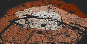
This masters-level course trains students to analyze urban data, develop indicators, conduct spatial analyses, create data visualizations, and build Paris open datainteractive web maps. To do this, we use the Python programming language, open source analysis and visualization tools, and public data.
This course is designed to provide future city planners with a toolkit of technical skills for quantitative problem solving. We don’t require any prior programming experience – we teach this from the ground up – but we do expect prior knowledge of basic statistics and GIS.

Update, September 2017: I am no longer a Berkeley GSI, but Paul’s class is ongoing. Check out his fantastic teaching materials in his GitHub repo. From my experiences here, I have developed a course series on urban data science with Python and Jupyter, available in this GitHub repo.

Categories
Data

Map Projections That Lie

How big is Greenland? It’s huge, right? At 836,109 square miles in size, Greenland is the largest island and the 12th largest country on Earth. With only 56,000 people living in that enormous area (80% of which is covered by the world’s only extant ice sheet outside of Antarctica), it is also the least densely populated country on Earth.

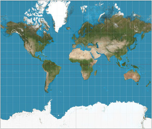
You can get a sense of how large Greenland is when you look at a map of the world:

world map mercator projection

It’s huge! Greenland is bigger than the entire continent of Africa! Or is it? The map above uses the common Mercator projection to project the 3-D surface of the Earth onto a 2-D surface suitable for a paper map or an image on your computer screen. But it’s not easy to project the curved surface of a sphere onto a rectangular plane. Compromises must be made. In the case of the Mercator projection, the compromise is that objects’ sizes become increasingly distorted the further they are from the equator. At the poles, the scale and distortion become infinite.

Categories
Planning

Visualizing Craigslist Rental Listings

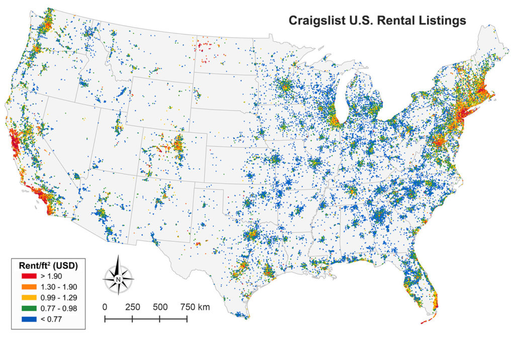
Our paper on collecting and analyzing U.S. housing rental markets through Craigslist rental listings has been accepted for publication by the Journal of Planning Education and Research. Check out the article here. This map of rental listings in the contiguous U.S. is divided into quintiles by rent per square foot:

Map of 1.5 million Craigslist rental listings in the contiguous U.S., divided into quintiles by each listing's rent per square foot
Map of 1.5 million Craigslist rental listings in the contiguous US, summer 2014

Categories
Data

Visualizing Summer Travels Part 6: Projecting Spatial Data with Python

This post is part of a series on visualizing data from my summer travels.

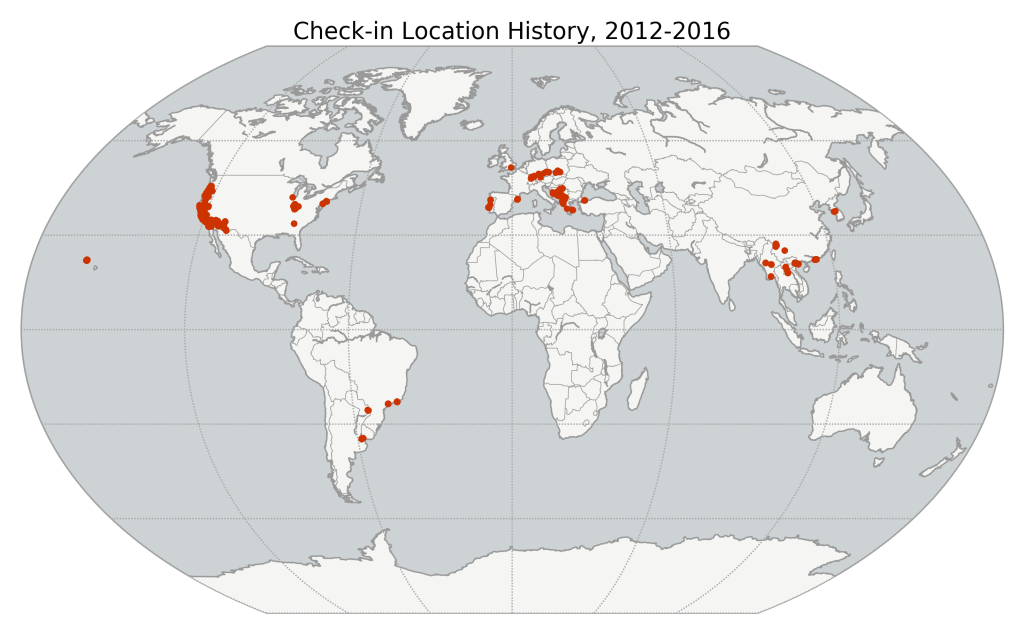
I’ve previously discussed visualizing the GPS location data from my summer travels with CartoDB, Leaflet, and Mapbox + Tilemill. I also visualized different aspects of this data set in Python, using the matplotlib plotting library. However, these spatial scatter plots used unprojected lat-long data which looked pretty distorted at European latitudes.

Today I will show how to convert this data into a projected coordinate reference system and plot it again using matplotlib. These projected maps will provide a much more accurate spatial representation of my spatial data and the geographic region. All of my code is available in this GitHub repo, particularly this notebook.

Categories
Data

Using geopandas on Windows

projected-shapefile-gps-coordinatesThis guide was written in 2014 and updated slightly in November 2020.

I recently went through the exercise of installing geopandas on Windows. Having learned several valuable lessons, I thought I’d share them with the world in case anyone else is trying to get this toolkit working in a Windows environment. It seems that pip installing geopandas usually works fine on Linux and Mac. However, several of its dependencies have C extensions that can cause compilation failures with pip on Windows. This guide gets around that issue.

Categories
Data

Visualizing Summer Travels Part 5: Python + Matplotlib

This post is part of a series on visualizing data from my summer travels.

I’ve previously discussed visualizing the GPS location data from my summer travels with CartoDB, Leaflet, and Mapbox + Tilemill. Today I will explore visualizing this data set in Python, using the matplotlib plotting library. All of my code is available in this GitHub repo, particularly this notebook.

Categories
Data

Visualizing Summer Travels Part 4: Mapbox + Tilemill

This post is part of a series on visualizing data from my summer travels.

I’ve previously discussed my goals in visualizing GPS data from my summer travels and explored visualizing the data set with CartoDB and with Leaflet. The full OpenPaths location data from my summer travels is available here and I discussed how I reverse-geocoded it here.

Mapbox is a major provider of online web mapping services such as tiled web maps, the Tilemill cartography IDE, and the mapbox.js javascript library. Today I’ll run through how to create an interactive data map in Tilemill’s design studio, export the map as a set of tiles, upload the tileset to Mapbox, and then use a javascript client to display the map on a web page. Our final result will look something like this:

Categories
Data

Visualizing Summer Travels Part 3: Leaflet

This post is part of a series on visualizing data from my summer travels.

I’ve previously discussed my goals in visualizing GPS data from my summer travels and explored visualizing the data set with CartoDB. The full OpenPaths location data from my summer travels is available here and I discussed how I reverse-geocoded it here.

Lastly, I reduced the size of this spatial data set so Leaflet can render it more quickly on low-power mobile devices. I discussed why this is important and how to do it with the DBSCAN clustering algorithm and also with the Douglas-Peucker algorithm. The final data set I’ll be working with is available here.

Categories
Data

Reducing Spatial Data Set Size with Douglas-Peucker

In a previous post I discussed how to reduce the size of a spatial data set by clustering. Too many data points in a visualization can overwhelm the user and bog down on-the-fly client-side map rendering (for example, with a javascript tool like Leaflet). So, I used the DBSCAN clustering algorithm to reduce my data set from 1,759 rows to 158 spatially-representative points. This series of posts discusses this data set in depth.

Categories
Data

Clustering to Reduce Spatial Data Set Size

Read/cite the paper here.

In this tutorial, I demonstrate how to reduce the size of a spatial data set of GPS latitude-longitude coordinates using Python and its scikit-learn implementation of the DBSCAN clustering algorithm. All my code is in this IPython notebook in this GitHub repo, where you can also find the data.

Traditionally it’s been a problem that researchers did not have enough spatial data to answer useful questions or build compelling visualizations. Today, however, the problem is often that we have too much data. Too many scattered points on a map can overwhelm a viewer looking for a simple narrative. Furthermore, rendering a JavaScript web map (like Leaflet) with millions of data points on a mobile device can swamp the processor and be unresponsive.