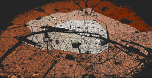
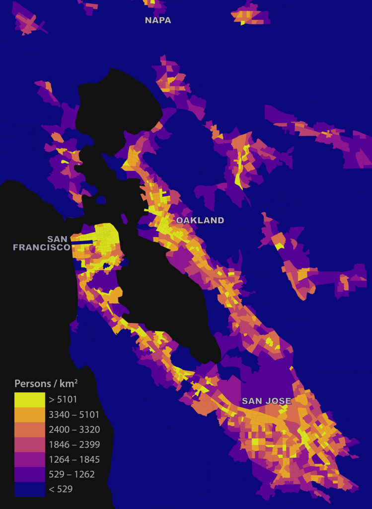
My short article “Estimating Local Daytime Population Density from Census and Payroll Data” is out now in the latest issue of Regional Studies, Regional Science. I discuss a method for estimating local daytime density across a metropolitan area using US Census and LEHD LODES data, and dig into some limitations and biases. I look at the San Francisco Bay Area as a case study:
Tag: leaflet
Estimating Daytime Population Density
Check out the journal article about this project.
I was recently asked: “how might someone figure out the local daytime population density across the Bay Area from public data?” My answer, in short, was that you really couldn’t accurately. But you could at least produce a coarse, biased estimate. Here’s how.
I examined the Bay Area’s tract-level daytime population density using three input data products: the 2010 TIGER/Line census tracts shapefile with DP1 attributes, the 2010 California LEHD LODES data, and the census bureau’s 2010 US states shapefile. I preferred the 2010 census demographic data to (more recent) ACS data because the ACS tract-level variables are five-year rolling averages. Given this, I preferred not to compare 2014 LODES data to 2010-2014 ACS data as the Bay Area experienced substantial housing, economic, and demographic upheaval over this interval – patterns obscured in the ACS rolling average. To avoid inconsistent comparison, I opted for more stale – but more accurate and comparable – data.
Mapping Everywhere I’ve Ever Been in My Life
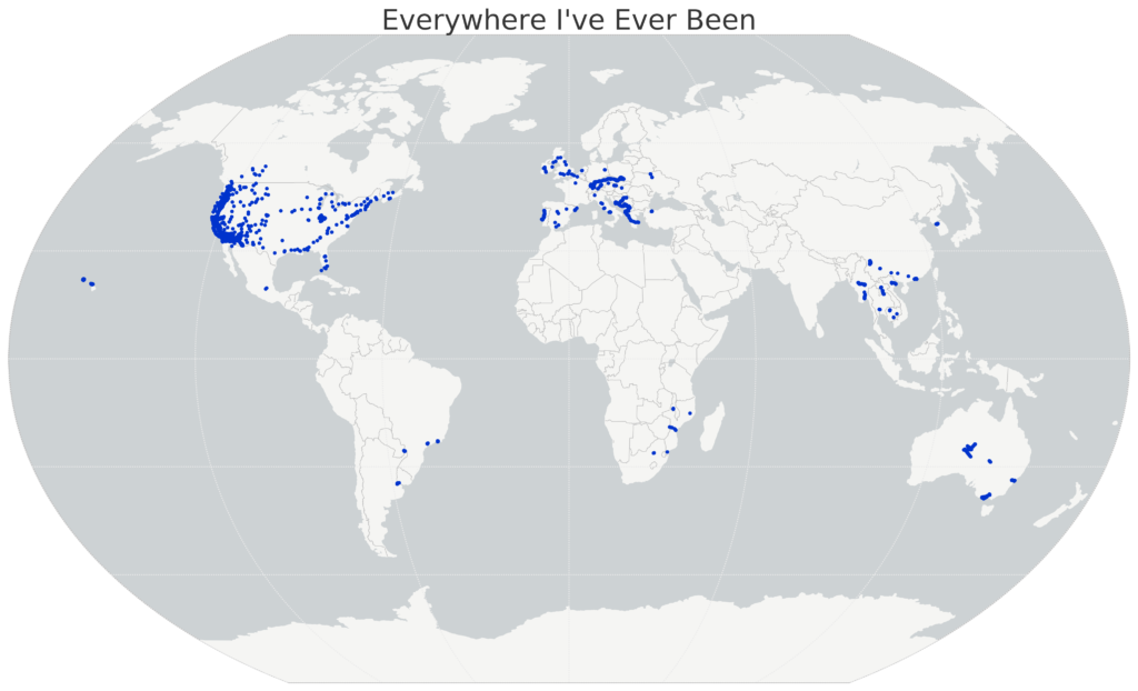
I recently wrote about visualizing my Foursquare check-in history and mapping my Google location history, and it inspired me to mount a more substantial project: mapping everywhere I’ve ever been in my life (!!). I’ve got 4 years of Foursquare check-ins and Google location history data. For everything pre-smart phone, I typed up a simple spreadsheet of places I’d visited in the past and then geocoded it with the Google Maps API. All my Python and Leaflet code is available in this GitHub repo and is easy to re-purpose to visualize your own location history.
I’ll show the maps first, then run through the process I followed, below. First off, I used Python and matplotlib basemap to create this map of everywhere I’ve ever been:
The Landscape of U.S. Rents
Which U.S. cities are the most expensive for rental housing? Where are rents rising the fastest? The American Community Survey (ACS) recently released its latest batch of 1-year data and I analyzed, mapped, and visualized it. My methodology is below, and my code and data are in this GitHub repo.
This interactive map shows median rents across the U.S. for every metro/micropolitan area. Click any one for details on population, rent, and change over time. Click “switch” to re-draw the map to visualize how median rents have risen since 2010:
Exporting Python Data to GeoJSON
I like to do my data wrangling and analysis work in Python, using the pandas library. I also use Python for much of my data visualization and simple mapping. But for interactive web maps, I usually use Leaflet. There isn’t dead-simple way to dump a pandas DataFrame with geographic data to something you can load with Leaflet. You could use GeoPandas to convert your DataFrame then dump it to GeoJSON, but that isn’t a very lightweight solution.
So, I wrote a simple reusable function to export any pandas DataFrame to GeoJSON:
The fall semester begins next week at UC Berkeley. For the third year in a row, Paul Waddell and I will be teaching CP255: Urban Informatics and Visualization, and this is my first year as co-lead instructor.
This masters-level course trains students to analyze urban data, develop indicators, conduct spatial analyses, create data visualizations, and build  interactive web maps. To do this, we use the Python programming language, open source analysis and visualization tools, and public data.
This course is designed to provide future city planners with a toolkit of technical skills for quantitative problem solving. We don’t require any prior programming experience – we teach this from the ground up – but we do expect prior knowledge of basic statistics and GIS.
Update, September 2017: I am no longer a Berkeley GSI, but Paul’s class is ongoing. Check out his fantastic teaching materials in his GitHub repo. From my experiences here, I have developed a course series on urban data science with Python and Jupyter, available in this GitHub repo.
Visualizing Summer Travels
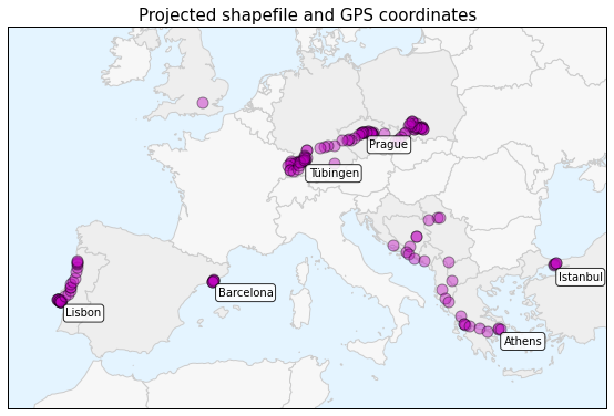
 This is a series of posts about visualizing spatial data. I spent a couple of months traveling in Europe this summer and collected GPS location data throughout the trip with the OpenPaths app. I explored different web mapping technologies such as CartoDB, Leaflet, Mapbox, and Tilemill to plot my travels. I also used Python and matplotlib to run some descriptive statistics and visualize other aspects of my trip.
Here is the series of posts:
- Part 1: introduction and data collection with OpenPaths
- Part 2: interactive web maps with CartoDB
- Part 3: interactive javascript web maps with Leaflet
- Part 4: interactive tiled web maps with Mapbox and Tilemill
- Part 5: visualizing data with Python and matplotlib
- Part 6: projecting spatial data and making beautiful maps with Python
My Python code is available in this GitHub repo. I also did some more involved work under the hood to prep the data and support these visualizations. For example, in the following posts I reverse-geocoded the spatial data set and reduced its size with clustering algorithms and the Douglas-Peucker algorithm:
This post is part of a series on visualizing data from my summer travels.
I’ve previously discussed my goals in visualizing GPS data from my summer travels and explored visualizing the data set with CartoDB and with Leaflet. The full OpenPaths location data from my summer travels is available here and I discussed how I reverse-geocoded it here.
Mapbox is a major provider of online web mapping services such as tiled web maps, the Tilemill cartography IDE, and the mapbox.js javascript library. Today I’ll run through how to create an interactive data map in Tilemill’s design studio, export the map as a set of tiles, upload the tileset to Mapbox, and then use a javascript client to display the map on a web page. Our final result will look something like this:
Visualizing Summer Travels Part 3: Leaflet
This post is part of a series on visualizing data from my summer travels.
I’ve previously discussed my goals in visualizing GPS data from my summer travels and explored visualizing the data set with CartoDB. The full OpenPaths location data from my summer travels is available here and I discussed how I reverse-geocoded it here.
Lastly, I reduced the size of this spatial data set so Leaflet can render it more quickly on low-power mobile devices. I discussed why this is important and how to do it with the DBSCAN clustering algorithm and also with the Douglas-Peucker algorithm. The final data set I’ll be working with is available here.


