 This is a guide for absolute beginners to get started using Python. Since releasing OSMnx a few weeks ago, I’ve received a lot of comments from people who would love to try it out, but don’t know where to begin with Python. I’ll demonstrate how to get Python up and running on your system, how to install packages, and how to run code.
Tag: geopandas
Square-Mile Street Network Visualization
Check out the journal article about OSMnx. All figures in this article come from this journal article, which you can read/cite for more.
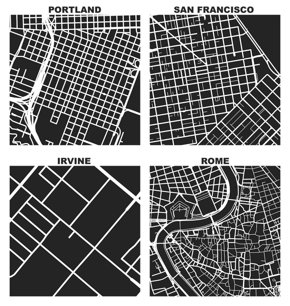
The heart of Allan Jacobs’ classic book on street-level urban form and design, Great Streets, features dozens of hand-drawn figure-ground diagrams in the style of Nolli maps. Each depicts one square mile of a city’s street network. Drawing these cities at the same scale provides a revealing spatial objectivity in visually comparing their street networks and urban forms.
We can recreate these visualizations automatically with Python and the OSMnx package, which I developed as part of my dissertation. With OSMnx we can download a street network from OpenStreetMap for anywhere in the world in just one line of code. Here are the square-mile diagrams of Portland, San Francisco, Irvine, and Rome created and plotted automatically by OSMnx:
OSMnx: Python for Street Networks
 If you use OSMnx in your work, please cite the journal article.
OSMnx is a Python package to retrieve, model, analyze, and visualize street networks from OpenStreetMap. Users can download and model walkable, drivable, or bikeable urban networks with a single line of Python code, and then easily analyze and visualize them. You can just as easily download and work with amenities/points of interest, building footprints, elevation data, street bearings/orientations, and network routing. If you use OSMnx in your work, please download/cite the paper here.
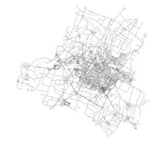
In a single line of code, OSMnx lets you download, model, and visualize the street network for, say, Modena Italy:
import osmnx as ox
ox.plot_graph(ox.graph_from_place('Modena, Italy'))
R-tree Spatial Indexing with Python
 Check out the journal article about OSMnx, which implements this technique.
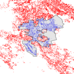
A spatial index such as R-tree can drastically speed up GIS operations like intersections and joins. Spatial indices are key features of spatial databases like PostGIS, but they’re also available for DIY coding in Python. I’ll introduce how R-trees work and how to use them in Python and its geopandas library. All of my code is in this notebook in this urban data science GitHub repo.
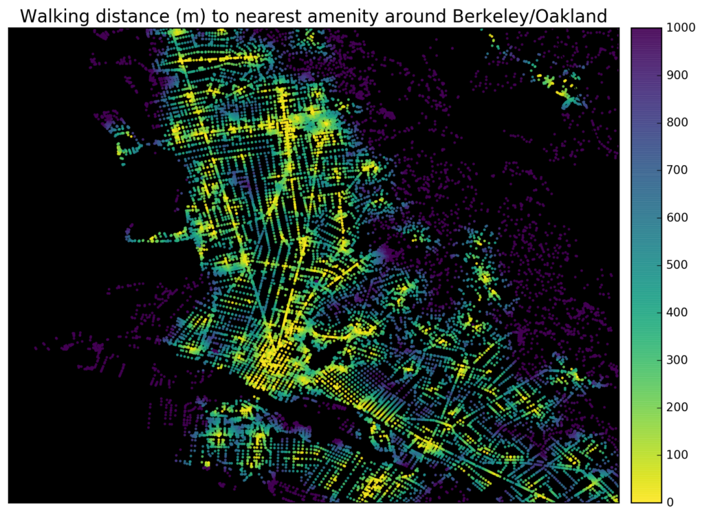
Tools like WalkScore visualize how “walkable” a neighborhood is in terms of access to different amenities like parks, schools, or restaurants. It’s easy to create accessibility visualizations like these ad hoc with Python and its pandana library. Pandana (pandas for network analysis – developed by Fletcher Foti during his dissertation research here at UC Berkeley) performs fast accessibility queries over a network. I’ll demonstrate how to use it to visualize urban walkability. My code is in these IPython notebooks in this urban data science course GitHub repo.
First I give pandana a bounding box around Berkeley/Oakland in the East Bay of the San Francisco Bay Area. Then I load the street network and amenities from OpenStreetMap. In this example I’ll look at accessibility to restaurants, bars, and schools. But, you can create any basket of amenities that you are interested in – basically visualizing a personalized “AnythingScore” instead of a generic WalkScore for everyone. Finally I calculate and plot the distance from each node in the network to the nearest amenity:
Scientific Python for Raspberry Pi
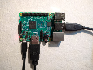 A guide to setting up the Python scientific stack, well-suited for geospatial analysis, on a Raspberry Pi 3. The whole process takes just a few minutes.
The Raspberry Pi 3 was announced two weeks ago and presents a substantial step up in computational power over its predecessors. It can serve as a functional Wi-Fi connected Linux desktop computer, albeit underpowered. However it’s perfectly capable of running the Python scientific computing stack including Jupyter, pandas, matplotlib, scipy, scikit-learn, and OSMnx.
Despite (or because of?) its low power, it’s ideal for low-overhead and repetitive tasks that researchers and engineers often face, including geocoding, web scraping, scheduled API calls, or recurring statistical or spatial analyses (with small-ish data sets). It’s also a great way to set up a simple server or experiment with Linux. This guide is aimed at newcomers to the world of Raspberry Pi and Linux, but who have an interest in setting up a Python environment on these $35 credit card sized computers. We’ll run through everything you need to do to get started (if your Pi is already up and running, skip steps 1 and 2).
The fall semester begins next week at UC Berkeley. For the third year in a row, Paul Waddell and I will be teaching CP255: Urban Informatics and Visualization, and this is my first year as co-lead instructor.
This masters-level course trains students to analyze urban data, develop indicators, conduct spatial analyses, create data visualizations, and build 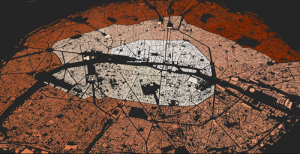 interactive web maps. To do this, we use the Python programming language, open source analysis and visualization tools, and public data.
This course is designed to provide future city planners with a toolkit of technical skills for quantitative problem solving. We don’t require any prior programming experience – we teach this from the ground up – but we do expect prior knowledge of basic statistics and GIS.
Update, September 2017: I am no longer a Berkeley GSI, but Paul’s class is ongoing. Check out his fantastic teaching materials in his GitHub repo. From my experiences here, I have developed a course series on urban data science with Python and Jupyter, available in this GitHub repo.
This post is part of a series on visualizing data from my summer travels.
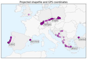
I’ve previously discussed visualizing the GPS location data from my summer travels with CartoDB, Leaflet, and Mapbox + Tilemill. I also visualized different aspects of this data set in Python, using the matplotlib plotting library. However, these spatial scatter plots used unprojected lat-long data which looked pretty distorted at European latitudes.
Today I will show how to convert this data into a projected coordinate reference system and plot it again using matplotlib. These projected maps will provide a much more accurate spatial representation of my spatial data and the geographic region. All of my code is available in this GitHub repo, particularly this notebook.
Using geopandas on Windows
 This guide was written in 2014 and updated slightly in November 2020.
I recently went through the exercise of installing geopandas on Windows. Having learned several valuable lessons, I thought I’d share them with the world in case anyone else is trying to get this toolkit working in a Windows environment. It seems that pip installing geopandas usually works fine on Linux and Mac. However, several of its dependencies have C extensions that can cause compilation failures with pip on Windows. This guide gets around that issue.
This post is part of a series on visualizing data from my summer travels.
I’ve previously discussed visualizing the GPS location data from my summer travels with CartoDB, Leaflet, and Mapbox + Tilemill. Today I will explore visualizing this data set in Python, using the matplotlib plotting library. All of my code is available in this GitHub repo, particularly this notebook.
