Categories
Data

Network-Based Spatial Clustering

Jobs, establishments, and other amenities tend to agglomerate and cluster in cities. To identify these agglomerations and explore their causes and effects, we often use spatial clustering algorithms. However, urban space cannot simply be traversed as-the-crow-flies: human mobility is network-constrained. To properly model agglomeration along a city’s street network, we must use network-based spatial clustering.

The code for this example can be found in this GitHub repo. We use OSMnx to download and assemble the street network for a small city. We also have a dataframe of points representing the locations of (fake) restaurants in this city. Our restaurants cluster into distinct districts, as many establishments and industries tend to do:
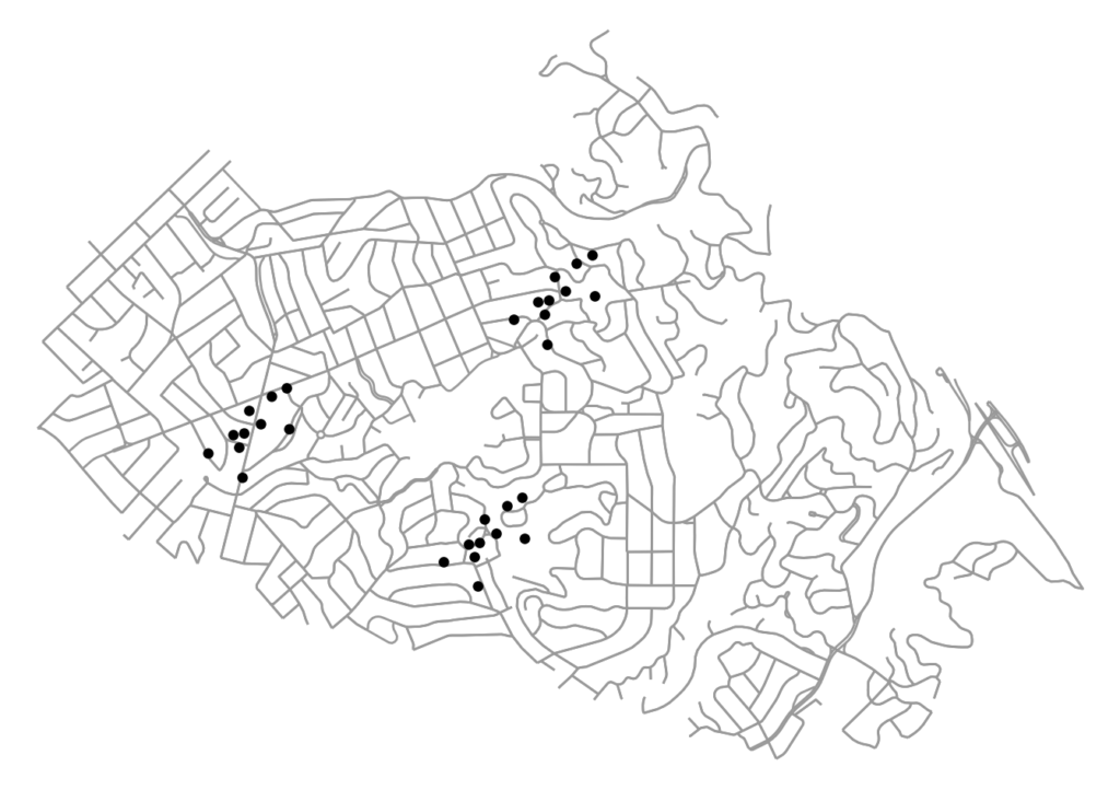
firm locations on the street network to be clustered: python, osmnx, matplotlib, scipy, scikit-learn, geopandas

Categories
Data

Mapping Everywhere I’ve Ever Been in My Life

I recently wrote about visualizing my Foursquare check-in history and mapping my Google location history, and it inspired me to mount a more substantial project: mapping everywhere I’ve ever been in my life (!!). I’ve got 4 years of Foursquare check-ins and Google location history data. For everything pre-smart phone, I typed up a simple spreadsheet of places I’d visited in the past and then geocoded it with the Google Maps API. All my Python and Leaflet code is available in this GitHub repo and is easy to re-purpose to visualize your own location history.

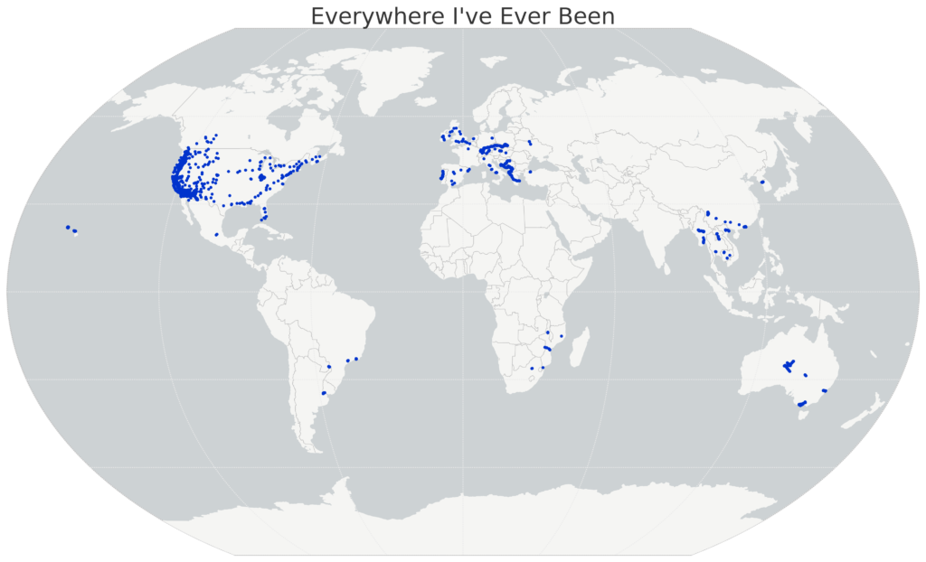
I’ll show the maps first, then run through the process I followed, below. First off, I used Python and matplotlib basemap to create this map of everywhere I’ve ever been:

Location History World Map, data from Foursquare and Google, made with Python matplotlib basemap

Categories
Data

Visualizing Summer Travels Part 5: Python + Matplotlib

This post is part of a series on visualizing data from my summer travels.

I’ve previously discussed visualizing the GPS location data from my summer travels with CartoDB, Leaflet, and Mapbox + Tilemill. Today I will explore visualizing this data set in Python, using the matplotlib plotting library. All of my code is available in this GitHub repo, particularly this notebook.

Categories
Data

Visualizing Summer Travels Part 3: Leaflet

This post is part of a series on visualizing data from my summer travels.

I’ve previously discussed my goals in visualizing GPS data from my summer travels and explored visualizing the data set with CartoDB. The full OpenPaths location data from my summer travels is available here and I discussed how I reverse-geocoded it here.

Lastly, I reduced the size of this spatial data set so Leaflet can render it more quickly on low-power mobile devices. I discussed why this is important and how to do it with the DBSCAN clustering algorithm and also with the Douglas-Peucker algorithm. The final data set I’ll be working with is available here.

Categories
Data

Clustering to Reduce Spatial Data Set Size

Read/cite the paper here.

In this tutorial, I demonstrate how to reduce the size of a spatial data set of GPS latitude-longitude coordinates using Python and its scikit-learn implementation of the DBSCAN clustering algorithm. All my code is in this IPython notebook in this GitHub repo, where you can also find the data.

Traditionally it’s been a problem that researchers did not have enough spatial data to answer useful questions or build compelling visualizations. Today, however, the problem is often that we have too much data. Too many scattered points on a map can overwhelm a viewer looking for a simple narrative. Furthermore, rendering a JavaScript web map (like Leaflet) with millions of data points on a mobile device can swamp the processor and be unresponsive.