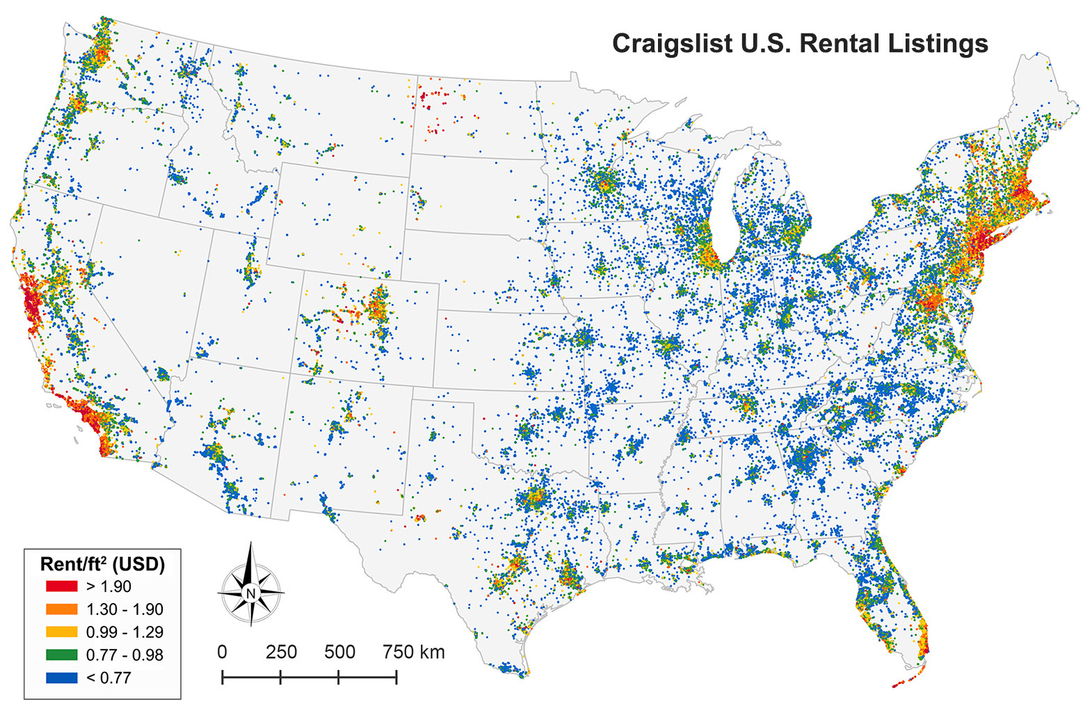
Categories
Data

Exporting Python Data to GeoJSON

I like to do my data wrangling and analysis work in Python, using the pandas library. I also use Python for much of my data visualization and simple mapping. But for interactive web maps, I usually use Leaflet. There isn’t dead-simple way to dump a pandas DataFrame with geographic data to something you can load with Leaflet. You could use GeoPandas to convert your DataFrame then dump it to GeoJSON, but that isn’t a very lightweight solution.

So, I wrote a simple reusable function to export any pandas DataFrame to GeoJSON:

Categories
Academia

Urban Informatics and Visualization at UC Berkeley

The fall semester begins next week at UC Berkeley. For the third year in a row, Paul Waddell and I will be teaching CP255: Urban Informatics and Visualization, and this is my first year as co-lead instructor.

This masters-level course trains students to analyze urban data, develop indicators, conduct spatial analyses, create data visualizations, and build Paris open datainteractive web maps. To do this, we use the Python programming language, open source analysis and visualization tools, and public data.

This course is designed to provide future city planners with a toolkit of technical skills for quantitative problem solving. We don’t require any prior programming experience – we teach this from the ground up – but we do expect prior knowledge of basic statistics and GIS.

Update, September 2017: I am no longer a Berkeley GSI, but Paul’s class is ongoing. Check out his fantastic teaching materials in his GitHub repo. From my experiences here, I have developed a course series on urban data science with Python and Jupyter, available in this GitHub repo.

Categories
Data

Animated 3-D Plots in Python

Download/cite the paper here!

In a previous post, I discussed chaos, fractals, and strange attractors. I also showed how to visualize them with static 3-D plots. Here, I’ll demonstrate how to create these animated visualizations using Python and matplotlib. All of my source code is available in this GitHub repo. By the end, we’ll produce animated data visualizations like this, in pure Python:

Animated 3-D Poincare plot of the logistic map's chaotic regime - this is time series data embedded in three dimensional state space

Categories
Data

Visualizing Chaos and Randomness

3-D Poincare plot of the logistic map's chaotic regime - this is time series data embedded in three dimensional state space

Download/cite the paper here!

In a previous post, I discussed chaos theory, fractals, and strange attractors – and their implications for knowledge and prediction of systems. I also briefly touched on how phase diagrams (or Poincaré plots) can help us visualize system attractors and differentiate chaotic behavior from true randomness.

In this post (adapted from this paper), I provide more detail on constructing and interpreting phase diagrams. These methods are particularly useful for discovering deterministic chaos in otherwise random-appearing time series data, as they visualize strange attractors. I’m using Python for all of these visualizations and the source code is available in this GitHub repo.

Categories
Data

Chaos Theory and the Logistic Map

Logistic map bifurcation diagram showing the period-doubling path to chaos
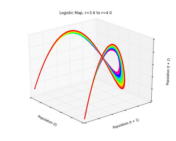
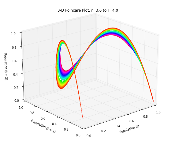
Using Python to visualize chaos, fractals, and self-similarity to better understand the limits of knowledge and prediction. Download/cite the article here and try pynamical yourself.

Chaos theory is a branch of mathematics that deals with nonlinear dynamical systems. A system is just a set of interacting components that form a larger whole. Nonlinear means that due to feedback or multiplicative effects between the components, the whole becomes something greater than just adding up the individual parts. Lastly, dynamical means the system changes over time based on its current state. In the following piece (adapted from this article), I break down some of this jargon, visualize interesting characteristics of chaos, and discuss its implications for knowledge and prediction.

Chaotic systems are a simple sub-type of nonlinear dynamical systems. They may contain very few interacting parts and these may follow very simple rules, but these systems all have a very sensitive dependence on their initial conditions. Despite their deterministic simplicity, over time these systems can produce totally unpredictable and wildly divergent (aka, chaotic) behavior. Edward Lorenz, the father of chaos theory, described chaos as “when the present determines the future, but the approximate present does not approximately determine the future.”

Categories
Planning

Visualizing Craigslist Rental Listings

Our paper on collecting and analyzing U.S. housing rental markets through Craigslist rental listings has been accepted for publication by the Journal of Planning Education and Research. Check out the article here. This map of rental listings in the contiguous U.S. is divided into quintiles by rent per square foot:

Map of 1.5 million Craigslist rental listings in the contiguous U.S., divided into quintiles by each listing's rent per square foot
Map of 1.5 million Craigslist rental listings in the contiguous US, summer 2014

Categories
Data

Visualizing Summer Travels Part 6: Projecting Spatial Data with Python

This post is part of a series on visualizing data from my summer travels.

I’ve previously discussed visualizing the GPS location data from my summer travels with CartoDB, Leaflet, and Mapbox + Tilemill. I also visualized different aspects of this data set in Python, using the matplotlib plotting library. However, these spatial scatter plots used unprojected lat-long data which looked pretty distorted at European latitudes.

Today I will show how to convert this data into a projected coordinate reference system and plot it again using matplotlib. These projected maps will provide a much more accurate spatial representation of my spatial data and the geographic region. All of my code is available in this GitHub repo, particularly this notebook.

Categories
Data

Using geopandas on Windows

projected-shapefile-gps-coordinatesThis guide was written in 2014 and updated slightly in November 2020.

I recently went through the exercise of installing geopandas on Windows. Having learned several valuable lessons, I thought I’d share them with the world in case anyone else is trying to get this toolkit working in a Windows environment. It seems that pip installing geopandas usually works fine on Linux and Mac. However, several of its dependencies have C extensions that can cause compilation failures with pip on Windows. This guide gets around that issue.

Categories
Data

Visualizing Summer Travels

projected-shapefile-gps-coordinatesThis is a series of posts about visualizing spatial data. I spent a couple of months traveling in Europe this summer and collected GPS location data throughout the trip with the OpenPaths app. I explored different web mapping technologies such as CartoDB, Leaflet, Mapbox, and Tilemill to plot my travels. I also used Python and matplotlib to run some descriptive statistics and visualize other aspects of my trip.

Here is the series of posts:

My Python code is available in this GitHub repo. I also did some more involved work under the hood to prep the data and support these visualizations. For example, in the following posts I reverse-geocoded the spatial data set and reduced its size with clustering algorithms and the Douglas-Peucker algorithm:

Categories
Data

Visualizing Summer Travels Part 5: Python + Matplotlib

This post is part of a series on visualizing data from my summer travels.

I’ve previously discussed visualizing the GPS location data from my summer travels with CartoDB, Leaflet, and Mapbox + Tilemill. Today I will explore visualizing this data set in Python, using the matplotlib plotting library. All of my code is available in this GitHub repo, particularly this notebook.