Categories
Planning

Street Network Design and GHG Emissions

I have a new article out in Transportation Research Part D that estimates relationships between street network characteristics and transport CO2 emissions across every urban area in the world and investigates whether they are the same across development levels and design paradigms.

The relationships between street network design and transport emissions in the US, Europe, and China are well-studied. But not so in many of the most rapidly developing parts of the world. Practitioners lack a strong local evidence base for local evidence-informed planning.
Categories
Urban

Urban Street Network Orientation

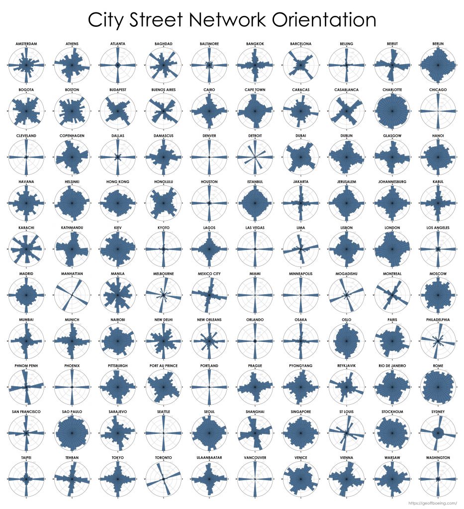
My new article, Urban Spatial Order: Street Network Orientation, Configuration, and Entropy, has just been published in one of my favorite journals: Applied Network Science (download free PDF). This study explores the spatial signatures of urban evolution and central planning. It examines street network orientation, connectivity, granularity, and entropy in 100 cities around the world using OpenStreetMap data and OSMnx for modeling and visualization:

City street network grid orientations, order, disorder, entropy, rose plot, polar histogram made with Python, OSMnx, OpenStreetMap, matplotlib.

So, who’s got a grid and who doesn’t? Each of the cities above is represented by a polar histogram (aka rose diagram) depicting how its streets orient. Each bar’s direction represents the compass bearings of the streets (in that histogram bin) and its length represents the relative frequency of streets with those bearings. The cities above are in alphabetical order. Here they are again, re-sorted from most-ordered/gridded city (Chicago) to most-disordered (Charlotte):

Categories
Data

New Article in Frontiers in Neurology

I recently teamed up with an international group of public health researchers and spatial analysts to co-author an article, An Introduction to Software Tools, Data, and Services for Geospatial Analysis of Stroke Services, that has been accepted for publication at Frontiers in Neurology (download free PDF).

Hospital catchment basin for stroke services. Spatial analysis in python, geopandas, osmnx.

Categories
Data

Network-Based Spatial Clustering

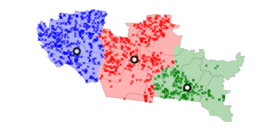
Jobs, establishments, and other amenities tend to agglomerate and cluster in cities. To identify these agglomerations and explore their causes and effects, we often use spatial clustering algorithms. However, urban space cannot simply be traversed as-the-crow-flies: human mobility is network-constrained. To properly model agglomeration along a city’s street network, we must use network-based spatial clustering.

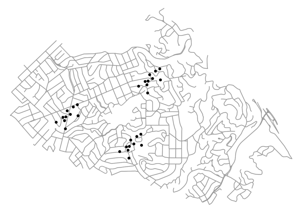
The code for this example can be found in this GitHub repo. We use OSMnx to download and assemble the street network for a small city. We also have a dataframe of points representing the locations of (fake) restaurants in this city. Our restaurants cluster into distinct districts, as many establishments and industries tend to do:

firm locations on the street network to be clustered: python, osmnx, matplotlib, scipy, scikit-learn, geopandas

Categories
Data

OSMnx Features Round-Up

OSMnx is a Python package for quickly and easily downloading, modeling, analyzing, and visualizing street networks and other spatial data from OpenStreetMap. Here’s a quick round-up of recent updates to OSMnx. I’ll try to keep this up to date as a single reference source. A lot of new features have appeared in the past few months, and people have been asking about what’s new and what’s possible. You can:

  • Download and model street networks or other networked infrastructure anywhere in the world with a single line of code
  • Download any other spatial geometries, place boundaries, building footprints, or points of interest as a GeoDataFrame
  • Download by city name, polygon, bounding box, or point/address + network distance
  • Download drivable, walkable, bikeable, or all street networks
  • Download node elevations and calculate edge grades (inclines)
  • Impute missing speeds and calculate graph edge travel times
  • Simplify and correct the network’s topology to clean-up nodes and consolidate intersections
  • Fast map-matching of points, routes, or trajectories to nearest graph edges or nodes
  • Save networks to disk as shapefiles, geopackages, and GraphML
  • Save/load street network to/from a local .osm xml file
  • Conduct topological and spatial analyses to automatically calculate dozens of indicators
  • Calculate and visualize street bearings and orientations
  • Calculate and visualize shortest-path routes that minimize distance, travel time, elevation, etc
  • Visualize street networks as a static map or interactive leaflet web map
  • Visualize travel distance and travel time with isoline and isochrone maps
  • Plot figure-ground diagrams of street networks and building footprints
Categories
Data

Street Network Orientation

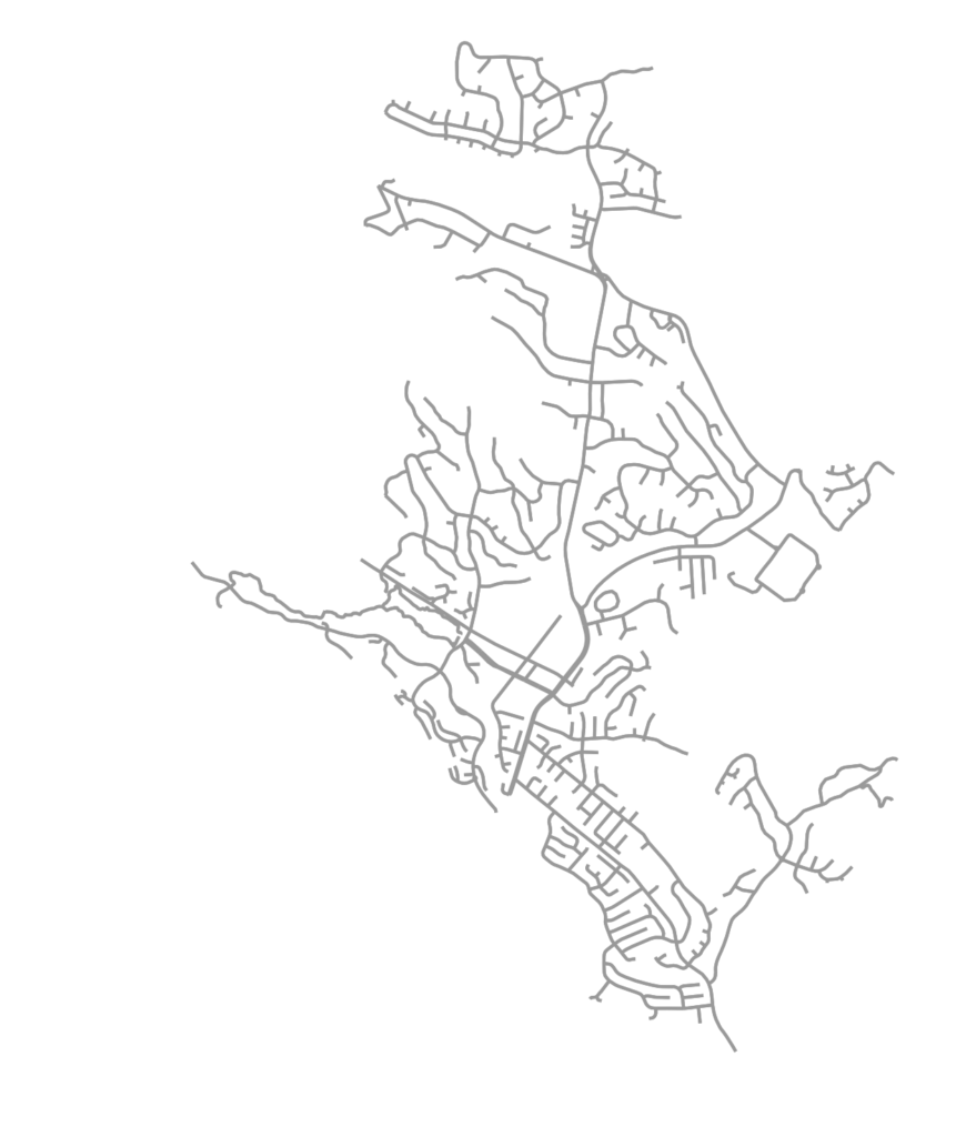
OSMnx is a Python package for easily downloading and analyzing street networks anywhere in the world. Among other analyses, we can use it to explore street network orientation. That is, what are the bearings and spatial orientations of the streets in the network? All of the code for this example is in this GitHub notebook. First we use OSMnx to download the street network of Moraga, California, a small town in the hills just east of Berkeley:

Moraga, California street network OSMnx OpenStreetMap Python

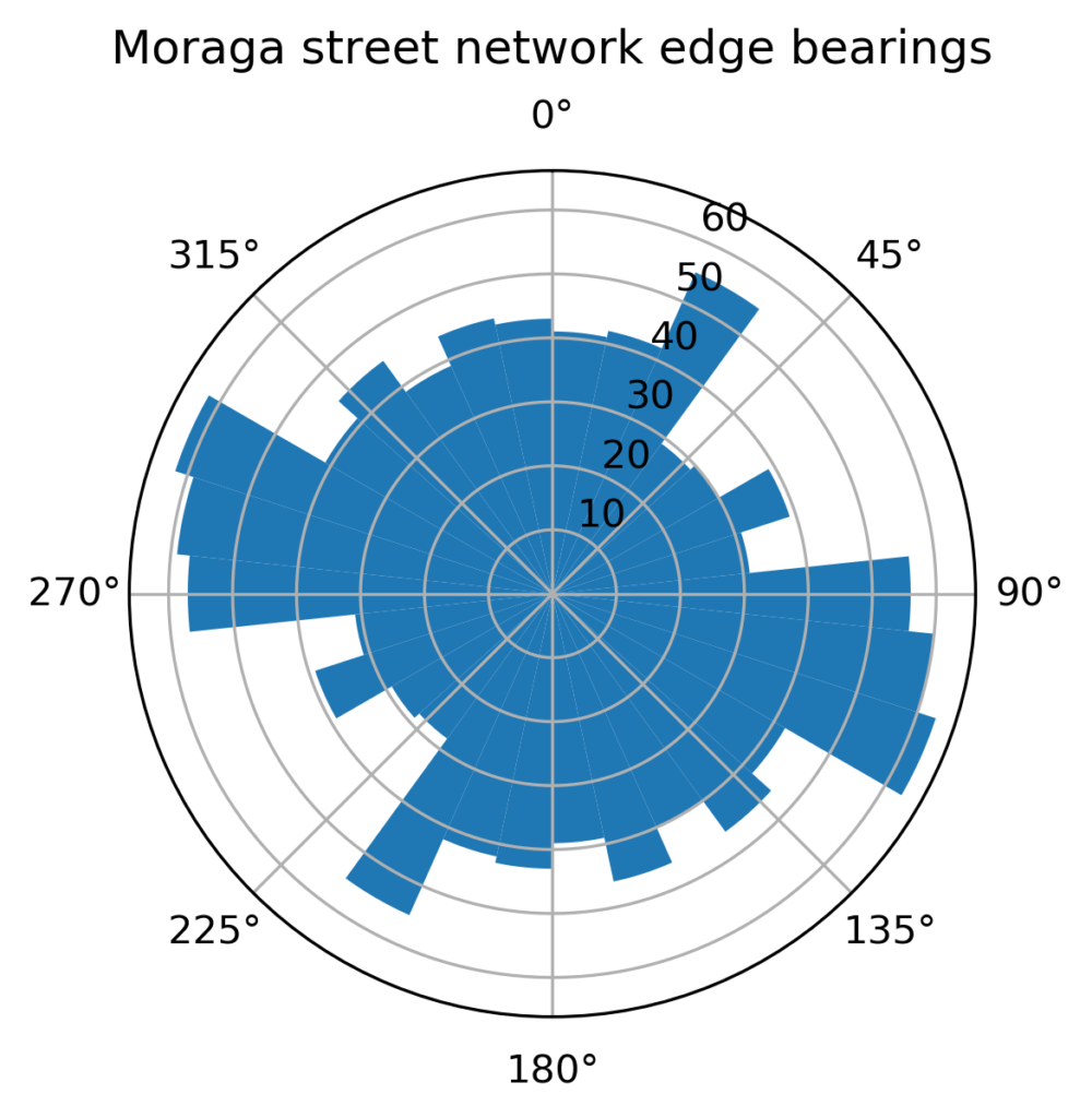
OSMnx automatically calculates all of the streets’ bearings. Specifically it calculates the compass bearing from each directed edge’s origin node u to its destination node v. Now we can visualize these bearings, binned together as a histogram to get a sense of the relative frequency of the streets’ spatial orientations. Or better yet, we can project that histogram as a polar plot to match the compass bearings:

Moraga, California street network orientation edge bearings polar plot OSMnx OpenStreetMap Python

Categories
Data

Mapping Everywhere I’ve Ever Been in My Life

I recently wrote about visualizing my Foursquare check-in history and mapping my Google location history, and it inspired me to mount a more substantial project: mapping everywhere I’ve ever been in my life (!!). I’ve got 4 years of Foursquare check-ins and Google location history data. For everything pre-smart phone, I typed up a simple spreadsheet of places I’d visited in the past and then geocoded it with the Google Maps API. All my Python and Leaflet code is available in this GitHub repo and is easy to re-purpose to visualize your own location history.

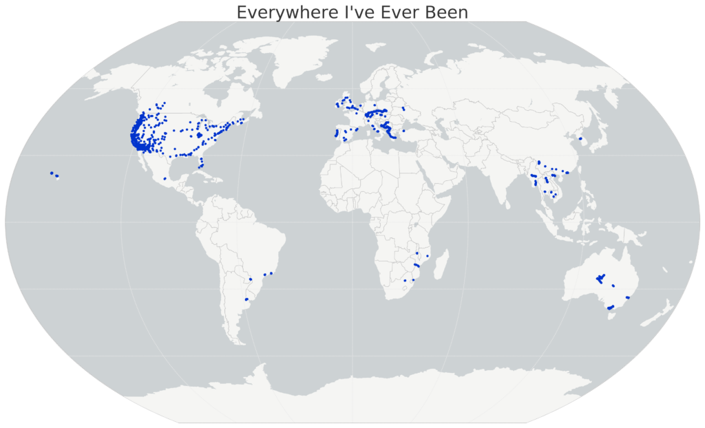
I’ll show the maps first, then run through the process I followed, below. First off, I used Python and matplotlib basemap to create this map of everywhere I’ve ever been:

Location History World Map, data from Foursquare and Google, made with Python matplotlib basemap

Categories
Data

Visualizing Summer Travels

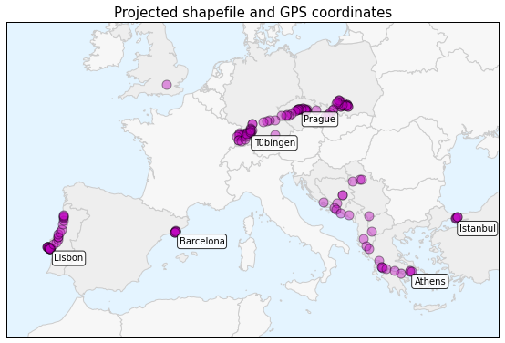
projected-shapefile-gps-coordinatesThis is a series of posts about visualizing spatial data. I spent a couple of months traveling in Europe this summer and collected GPS location data throughout the trip with the OpenPaths app. I explored different web mapping technologies such as CartoDB, Leaflet, Mapbox, and Tilemill to plot my travels. I also used Python and matplotlib to run some descriptive statistics and visualize other aspects of my trip.

Here is the series of posts:

My Python code is available in this GitHub repo. I also did some more involved work under the hood to prep the data and support these visualizations. For example, in the following posts I reverse-geocoded the spatial data set and reduced its size with clustering algorithms and the Douglas-Peucker algorithm:

Categories
Data

Visualizing Summer Travels Part 5: Python + Matplotlib

This post is part of a series on visualizing data from my summer travels.

I’ve previously discussed visualizing the GPS location data from my summer travels with CartoDB, Leaflet, and Mapbox + Tilemill. Today I will explore visualizing this data set in Python, using the matplotlib plotting library. All of my code is available in this GitHub repo, particularly this notebook.

Categories
Data

Visualizing Summer Travels Part 3: Leaflet

This post is part of a series on visualizing data from my summer travels.

I’ve previously discussed my goals in visualizing GPS data from my summer travels and explored visualizing the data set with CartoDB. The full OpenPaths location data from my summer travels is available here and I discussed how I reverse-geocoded it here.

Lastly, I reduced the size of this spatial data set so Leaflet can render it more quickly on low-power mobile devices. I discussed why this is important and how to do it with the DBSCAN clustering algorithm and also with the Douglas-Peucker algorithm. The final data set I’ll be working with is available here.