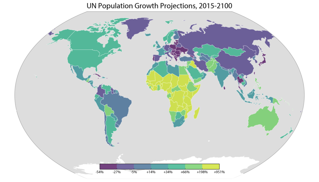
 The U.N. world population prospects data set depicts the U.N.’s projections for every country’s population, decade by decade through 2100. The 2015 revision was recently released, and I analyzed, visualized, and mapped the data (methodology and code described below).
The world population is expected to grow from about 7.3 billion people today to 11.2 billion in 2100. While the populations of Eastern Europe, Taiwan, and Japan are projected to decline significantly over the 21st century, the U.N. projects Africa’s population to grow by an incredible 3.2 billion people. This map depicts each country’s projected percentage change in population from 2015 to 2100:
