Categories
Academia

Urban Informatics and Visualization at UC Berkeley

The fall semester begins next week at UC Berkeley. For the third year in a row, Paul Waddell and I will be teaching CP255: Urban Informatics and Visualization, and this is my first year as co-lead instructor.

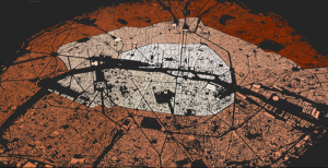
This masters-level course trains students to analyze urban data, develop indicators, conduct spatial analyses, create data visualizations, and build Paris open datainteractive web maps. To do this, we use the Python programming language, open source analysis and visualization tools, and public data.
This course is designed to provide future city planners with a toolkit of technical skills for quantitative problem solving. We don’t require any prior programming experience – we teach this from the ground up – but we do expect prior knowledge of basic statistics and GIS.

Update, September 2017: I am no longer a Berkeley GSI, but Paul’s class is ongoing. Check out his fantastic teaching materials in his GitHub repo. From my experiences here, I have developed a course series on urban data science with Python and Jupyter, available in this GitHub repo.
Categories
Data

Visualizing Summer Travels

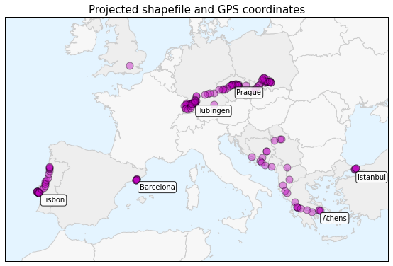
projected-shapefile-gps-coordinatesThis is a series of posts about visualizing spatial data. I spent a couple of months traveling in Europe this summer and collected GPS location data throughout the trip with the OpenPaths app. I explored different web mapping technologies such as CartoDB, Leaflet, Mapbox, and Tilemill to plot my travels. I also used Python and matplotlib to run some descriptive statistics and visualize other aspects of my trip.

Here is the series of posts:

My Python code is available in this GitHub repo. I also did some more involved work under the hood to prep the data and support these visualizations. For example, in the following posts I reverse-geocoded the spatial data set and reduced its size with clustering algorithms and the Douglas-Peucker algorithm:

Categories
Data

Visualizing Summer Travels Part 2: CartoDB

This post is part of a series on visualizing data from my summer travels.

I recently discussed OpenPaths and my goals in visualizing location data from my summer travels. In this post, I’ll explore visualizing this dataset with CartoDB. The OpenPaths data from my summer travels, which I’ll be working with in these examples, is available here and I discuss how I reverse-geocoded it here. CartoDB is a simple cloud-based tool for building web maps. You can import data through their web-based dashboard and quickly turn it into a dynamic map or visualization.