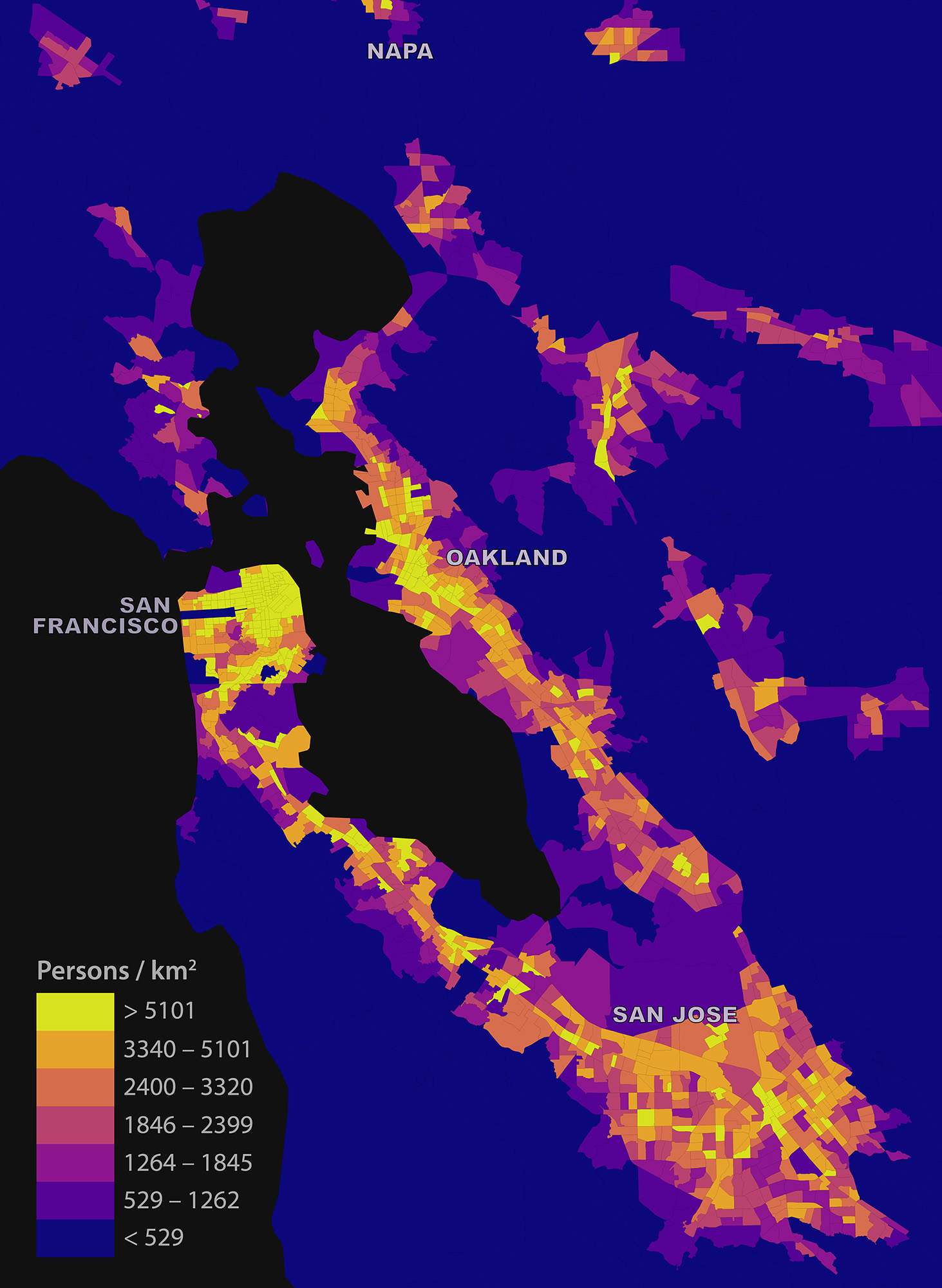
My short article “Estimating Local Daytime Population Density from Census and Payroll Data” is out now in the latest issue of Regional Studies, Regional Science. I discuss a method for estimating local daytime density across a metropolitan area using US Census and LEHD LODES data, and dig into some limitations and biases. I look at the San Francisco Bay Area as a case study:
Tag: berkeley
Isochrone Maps with OSMnx + Python
Check out the journal article about OSMnx.
How far can you travel on foot in 15 minutes? Urban planners use isochrone maps to show spatial horizons (i.e., isolines) that are equal in time. Isochrones depict areas according to how long it takes to arrive there from some point. These visualizations are particularly useful in transportation planning as they reveal what places are accessible within a set of time horizons.
We can create isochrone maps for anywhere in the world automatically with Python and its OSMnx package:
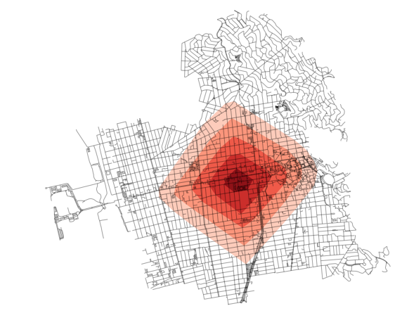
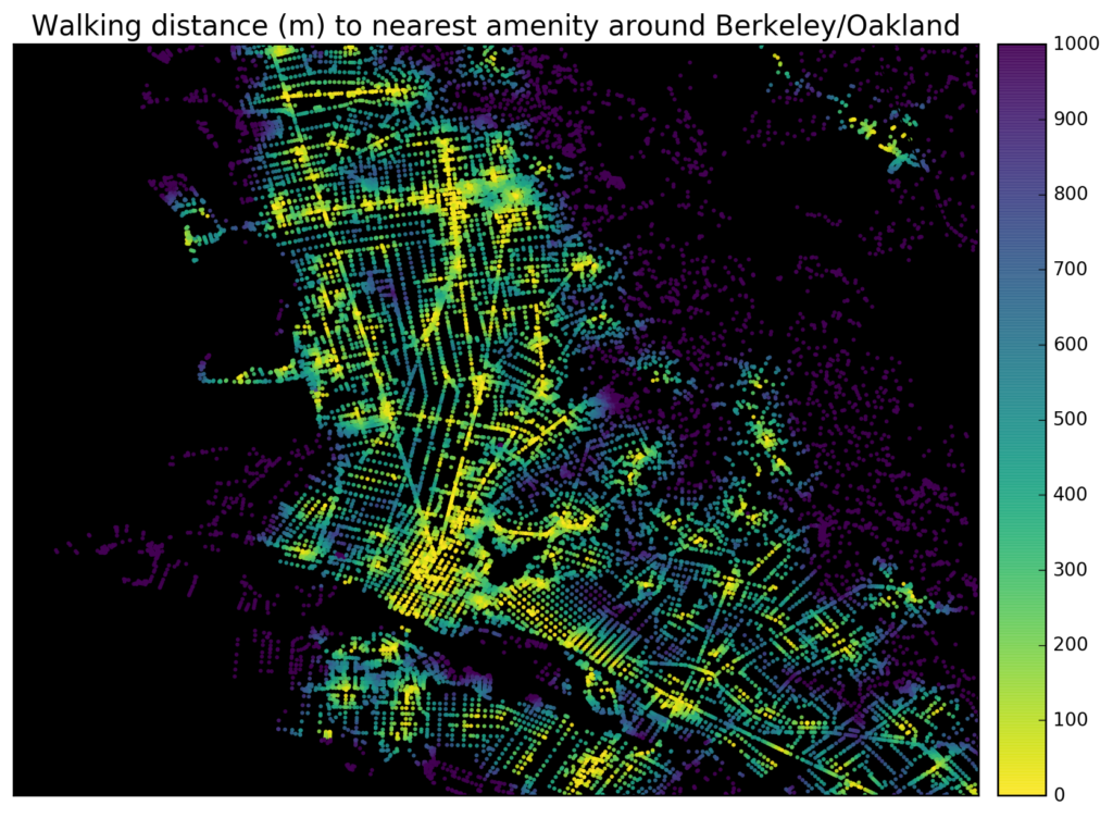
Tools like WalkScore visualize how “walkable” a neighborhood is in terms of access to different amenities like parks, schools, or restaurants. It’s easy to create accessibility visualizations like these ad hoc with Python and its pandana library. Pandana (pandas for network analysis – developed by Fletcher Foti during his dissertation research here at UC Berkeley) performs fast accessibility queries over a network. I’ll demonstrate how to use it to visualize urban walkability. My code is in these IPython notebooks in this urban data science course GitHub repo.
First I give pandana a bounding box around Berkeley/Oakland in the East Bay of the San Francisco Bay Area. Then I load the street network and amenities from OpenStreetMap. In this example I’ll look at accessibility to restaurants, bars, and schools. But, you can create any basket of amenities that you are interested in – basically visualizing a personalized “AnythingScore” instead of a generic WalkScore for everyone. Finally I calculate and plot the distance from each node in the network to the nearest amenity:
Mapping Everywhere I’ve Ever Been in My Life
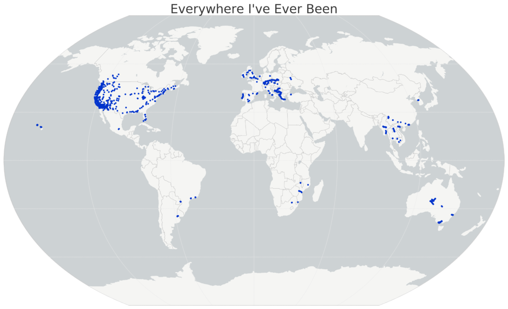
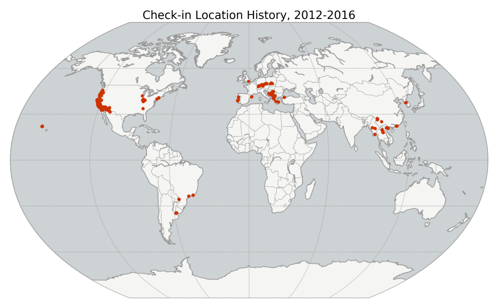
I recently wrote about visualizing my Foursquare check-in history and mapping my Google location history, and it inspired me to mount a more substantial project: mapping everywhere I’ve ever been in my life (!!). I’ve got 4 years of Foursquare check-ins and Google location history data. For everything pre-smart phone, I typed up a simple spreadsheet of places I’d visited in the past and then geocoded it with the Google Maps API. All my Python and Leaflet code is available in this GitHub repo and is easy to re-purpose to visualize your own location history.
I’ll show the maps first, then run through the process I followed, below. First off, I used Python and matplotlib basemap to create this map of everywhere I’ve ever been:
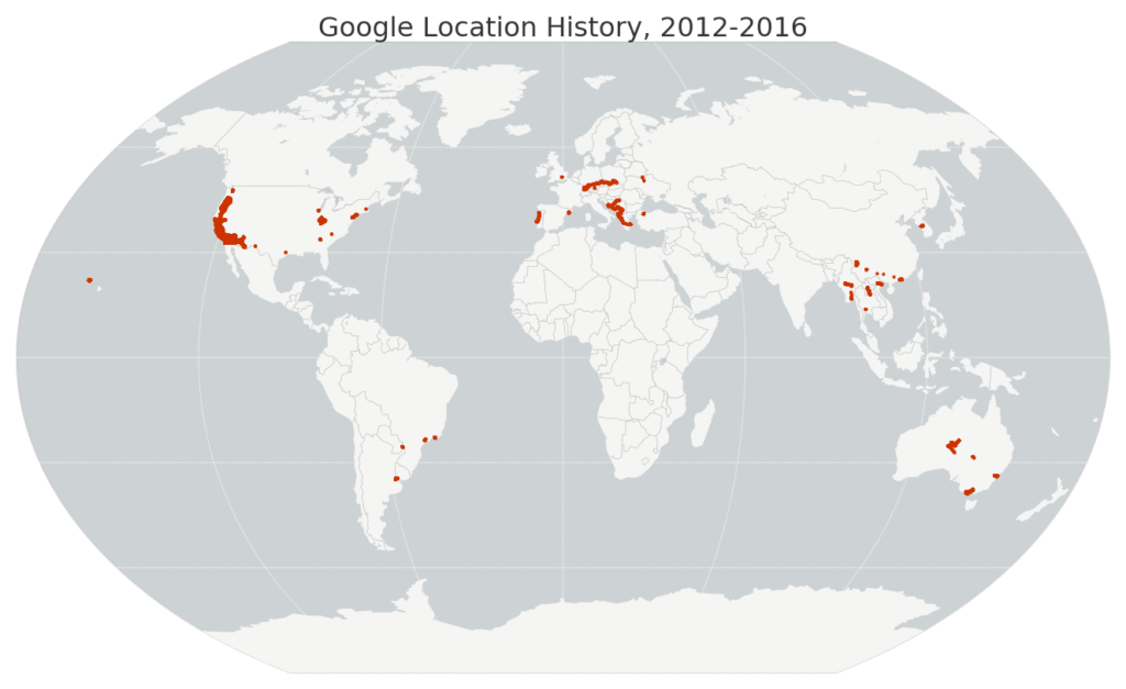
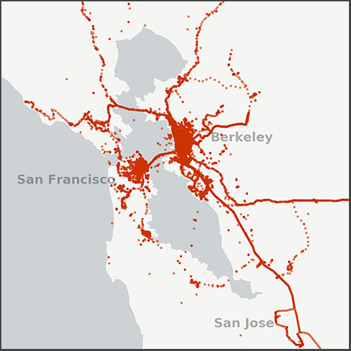 I recently wrote about visualizing my Foursquare check-in history and it inspired me to map my entire Google location history data – about 1.2 million GPS coordinates from my Android phone between 2012 and 2016. I used Python and its pandas, matplotlib, and basemap libraries. The Python code is available in this notebook in this GitHub repo, and it’s simple to re-use to visualize your own location history.
Just download your JSON file from Google then run the code. First I load the JSON file and parse the latitude, longitude, and timestamp with pandas. Then I map my worldwide data set:
Visualize Foursquare Location History
I started using Foursquare at the end of 2012 and kept with it even after it became the pointless muck that is Swarm. Since I’ve now got 4 years of location history (ie, check-ins) data, I decided to visualize and map it with Python, matplotlib, and basemap. The code is available in this GitHub repo. It’s easy to re-purpose to visualize your own check-in history: you just need to plug in your Foursquare OAuth token then run the notebook.
First the notebook downloads all my check-ins from the Foursquare API. Then I mapped all of them, using matplotlib basemap.
The fall semester begins next week at UC Berkeley. For the third year in a row, Paul Waddell and I will be teaching CP255: Urban Informatics and Visualization, and this is my first year as co-lead instructor.
This masters-level course trains students to analyze urban data, develop indicators, conduct spatial analyses, create data visualizations, and build  interactive web maps. To do this, we use the Python programming language, open source analysis and visualization tools, and public data.
This course is designed to provide future city planners with a toolkit of technical skills for quantitative problem solving. We don’t require any prior programming experience – we teach this from the ground up – but we do expect prior knowledge of basic statistics and GIS.
Update, September 2017: I am no longer a Berkeley GSI, but Paul’s class is ongoing. Check out his fantastic teaching materials in his GitHub repo. From my experiences here, I have developed a course series on urban data science with Python and Jupyter, available in this GitHub repo.
LEED-ND and Neighborhood Livability
I recently co-authored a journal article titled LEED-ND and Livability Revisited, which won the Kaye Bock award. LEED-ND is a system for evaluating neighborhood design that was developed by CNU, USGBC, and NRDC. Many of its criteria, particularly site location and neighborhood pattern, accordingly reflect New Urbanist and Smart Growth principles and are inspired by traditional neighborhood design.
I recently completed my inside field exam, one of the many steps involved in advancing to candidacy. The three professors on your inside field committee send you six questions – a pair per professor – and you are given 72 hours total to answer one question from each pair. The answers are to be in the form of a scholarly article with thorough citations. Long story short, you’ve got to write 30 pages of academic scholarship in three days.
The exam questions themselves are very interesting. The professors construct them based on their reading of your inside field statement, trying to probe areas that might be particularly rich or a bit weak in the statement. Here are the questions I answered:
Aftermath of the Berkeley Protests
I walked around downtown Berkeley this morning and took photos of the aftermath of last night’s protests. It had been a predominately peaceful event. Out of 500+ protesters, only 4-5 individuals smashed windows, started fires, and looted local businesses. The ransackers sadly had nothing to do with the message of the protest. Rather, these were opportunists who camouflaged themselves among peaceful protesters to loot and vandalize under the cloak of anonymity granted by a large group.
It was a frustrating distraction away from the protest’s message, and it undermined the peaceful majority. Now the national news is focused on the destruction caused by a small group, instead of discussing the point of the protest. Do not conflate the protesters with the vandals – these were two separate groups out last night for different reasons.
