Categories
Data

Visualizing Summer Travels

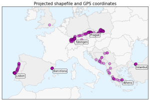
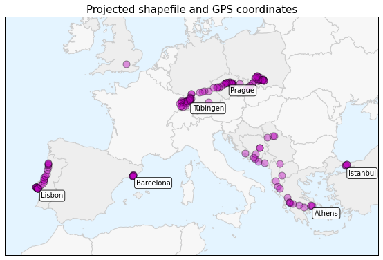
projected-shapefile-gps-coordinatesThis is a series of posts about visualizing spatial data. I spent a couple of months traveling in Europe this summer and collected GPS location data throughout the trip with the OpenPaths app. I explored different web mapping technologies such as CartoDB, Leaflet, Mapbox, and Tilemill to plot my travels. I also used Python and matplotlib to run some descriptive statistics and visualize other aspects of my trip.

Here is the series of posts:

My Python code is available in this GitHub repo. I also did some more involved work under the hood to prep the data and support these visualizations. For example, in the following posts I reverse-geocoded the spatial data set and reduced its size with clustering algorithms and the Douglas-Peucker algorithm:

Categories
Data

Visualizing Summer Travels Part 5: Python + Matplotlib

This post is part of a series on visualizing data from my summer travels.

I’ve previously discussed visualizing the GPS location data from my summer travels with CartoDB, Leaflet, and Mapbox + Tilemill. Today I will explore visualizing this data set in Python, using the matplotlib plotting library. All of my code is available in this GitHub repo, particularly this notebook.

Categories
Data

Visualizing Summer Travels Part 4: Mapbox + Tilemill

This post is part of a series on visualizing data from my summer travels.

I’ve previously discussed my goals in visualizing GPS data from my summer travels and explored visualizing the data set with CartoDB and with Leaflet. The full OpenPaths location data from my summer travels is available here and I discussed how I reverse-geocoded it here.

Mapbox is a major provider of online web mapping services such as tiled web maps, the Tilemill cartography IDE, and the mapbox.js javascript library. Today I’ll run through how to create an interactive data map in Tilemill’s design studio, export the map as a set of tiles, upload the tileset to Mapbox, and then use a javascript client to display the map on a web page. Our final result will look something like this:

Categories
Data

Visualizing Summer Travels Part 3: Leaflet

This post is part of a series on visualizing data from my summer travels.

I’ve previously discussed my goals in visualizing GPS data from my summer travels and explored visualizing the data set with CartoDB. The full OpenPaths location data from my summer travels is available here and I discussed how I reverse-geocoded it here.

Lastly, I reduced the size of this spatial data set so Leaflet can render it more quickly on low-power mobile devices. I discussed why this is important and how to do it with the DBSCAN clustering algorithm and also with the Douglas-Peucker algorithm. The final data set I’ll be working with is available here.

Categories
Data

Reducing Spatial Data Set Size with Douglas-Peucker

In a previous post I discussed how to reduce the size of a spatial data set by clustering. Too many data points in a visualization can overwhelm the user and bog down on-the-fly client-side map rendering (for example, with a javascript tool like Leaflet). So, I used the DBSCAN clustering algorithm to reduce my data set from 1,759 rows to 158 spatially-representative points. This series of posts discusses this data set in depth.

Categories
Data

Clustering to Reduce Spatial Data Set Size

Read/cite the paper here.

In this tutorial, I demonstrate how to reduce the size of a spatial data set of GPS latitude-longitude coordinates using Python and its scikit-learn implementation of the DBSCAN clustering algorithm. All my code is in this IPython notebook in this GitHub repo, where you can also find the data.

Traditionally it’s been a problem that researchers did not have enough spatial data to answer useful questions or build compelling visualizations. Today, however, the problem is often that we have too much data. Too many scattered points on a map can overwhelm a viewer looking for a simple narrative. Furthermore, rendering a JavaScript web map (like Leaflet) with millions of data points on a mobile device can swamp the processor and be unresponsive.

Categories
Data

Reverse Geocode a Set of Lat-Long Coordinates to City + Country

This tutorial demonstrates how to reverse geocode a set of latitude-longitude coordinates to city and country using Python and the Google Maps API.

I have previously written about my GPS location data from this summer’s travels. The data set, gathered with the OpenPaths app, contains lat-long coordinates and timestamps. Without city or country data, any visualizations would be very simplistic because all I have is coordinates and timestamps. It would be nice to reverse geocode these coordinates to add city and country data to each point. Then, I could create richer, more informative marker popups that include this new geographical information.

Categories
Data

Visualizing Summer Travels Part 2: CartoDB

This post is part of a series on visualizing data from my summer travels.

I recently discussed OpenPaths and my goals in visualizing location data from my summer travels. In this post, I’ll explore visualizing this dataset with CartoDB. The OpenPaths data from my summer travels, which I’ll be working with in these examples, is available here and I discuss how I reverse-geocoded it here. CartoDB is a simple cloud-based tool for building web maps. You can import data through their web-based dashboard and quickly turn it into a dynamic map or visualization.

Categories
Data

Visualizing Summer Travels Part 1: OpenPaths

This post is part of a series on visualizing data from my summer travels.

Oscar Levant once said, darkly, that “happiness isn’t something you experience; it’s something you remember.” We humans have a way of constructing and reconstructing experiences and memories through the methods by which we recall them. The endlessly repeated anecdote from your vacation in Italy eventually becomes emblematic of the larger trip. The photograph on the wall from your wedding day becomes a synecdoche for the entire event.

I spent the past two months in Europe and documented my travels through a set of photographs which have become emblematic, for me, of packages of experiences from different places. However, they are often skewed and selective, telling only one deliberate perspective of a wider, richer experience. Another way to remember and reminisce about one’s travels is through maps. Where did I go? What path did I take? How did the parts of the trip fit together? The answers to these questions are useful in revealing another perspective of the larger experience.