Categories
Data

America’s College Football Stadiums

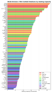
stadiums-fbs-conf-barAlso check out this follow-up analysis of stadium attendance.

The 2016 college football championship game between Clemson and Alabama was held at University of Phoenix Stadium, where the NFL’s Arizona Cardinals play. Interestingly, this NFL (ironic, given its name) stadium is considerably smaller than the home stadiums of either Clemson or Alabama. In fact every NFL stadium is considerably smaller than the largest college stadiums. Outside of North Korea, the 8 largest stadiums in the world are college football stadiums, and the 15 largest college football stadiums are larger than any NFL stadium.

Americans are obsessed with college football, but how much is too much? Today most athletic departments are subsidized by their schools. Public universities increased their annual football spending by $1.8 billion between 2009-2013 while racking up huge debts to finance stadiums with little chance of profit. This interactive map shows each NCAA Division I college football team’s home stadium: collectively they seat 8.5 million people. Click any point for details about stadium capacity and year built:

Categories
Data

World Population Projections

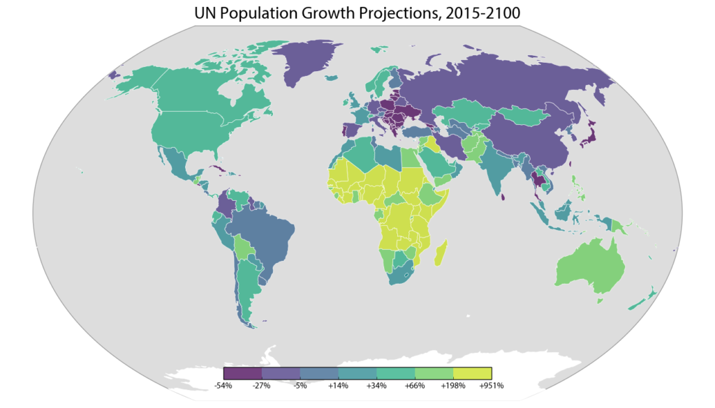
Batman and Robin: By 2050, 70% of the world's population...The U.N. world population prospects data set depicts the U.N.’s projections for every country’s population, decade by decade through 2100. The 2015 revision was recently released, and I analyzed, visualized, and mapped the data (methodology and code described below).

The world population is expected to grow from about 7.3 billion people today to 11.2 billion in 2100. While the populations of Eastern Europe, Taiwan, and Japan are projected to decline significantly over the 21st century, the U.N. projects Africa’s population to grow by an incredible 3.2 billion people. This map depicts each country’s projected percentage change in population from 2015 to 2100:

UN world population projections data map: Africa, Asia, Australia, Europe, North America, South America

Categories
Data

The Landscape of U.S. Rents

Which U.S. cities are the most expensive for rental housing? Where are rents rising the fastest? The American Community Survey (ACS) recently released its latest batch of 1-year data and I analyzed, mapped, and visualized it. My methodology is below, and my code and data are in this GitHub repo.

This interactive map shows median rents across the U.S. for every metro/micropolitan area. Click any one for details on population, rent, and change over time. Click “switch” to re-draw the map to visualize how median rents have risen since 2010:

Categories
Data

Exporting Python Data to GeoJSON

I like to do my data wrangling and analysis work in Python, using the pandas library. I also use Python for much of my data visualization and simple mapping. But for interactive web maps, I usually use Leaflet. There isn’t dead-simple way to dump a pandas DataFrame with geographic data to something you can load with Leaflet. You could use GeoPandas to convert your DataFrame then dump it to GeoJSON, but that isn’t a very lightweight solution.

So, I wrote a simple reusable function to export any pandas DataFrame to GeoJSON:

Categories
Data

Map Projections That Lie

How big is Greenland? It’s huge, right? At 836,109 square miles in size, Greenland is the largest island and the 12th largest country on Earth. With only 56,000 people living in that enormous area (80% of which is covered by the world’s only extant ice sheet outside of Antarctica), it is also the least densely populated country on Earth.

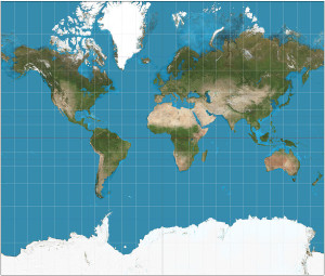
You can get a sense of how large Greenland is when you look at a map of the world:

world map mercator projection

It’s huge! Greenland is bigger than the entire continent of Africa! Or is it? The map above uses the common Mercator projection to project the 3-D surface of the Earth onto a 2-D surface suitable for a paper map or an image on your computer screen. But it’s not easy to project the curved surface of a sphere onto a rectangular plane. Compromises must be made. In the case of the Mercator projection, the compromise is that objects’ sizes become increasingly distorted the further they are from the equator. At the poles, the scale and distortion become infinite.

Categories
Data

Animated 3-D Plots in Python

Download/cite the paper here!

In a previous post, I discussed chaos, fractals, and strange attractors. I also showed how to visualize them with static 3-D plots. Here, I’ll demonstrate how to create these animated visualizations using Python and matplotlib. All of my source code is available in this GitHub repo. By the end, we’ll produce animated data visualizations like this, in pure Python:

Animated 3-D Poincare plot of the logistic map's chaotic regime - this is time series data embedded in three dimensional state space

Categories
Data

Visualizing Chaos and Randomness

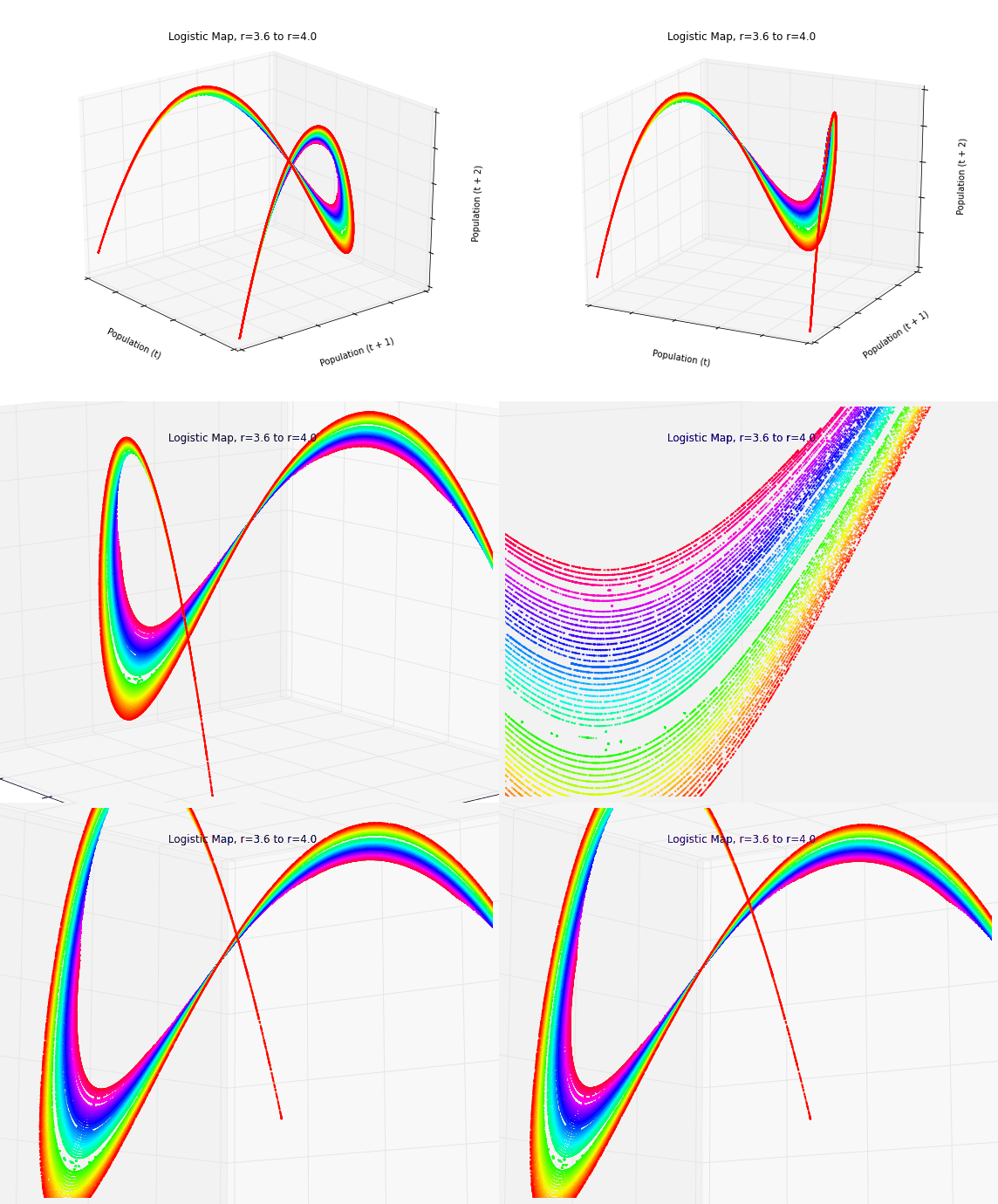
3-D Poincare plot of the logistic map's chaotic regime - this is time series data embedded in three dimensional state space

Download/cite the paper here!

In a previous post, I discussed chaos theory, fractals, and strange attractors – and their implications for knowledge and prediction of systems. I also briefly touched on how phase diagrams (or Poincaré plots) can help us visualize system attractors and differentiate chaotic behavior from true randomness.

In this post (adapted from this paper), I provide more detail on constructing and interpreting phase diagrams. These methods are particularly useful for discovering deterministic chaos in otherwise random-appearing time series data, as they visualize strange attractors. I’m using Python for all of these visualizations and the source code is available in this GitHub repo.

Categories
Data

Chaos Theory and the Logistic Map

Logistic map bifurcation diagram showing the period-doubling path to chaosUsing Python to visualize chaos, fractals, and self-similarity to better understand the limits of knowledge and prediction. Download/cite the article here and try pynamical yourself.
Chaos theory is a branch of mathematics that deals with nonlinear dynamical systems. A system is just a set of interacting components that form a larger whole. Nonlinear means that due to feedback or multiplicative effects between the components, the whole becomes something greater than just adding up the individual parts. Lastly, dynamical means the system changes over time based on its current state. In the following piece (adapted from this article), I break down some of this jargon, visualize interesting characteristics of chaos, and discuss its implications for knowledge and prediction.

Chaotic systems are a simple sub-type of nonlinear dynamical systems. They may contain very few interacting parts and these may follow very simple rules, but these systems all have a very sensitive dependence on their initial conditions. Despite their deterministic simplicity, over time these systems can produce totally unpredictable and wildly divergent (aka, chaotic) behavior. Edward Lorenz, the father of chaos theory, described chaos as “when the present determines the future, but the approximate present does not approximately determine the future.”

Categories
Data

Visualizing Summer Travels Part 6: Projecting Spatial Data with Python

This post is part of a series on visualizing data from my summer travels.

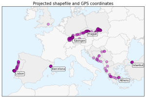
I’ve previously discussed visualizing the GPS location data from my summer travels with CartoDB, Leaflet, and Mapbox + Tilemill. I also visualized different aspects of this data set in Python, using the matplotlib plotting library. However, these spatial scatter plots used unprojected lat-long data which looked pretty distorted at European latitudes.

Today I will show how to convert this data into a projected coordinate reference system and plot it again using matplotlib. These projected maps will provide a much more accurate spatial representation of my spatial data and the geographic region. All of my code is available in this GitHub repo, particularly this notebook.

Categories
Data

Using geopandas on Windows

projected-shapefile-gps-coordinatesThis guide was written in 2014 and updated slightly in November 2020.

I recently went through the exercise of installing geopandas on Windows. Having learned several valuable lessons, I thought I’d share them with the world in case anyone else is trying to get this toolkit working in a Windows environment. It seems that pip installing geopandas usually works fine on Linux and Mac. However, several of its dependencies have C extensions that can cause compilation failures with pip on Windows. This guide gets around that issue.