After my recent trip through Myanmar, I backpacked across Laos. Much like Myanmar, Laos was closed to tourism and the West for decades, but has recently re-opened its doors. Unlike Myanmar, Laos is officially a communist state – one of only five remaining in the world, alongside Cuba, China, Vietnam, and (nominally) North Korea.
Author: gboeing
Off the Beaten Path in Myanmar
 I recently had the opportunity to travel across Myanmar for the first time. It’s a fascinating country, only recently emerging from decades of isolation. Travelers here today are greeted with the first few baby steps toward a tourism industry, as well some of the kindest people and most spectacular sights in Asia.
Myanmar is not the easiest country to approach. It remains, effectively, a military dictatorship wracked with corruption and abuse. Government officials control the airlines and hotels for personal profit. Large swaths of eastern Myanmar are dedicated to opium plantations funneling foreign currency into the pockets of powerful officials. Even its name is controversial: many foreign governments still officially recognize only its traditional name, Burma, as a political statement against the authoritarian regime that renamed it Myanmar in 1989.
Hong Kong at Night
Hong Kong is a remarkable place. It is the 4th-densest sovereign state or self-governing territory in the world (in 1st place is its neighbor across the delta: Macau). Yet this density is fantastically constrained by the mountains and the sea into narrow, snaking corridors of high-rises wherever the terrain permits. At no time is this unique urban development better seen than at night, when Hong Kong lights up like a carnival.
I took these photos from the top of Victoria Peak on Hong Kong island and from the Tsim Sha Tsui promenade on the Kowloon peninsula, using long exposures of between 3 and 12 seconds.
Animated 3-D Plots in Python
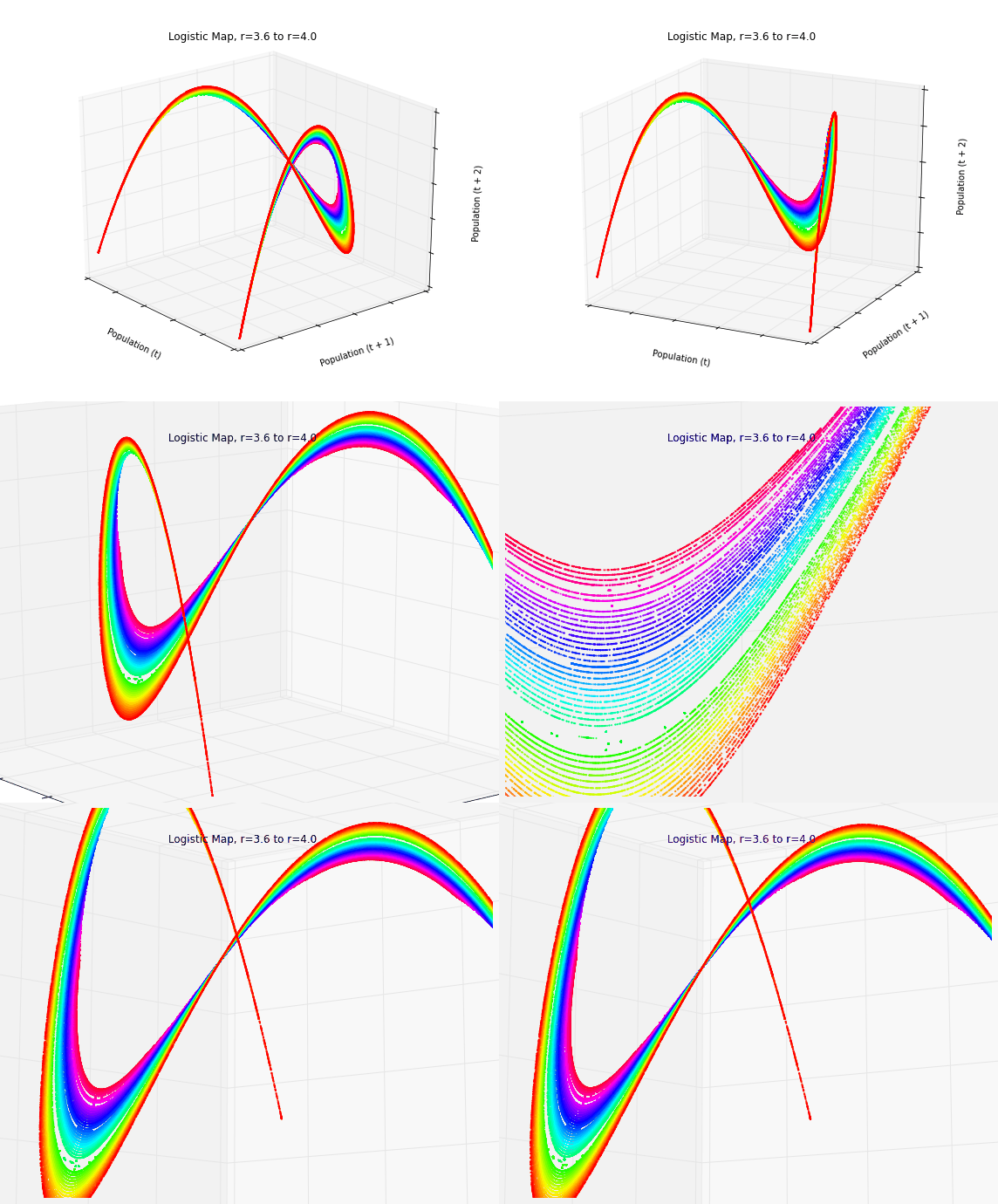
In a previous post, I discussed chaos, fractals, and strange attractors. I also showed how to visualize them with static 3-D plots. Here, I’ll demonstrate how to create these animated visualizations using Python and matplotlib. All of my source code is available in this GitHub repo. By the end, we’ll produce animated data visualizations like this, in pure Python:
Visualizing Chaos and Randomness
In a previous post, I discussed chaos theory, fractals, and strange attractors – and their implications for knowledge and prediction of systems. I also briefly touched on how phase diagrams (or Poincaré plots) can help us visualize system attractors and differentiate chaotic behavior from true randomness.
In this post (adapted from this paper), I provide more detail on constructing and interpreting phase diagrams. These methods are particularly useful for discovering deterministic chaos in otherwise random-appearing time series data, as they visualize strange attractors. I’m using Python for all of these visualizations and the source code is available in this GitHub repo.
Chaos Theory and the Logistic Map
 Using Python to visualize chaos, fractals, and self-similarity to better understand the limits of knowledge and prediction. Download/cite the article here and try pynamical yourself.
Chaos theory is a branch of mathematics that deals with nonlinear dynamical systems. A system is just a set of interacting components that form a larger whole. Nonlinear means that due to feedback or multiplicative effects between the components, the whole becomes something greater than just adding up the individual parts. Lastly, dynamical means the system changes over time based on its current state. In the following piece (adapted from this article), I break down some of this jargon, visualize interesting characteristics of chaos, and discuss its implications for knowledge and prediction.
Chaotic systems are a simple sub-type of nonlinear dynamical systems. They may contain very few interacting parts and these may follow very simple rules, but these systems all have a very sensitive dependence on their initial conditions. Despite their deterministic simplicity, over time these systems can produce totally unpredictable and wildly divergent (aka, chaotic) behavior. Edward Lorenz, the father of chaos theory, described chaos as “when the present determines the future, but the approximate present does not approximately determine the future.”
LEED-ND and Neighborhood Livability
I recently co-authored a journal article titled LEED-ND and Livability Revisited, which won the Kaye Bock award. LEED-ND is a system for evaluating neighborhood design that was developed by CNU, USGBC, and NRDC. Many of its criteria, particularly site location and neighborhood pattern, accordingly reflect New Urbanist and Smart Growth principles and are inspired by traditional neighborhood design.
I recently completed my inside field exam, one of the many steps involved in advancing to candidacy. The three professors on your inside field committee send you six questions – a pair per professor – and you are given 72 hours total to answer one question from each pair. The answers are to be in the form of a scholarly article with thorough citations. Long story short, you’ve got to write 30 pages of academic scholarship in three days.
The exam questions themselves are very interesting. The professors construct them based on their reading of your inside field statement, trying to probe areas that might be particularly rich or a bit weak in the statement. Here are the questions I answered:
Aftermath of the Berkeley Protests
I walked around downtown Berkeley this morning and took photos of the aftermath of last night’s protests. It had been a predominately peaceful event. Out of 500+ protesters, only 4-5 individuals smashed windows, started fires, and looted local businesses. The ransackers sadly had nothing to do with the message of the protest. Rather, these were opportunists who camouflaged themselves among peaceful protesters to loot and vandalize under the cloak of anonymity granted by a large group.
It was a frustrating distraction away from the protest’s message, and it undermined the peaceful majority. Now the national news is focused on the destruction caused by a small group, instead of discussing the point of the protest. Do not conflate the protesters with the vandals – these were two separate groups out last night for different reasons.
 This post is adapted from an article I wrote in Progressive Planning.
Does food matter in neighborhood design? Should it? The answers to these questions are complicated and obscured by decades of perplexing policy and practice. There are many benefits of good food – that is, food which is healthy, affordable, fair, and sustainable. Proper nourishment has been linked in several studies to better classroom performance. Walkable access to healthy food can reduce America’s growing obesity and diabetes epidemics. Locally-sourced food can reinforce better dietary habits as consumers connect with the value chain and see eating as a more natural process.
The benefits are straightforward, but do most American neighborhoods actually support healthy food access?


