Categories
Tech

Scientific Python for Raspberry Pi

Raspberry Pi 3 Model BA guide to setting up the Python scientific stack, well-suited for geospatial analysis, on a Raspberry Pi 3. The whole process takes just a few minutes.

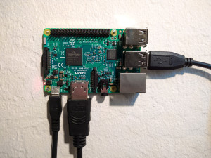
The Raspberry Pi 3 was announced two weeks ago and presents a substantial step up in computational power over its predecessors. It can serve as a functional Wi-Fi connected Linux desktop computer, albeit underpowered. However it’s perfectly capable of running the Python scientific computing stack including Jupyter, pandas, matplotlib, scipy, scikit-learn, and OSMnx.

Despite (or because of?) its low power, it’s ideal for low-overhead and repetitive tasks that researchers and engineers often face, including geocoding, web scraping, scheduled API calls, or recurring statistical or spatial analyses (with small-ish data sets). It’s also a great way to set up a simple server or experiment with Linux. This guide is aimed at newcomers to the world of Raspberry Pi and Linux, but who have an interest in setting up a Python environment on these $35 credit card sized computers. We’ll run through everything you need to do to get started (if your Pi is already up and running, skip steps 1 and 2).

Categories
Data

Visualizing a Gmail Inbox

Google Takeout lets you download an archive of your data from various Google products. I downloaded my Gmail archive as an mbox file and visualized all of my personal Gmail account traffic since signing up back in July 2004. This analysis excludes work and school email traffic (as well as my other Gmail account for signing up for web sites and services), as I have separate dedicated email accounts for each. It also excludes the Hangouts/chats that Google includes in your mbox archive. So, this analysis just covers personal communication.

This also demonstrates working with time series in Python and pandas. All of my code is on GitHub as an IPython notebook. You can re-purpose it for your own inbox – just download your Gmail archive then run my code.

Visualizing Gmail inbox email traffic volume by day with Python, pandas, and matplotlib

Categories
Data

America’s College Football Stadiums

stadiums-fbs-conf-barAlso check out this follow-up analysis of stadium attendance.

The 2016 college football championship game between Clemson and Alabama was held at University of Phoenix Stadium, where the NFL’s Arizona Cardinals play. Interestingly, this NFL (ironic, given its name) stadium is considerably smaller than the home stadiums of either Clemson or Alabama. In fact every NFL stadium is considerably smaller than the largest college stadiums. Outside of North Korea, the 8 largest stadiums in the world are college football stadiums, and the 15 largest college football stadiums are larger than any NFL stadium.

Americans are obsessed with college football, but how much is too much? Today most athletic departments are subsidized by their schools. Public universities increased their annual football spending by $1.8 billion between 2009-2013 while racking up huge debts to finance stadiums with little chance of profit. This interactive map shows each NCAA Division I college football team’s home stadium: collectively they seat 8.5 million people. Click any point for details about stadium capacity and year built:

Categories
Data

World Population Projections

Batman and Robin: By 2050, 70% of the world's population...The U.N. world population prospects data set depicts the U.N.’s projections for every country’s population, decade by decade through 2100. The 2015 revision was recently released, and I analyzed, visualized, and mapped the data (methodology and code described below).

The world population is expected to grow from about 7.3 billion people today to 11.2 billion in 2100. While the populations of Eastern Europe, Taiwan, and Japan are projected to decline significantly over the 21st century, the U.N. projects Africa’s population to grow by an incredible 3.2 billion people. This map depicts each country’s projected percentage change in population from 2015 to 2100:

UN world population projections data map: Africa, Asia, Australia, Europe, North America, South America

Categories
Data

The Landscape of U.S. Rents

Which U.S. cities are the most expensive for rental housing? Where are rents rising the fastest? The American Community Survey (ACS) recently released its latest batch of 1-year data and I analyzed, mapped, and visualized it. My methodology is below, and my code and data are in this GitHub repo.

This interactive map shows median rents across the U.S. for every metro/micropolitan area. Click any one for details on population, rent, and change over time. Click “switch” to re-draw the map to visualize how median rents have risen since 2010:

Categories
Data

Exporting Python Data to GeoJSON

I like to do my data wrangling and analysis work in Python, using the pandas library. I also use Python for much of my data visualization and simple mapping. But for interactive web maps, I usually use Leaflet. There isn’t dead-simple way to dump a pandas DataFrame with geographic data to something you can load with Leaflet. You could use GeoPandas to convert your DataFrame then dump it to GeoJSON, but that isn’t a very lightweight solution.

So, I wrote a simple reusable function to export any pandas DataFrame to GeoJSON:

Categories
Planning

Urban Design and Complexity

Corbusier Paris planI am presenting at the 2015 Conference on Complex Systems tomorrow in Tempe, Arizona. My paper is on methods for assessing the complexity of urban design. If you’re attending the conference, come on by!

Here’s the paper.

Here’s the abstract:

Categories
Academia

Urban Informatics and Visualization at UC Berkeley

The fall semester begins next week at UC Berkeley. For the third year in a row, Paul Waddell and I will be teaching CP255: Urban Informatics and Visualization, and this is my first year as co-lead instructor.

This masters-level course trains students to analyze urban data, develop indicators, conduct spatial analyses, create data visualizations, and build Paris open datainteractive web maps. To do this, we use the Python programming language, open source analysis and visualization tools, and public data.

This course is designed to provide future city planners with a toolkit of technical skills for quantitative problem solving. We don’t require any prior programming experience – we teach this from the ground up – but we do expect prior knowledge of basic statistics and GIS.

Update, September 2017: I am no longer a Berkeley GSI, but Paul’s class is ongoing. Check out his fantastic teaching materials in his GitHub repo. From my experiences here, I have developed a course series on urban data science with Python and Jupyter, available in this GitHub repo.

Categories
Travel

Oregon Night Skies

I drove through Oregon last week and took some night sky photos. These first two are from Indian Mary park in southern Oregon, along the banks of the Rogue River:

Milky Way in the night sky, viewed from Indian Mary park in southern Oregon

Categories
Data

Map Projections That Lie

How big is Greenland? It’s huge, right? At 836,109 square miles in size, Greenland is the largest island and the 12th largest country on Earth. With only 56,000 people living in that enormous area (80% of which is covered by the world’s only extant ice sheet outside of Antarctica), it is also the least densely populated country on Earth.

You can get a sense of how large Greenland is when you look at a map of the world:

world map mercator projection

It’s huge! Greenland is bigger than the entire continent of Africa! Or is it? The map above uses the common Mercator projection to project the 3-D surface of the Earth onto a 2-D surface suitable for a paper map or an image on your computer screen. But it’s not easy to project the curved surface of a sphere onto a rectangular plane. Compromises must be made. In the case of the Mercator projection, the compromise is that objects’ sizes become increasingly distorted the further they are from the equator. At the poles, the scale and distortion become infinite.