 The U.N. world population prospects data set depicts the U.N.’s projections for every country’s population, decade by decade through 2100. The 2015 revision was recently released, and I analyzed, visualized, and mapped the data (methodology and code described below).
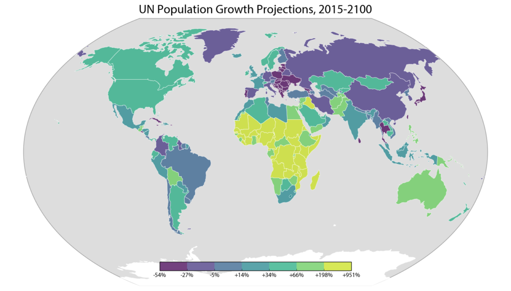
The world population is expected to grow from about 7.3 billion people today to 11.2 billion in 2100. While the populations of Eastern Europe, Taiwan, and Japan are projected to decline significantly over the 21st century, the U.N. projects Africa’s population to grow by an incredible 3.2 billion people. This map depicts each country’s projected percentage change in population from 2015 to 2100:
There are about 1.2 billion people in Africa today, and by 2100, Africa’s population is projected to grow by an additional 3.2 billion. For comparison, the entire world population is projected to grow by a total of 3.86 billion in this time, which means that outside of Africa, the rest of the world will add only 660 million people.
Africa alone accounts for an incredible 83% of the world’s projected population growth between 2015 and 2100:
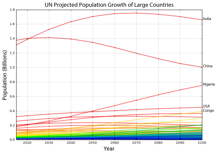
In contrast, the U.N. projects Japan, Taiwan, China, Thailand, and Eastern Europe (among others) to decline significantly in population. Here are the projected population trends over time for each country that currently has at least 10 million people:
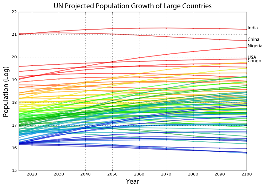
Each country’s trend line is colored from red to violet based on 2015 population. I annotated the lines of the projected 5 most populous countries in 2100 (India, China, Nigeria, USA, and Congo) on the right. Notice that China loses 400 million people between 2030 and 2100. India is projected to overtake China in population within the next decade, and Nigeria is projected to overtake the U.S. by 2050.
These trend lines are much easier to see (even if somewhat less interpretable) when we plot the logarithm of population:
Again each country’s trend line is colored by 2015 population, and we can see major population increases by several of the blue and violet lines in particular. So which nations does the U.N. project to experience the greatest percentage gains and losses in population? First the losses:
Like we saw in the map at the beginning, Eastern Europe dominates the ranks of greatest projected population declines. The populations of Moldova, Bulgaria, and Bosnia are all projected to decrease by 50% or more. Interestingly though, “Asian tiger” Taiwan is also projected to decline by nearly half.
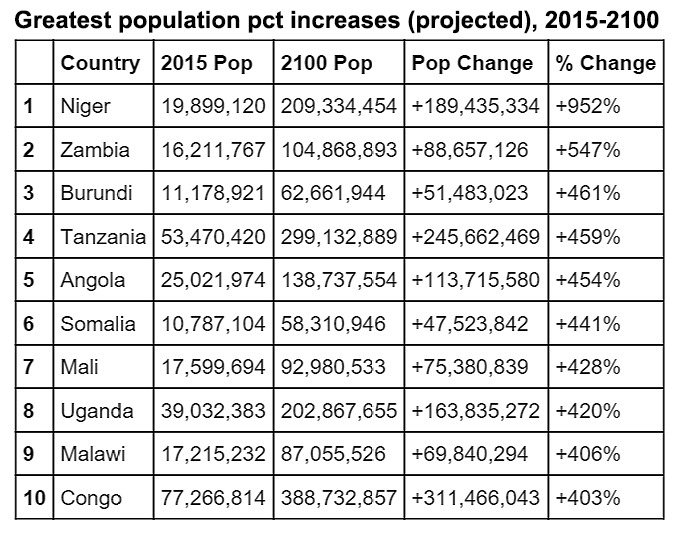
Next, the greatest projected population increases:
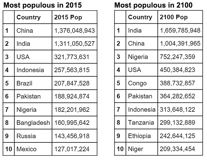
As we saw earlier, African countries dominate the ranks of greatest population gains. Niger is projected to increase its population 10 fold, from approximately 20 million today to 209 million in 2100. Congo is projected to add 311 million people (approximately as many as live in the U.S. today).
Lastly, I took a look at how the “top 10” list of most populous countries will change between 2015 and 2100:
All of these analyses use the U.N.’s baseline “medium variant” scenario. But if today’s fertility rates were to remain constant through 2100, Nigeria and India would each have populations of 2.7 billion people, Congo would have 1.7 billion, and Ethiopia, Pakistan, and Niger would each have about 1 billion. This constant fertility scenario is admittedly completely implausible, but it’s interesting for comparison.
Our world is rapidly urbanizing and the 21st century will see massive population growth in the poorer nations of the Global South – especially Africa. What models of urbanization will these future giants follow as they grow? Today the Global North comprises 25% of the world’s population yet controls 80% of its income. How different will our world look at the close of this century?
All of my code is available on GitHub. I did the analysis, line charts, and choropleth map in Python. The World Population Prospects data set, 2015 revision, is available online from the U.N. Department of Social and Economic Affairs, Population Division. I presented their medium variant projections, as they serve as the U.N.’s baseline scenario. But for a real trip, try running my code on their constant fertility projections (available in the same data set).



One reply on “World Population Projections”
[…] 4,4 miljard zijn. Dat gaat samen met een gigantische verstedelijking van dit continent. Aldus een analyse van Geoff Boeing. Afrika’s groei vraagt om beheersing, stroomlijning en planning door […]