How big is Greenland? It’s huge, right? At 836,109 square miles in size, Greenland is the largest island and the 12th largest country on Earth. With only 56,000 people living in that enormous area (80% of which is covered by the world’s only extant ice sheet outside of Antarctica), it is also the least densely populated country on Earth.
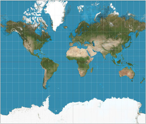
You can get a sense of how large Greenland is when you look at a map of the world:

It’s huge! Greenland is bigger than the entire continent of Africa! Or is it? The map above uses the common Mercator projection to project the 3-D surface of the Earth onto a 2-D surface suitable for a paper map or an image on your computer screen. But it’s not easy to project the curved surface of a sphere onto a rectangular plane. Compromises must be made. In the case of the Mercator projection, the compromise is that objects’ sizes become increasingly distorted the further they are from the equator. At the poles, the scale and distortion become infinite.
Thus, polar regions like Greenland and Antarctica appear unrealistically large. How unrealistically large? Very unrealistically large.
So Greenland isn’t as big as it’s been made out to be, but don’t hold that against it. It’s still pretty big. But why is it so distorted on so many maps?
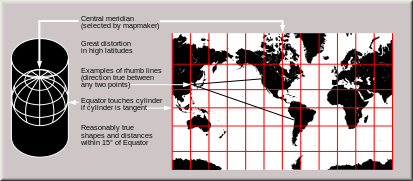
The Mercator projection was developed by the Flemish cartographer Gerardus Mercator in 1569. It quickly became the standard for maritime navigation because it represented each meridian line and circle of latitude as a straight line. In other words, were you to travel (in the real world) along a straight line, you could trace your path along a similarly straight line on a Mercator map:
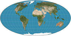
A Mercator projected map is a conformal map – one that preserves all angles locally. Contrast that with this Mollweide projection, which is an equal-area map that preserves area at the expense of distorting shapes:
So it seems that some map projections lie and distort reality! Can we avoid this deceit by choosing a better projection? Yes and no. There is no ideal projection, and all distort reality in some way, to some degree. A topic as obscurely technical as map projections can quickly become a potent tool for propaganda or activism.
For example, the Mercator projection makes traditionally powerful Northern Hemisphere nations appear larger and more important than the poorer Global South, subtly shaping people’s perceptions and understandings of the world. A Mercator map makes Europe appear to be larger than South America, even though it is only 56% its size in reality. And it makes Greenland appear larger than Africa, though it is only 7% its size in reality.
If we are systematically taught to underestimate Africa’s size, what happens subconsciously to our expectations of its population, diversity, and importance? It’s far too easy to reduce “Africa” to a simple and unrealistically small geopolitical monoculture. As consumers, we need to be aware of projections – and what they distort or represent accurately – when we read maps.
Mercator isn’t necessarily bad. The angular consistency of a conformal projection can’t be beat when it comes to portraying streets and buildings – that’s why Google Maps and Leaflet use Mercator! Go ahead, open up Google Maps and see how big Greenland looks.
The very nature of projecting a 3-D spheroid’s surface into two dimensions requires compromise. Every mapping task should include an analysis of the trade-offs between different projections – and different projections will be preferred in different situations. What story is your projection going to tell?


2 replies on “Map Projections That Lie”
Biggest eye opener I have experienced all summer (which includes my summer courses at Cal)! I think it’s very insightful that you not only corrected the descrepancies between the maps but also how you opened the psychological subconscious framework that is laid out unintentionally. Great read!
[…] Source: Geoff Boeing […]