Visualizing Chaos and Randomness
In a previous post, I discussed chaos theory, fractals, and strange attractors - and their implications for knowledge and prediction of systems. I also briefly touched on how phase diagrams (or Poincaré plots) can help us visualize system attractors and differentiate chaotic behavior from true randomness.
In this post (adapted from this paper), I provide more detail on constructing and interpreting phase diagrams. These methods are particularly useful for discovering deterministic chaos in otherwise random-appearing time series data, as they visualize strange attractors. I’m using Python for all of these visualizations and the source code is available in this GitHub repo.
Background: Chaos and the Logistic Model
The logistic map is a simple function that models growth dynamics by mapping a population’s value at any time step to its value at the next time step. The population level at any given time is a function of a growth rate parameter and the previous time step’s population level. If the growth rate is too low, the population will die out and go extinct. Higher growth rates might settle toward a stable value or fluctuate across a series of population booms and busts.
As simple as this function is, at certain growth rate parameters it can produce stability, periodic oscillations, or chaos. A bifurcation diagram is one way to visualize this range of behavior:
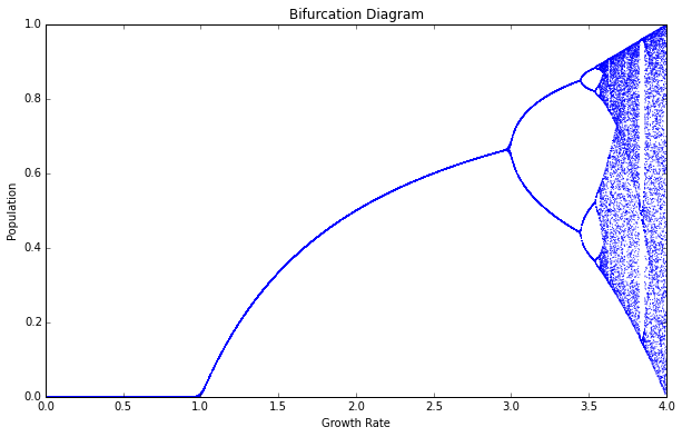
The x-axis depicts 1,000 different growth rate parameters between 0.0 and 4.0, and the y-axis depicts the population value(s) that the system settles down to over time. In other words, this diagram shows the system’s attractor for each growth rate. When the rate is < 1.0, the system settles to a population level of 0. This is extinction. Between rates of 1.0 and 3.0, the system evolves to single, stable population values.
Between rates of 3.0 and 3.5, the population value bifurcates into two lines: it has two stable values that it oscillates between over time. At 3.5, it bifurcates again into four lines: here it oscillates over four different population values. However, when the growth rate parameter moves above 3.6, the system starts behaving erratically. As it approaches 4.0, the system jumps, seemingly randomly, between all population values. I say seemingly randomly because it is definitely not truly random.
Rather, this model follows very simple deterministic rules yet produces apparent randomness. This can make it challenging to differentiate deterministic chaos from true randomness. Fortunately, we can use phase diagrams to tell them apart.
Attractors and Phase Diagrams
A phase diagram is a return map that plots some system value at generation t + 1 on the y-axis versus its value at t on the x-axis. The nifty trick with our phase diagrams is that they essentially embed 1-dimensional time series data from the logistic map into 2-dimensional state space : an imaginary space that uses system variables as its dimensions. Each point in state space is a possible system state, or in other words, a set of variable values.
In our case, the two variables are 1) the population value at generation t and 2) the value at t + 1. For example, if for some (fake) growth rate parameter, the population value at generation 1 is 0.5, the value at generation 2 is 0.75, and the value at generation 3 is 0.25, then our plot will have points at (0.5, 0.75) and (0.75, 0.25). Remember that our model follows a simple deterministic rule, so if we know a certain generation’s population value, we can easily determine the next generation’s value.
To generate these plots, I ran the logistic model for 200 generations and then discarded the first 100 rows, so we only see the values that the system settles toward over time:
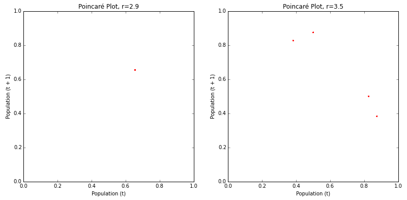
The phase diagram above on the left shows that the logistic map homes in on a fixed-point attractor at 0.655 (on both axes) when the growth rate parameter is set to 2.9. This corresponds to the vertical slice above the x-axis value of 2.9 in the bifurcation diagram shown earlier. The plot on the right shows a limit cycle attractor. When the growth rate is set to 3.5, the logistic map oscillates across four points, as shown in this phase diagram (and in the bifurcation diagram from earlier).
If we adjust the growth rate parameter up to 3.56, we witness a period- doubling bifurcation:
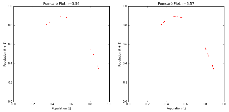
The plot on the left shows the system now oscillating over eight points when the growth rate is set to 3.56. As we approach the chaotic regime (the range of parameter values in which the logistic map behaves chaotically), the period-doubling bifurcations start to come quickly. The plot on the right shows that another two or three bifurcations occurred between the growth rates of 3.56 and 3.57.
A kind of structure is slowly being revealed in these plots, and it’s easier to see when we bump the growth rate deep into the chaotic regime:
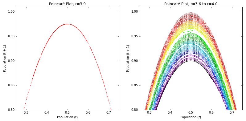
The plot on the left depicts a parabola formed by a growth rate parameter of 3.9. The plot on the right depicts 50 different growth rate parameters between 3.6 and 4.0. Each growth rate is given its own color. Those rates that exhibit chaos form parabolas, but some gaps exist where the system occasionally settles down into periodic behavior, for example when the growth rate is 3.83 (see the bifurcation diagram from earlier).
The previous phase diagrams hinted at the beginnings of a curve, and the plot for r=3.9 fleshes it out. Strange attractors are revealed by these shapes: the system is somehow oddly constrained, yet never settles into a fixed point or a steady oscillation like it did in the earlier phase diagrams for r=2.9 and r=3.5. It just bounces around different population values, forever, without ever repeating the same value twice.
The range of parameters on the right represents the chaotic regime and each growth rate forms its own curve. These parabolas never overlap, due to their fractal geometry and the deterministic nature of the logistic equation. If two different curves could land on the same point, their systems would have to evolve identically over time because the logistic map is deterministic. We can see in these plots that this indeed never happens.
Strange Attractors in 3-D Phase Diagrams
So far we have seen how chaos is revealed in a 2-D plot. We can also create 3-D phase diagrams that embed our 1-dimensional time series data from the logistic map into a 3-dimensional state space. This would depict the population value at generation t + 2 on the z-axis vs the value at generation t + 1 on the y-axis vs the value at t on the x-axis:
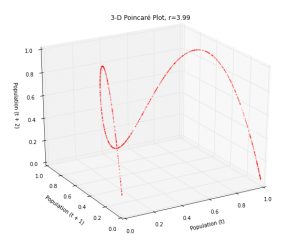
This plot essentially extrudes our original 2-D plot, then pans and rotates the viewpoint. In fact, if we looked straight down at this 3-D plot, it would look exactly like the 2-D version:
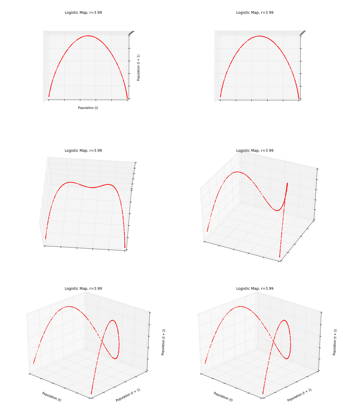
For a detailed description of these animated plots and how to create them, check out this subsequent post. Let’s plot the rest of the logistic map’s chaotic regime in 3-D. This is a 3-D version of the 2-D rainbow parabolas we saw earlier:
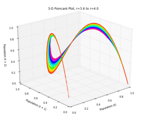
In three dimensions, the beautiful structure of the strange attractor is revealed as it twists and curls around its 3-D state space. This structure demonstrates that our apparently random time series data from the logistic model isn’t really random at all. Instead, it is aperiodic deterministic chaos, constrained by a mind-bending strange attractor.
Let’s pan around and zoom into this 3-D phase diagram to get a better look at its structure:
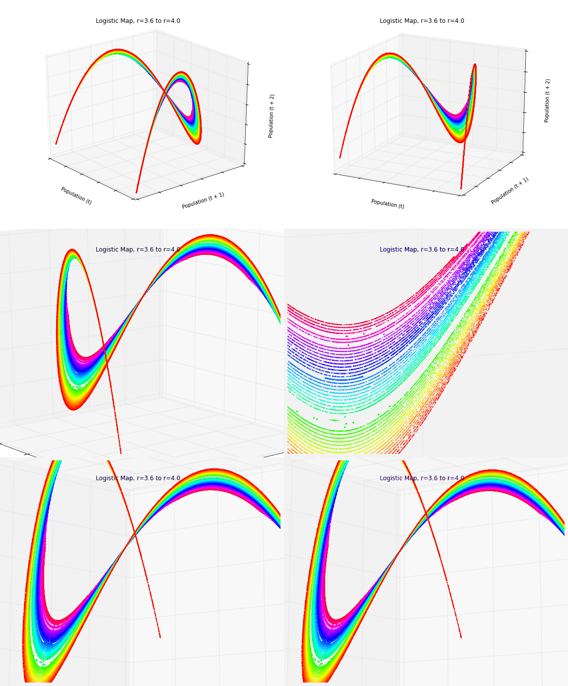
When we zoom in, we can more clearly see how the parabolas never overlap and no point ever repeats itself. We can also see those growth rates that exhibit oscillating periodic behavior instead of chaos, as they do not form a complete parabola (for example, the gap in light green).
Chaos in Time Series Data
Phase diagrams are useful for revealing chaos in time series data (like that produced by the logistic map), because they embed this 1-dimensional data set into a 2- or even 3-dimensional state space. Indeed, it can be hard to tell if certain time series are chaotic or just random when you don’t fully understand their system’s underlying dynamics. Take these two as an example:
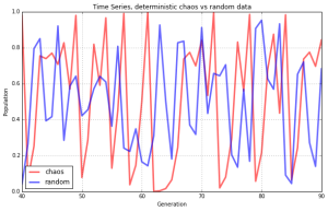
Both of the lines seem to jump around randomly. The red line does depict random data, but the blue line comes from our logistic model when the growth rate is set to 3.99. This is deterministic chaos, but it’s hard to differentiate it from randomness. So, let’s visualize these same two data sets with phase diagrams instead of line charts:
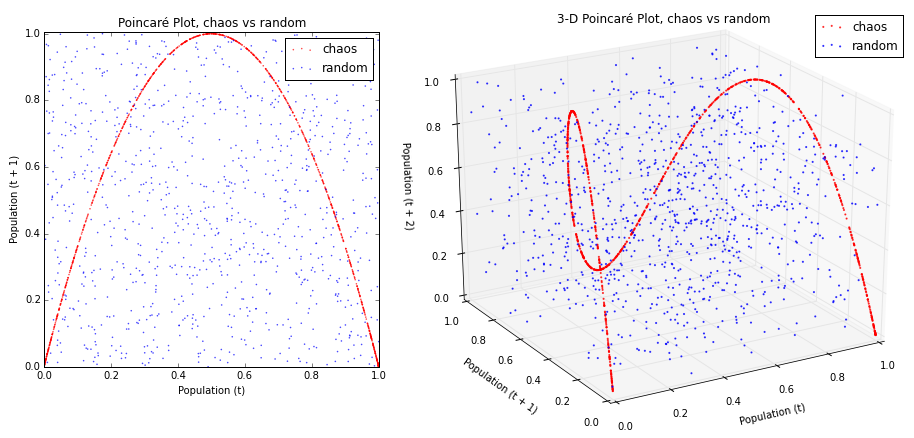
Now we can see our chaotic system (in red, above) constrained by its strange attractor. In contrast, the random data (in blue, above) just looks like noise. Animating this 3-D plot makes the distinct structures of the two data sets even clearer:
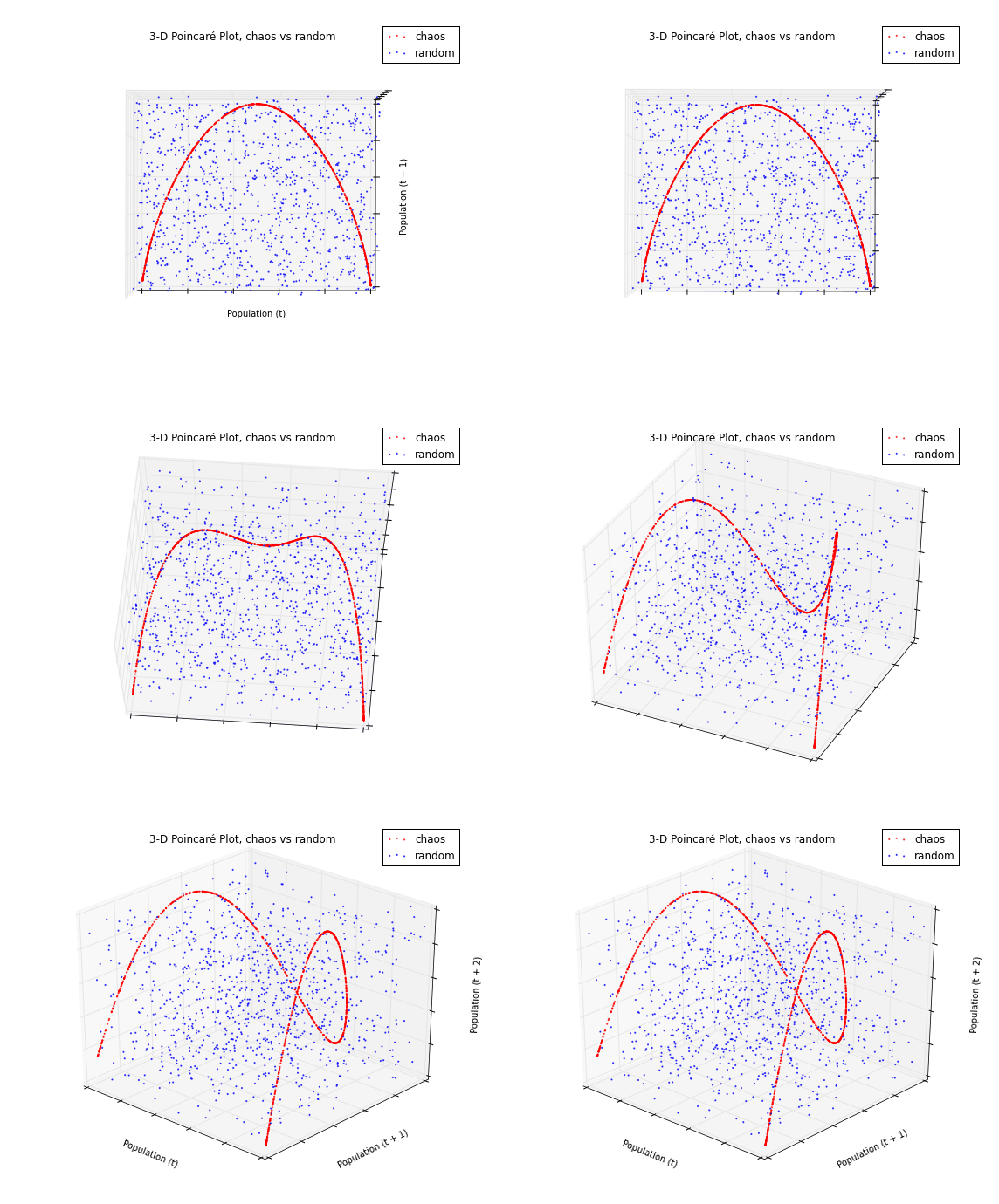
Visualizing data in this way can help researchers identify chaos in data sets whose underlying dynamics are not well known. Our chaotic and random time series data were 1-dimensional. By embedding each into 2- and 3-dimensional state space, we are able to see the hidden structure of the chaotic data set. The random time series just looks like noise, but the strange attractor that constrains our chaotic time series is revealed as it curves through state space.
Wrap-Up
Real-world chaotic and fractal systems include leaky faucets, ferns, heart rates, and random number generators. Many scholars have studied the implications of chaos theory for the social sciences, cities, and urban planning. Chaos fundamentally indicates that there are limits to knowledge and prediction: some futures may be unknowable with any precision.
You can download/cite the paper here. For a wider-ranging intro to chaos and the logistic map, check out my previous post. For more on creating animated 3-D data visualizations in Python, check out this post. All of the Python code that I used to run the model and produce these graphics is available in this GitHub repo. All of its functionality is thoroughly commented, but leave a note if you have any questions or suggestions. Feel free to play with it and explore the beauty of chaos.