Categories
Data

Animated 3-D Plots in Python

Download/cite the paper here!

In a previous post, I discussed chaos, fractals, and strange attractors. I also showed how to visualize them with static 3-D plots. Here, I’ll demonstrate how to create these animated visualizations using Python and matplotlib. All of my source code is available in this GitHub repo. By the end, we’ll produce animated data visualizations like this, in pure Python:

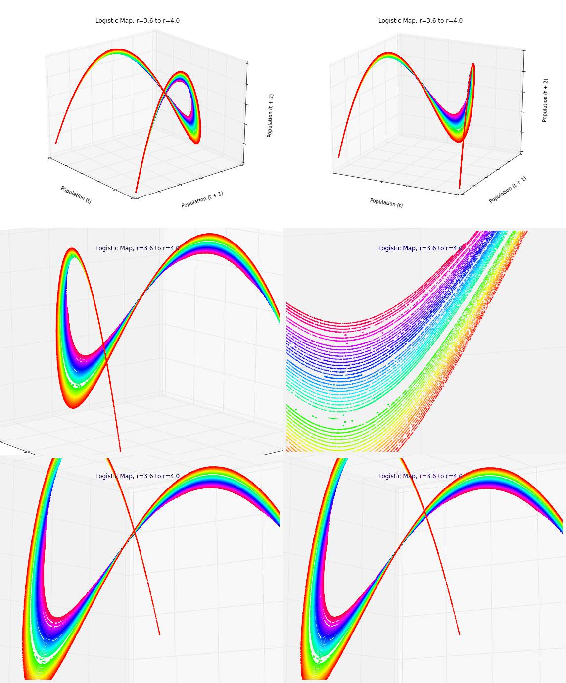
Animated 3-D Poincare plot of the logistic map's chaotic regime - this is time series data embedded in three dimensional state space

Categories
Data

Visualizing Chaos and Randomness

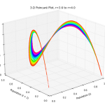
3-D Poincare plot of the logistic map's chaotic regime - this is time series data embedded in three dimensional state space

Download/cite the paper here!

In a previous post, I discussed chaos theory, fractals, and strange attractors – and their implications for knowledge and prediction of systems. I also briefly touched on how phase diagrams (or Poincaré plots) can help us visualize system attractors and differentiate chaotic behavior from true randomness.

In this post (adapted from this paper), I provide more detail on constructing and interpreting phase diagrams. These methods are particularly useful for discovering deterministic chaos in otherwise random-appearing time series data, as they visualize strange attractors. I’m using Python for all of these visualizations and the source code is available in this GitHub repo.