This post is part of a series on visualizing data from my summer travels.
I’ve previously discussed visualizing the GPS location data from my summer travels with CartoDB, Leaflet, and Mapbox + Tilemill. I also visualized different aspects of this data set in Python, using the matplotlib plotting library. However, these spatial scatter plots used unprojected lat-long data which looked pretty distorted at European latitudes.
Today I will show how to convert this data into a projected coordinate reference system and plot it again using matplotlib. These projected maps will provide a much more accurate spatial representation of my spatial data and the geographic region. All of my code is available in this GitHub repo, particularly this notebook.
Projected vs. not projected
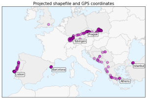
In my previous post, I created several plots of my GPS location data. However, this lat-long data and the shapefile I used as a basemap were distorted at these European latitudes because the spatial data was not projected. The easiest way to understand this distortion is to see it visually. Here is the very simple but very distorted plot of my lat-long data, from the previous post:
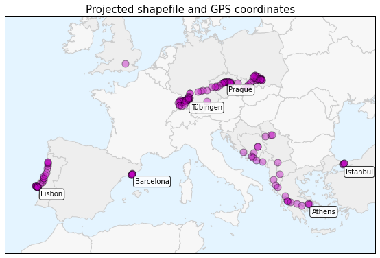
And here is the projected data in a more geographically representative plot which I will create today in this post:
You can see the horizontal distortion in the top image: France, Germany, England, etc are too wide because the three dimensional lat-long data from the surface of the Earth is stretched onto a two dimensional surface. At these high latitudes, the longitude lines are converging toward each other, but this plot stretches them to parallel equidistant lines.
The bottom plot, which I will walk through momentarily, projects the shapefile and the point data into a coordinate system that is more appropriate for representing spatial data in Europe. I will explain more about how this works in a second.
Getting started
First I’m going to import the necessary Python modules I’ll be working with. I’ll use pandas and numpy for data analysis. The matplotlib modules are for plotting the visualizations. The descartes library is used to convert the shapes into plottable objects. Lastly, shapely, geopy, and geopandas will perform spatial and geographic calculations and analysis.
Then I load two location data sets: one is the original full set and the other is a clustered, reduced set of location data points. Both of these data sets have been reverse-geocoded so I have lat-long coordinates, city, and country data. Finally I load a shapefile of world country borders as a geopandas GeoDataFrame.
import pandas as pd, numpy as np, matplotlib.pyplot as plt, matplotlib.font_manager as fm
from shapely.geometry import Polygon, Point
from geopy.distance import great_circle
from geopandas import GeoDataFrame
from descartes import PolygonPatch

df = pd.read_csv('data/summer-travel-gps-full.csv', encoding='utf-8')
rs = pd.read_csv('data/summer-travel-gps-dbscan.csv', encoding='utf-8')
all_countries = GeoDataFrame.from_file('shapefiles/world_borders/TM_WORLD_BORDERS-0.3.shp')
Next I define fonts to use for my plot titles and annotation labels, and a pale blue background color (like, um, water) for my plots:
title_font = fm.FontProperties(family='Bitstream Vera Sans', style='normal', size=15, weight='normal', stretch='normal')
annotation_font = fm.FontProperties(family='Bitstream Vera Sans', style='normal', size=10, weight='normal', stretch='normal')
backgroundcolor = '#e4f4ff'
Defining projections and projecting the data
My country borders shapefile comes with a .prj file that states its coordinate reference system (or CRS) is WGS84 and doesn’t define a projection. The problem is that I am projecting this data onto a two-dimensional surface (my matplotlib canvas), which distorts shapes at high latitudes.
The solution is to project my shapefiles and point data into a projected coordinate system appropriate for Europe’s location on the globe. First I’ll extract the original shapefile CRS. Then I define a new projected CRS to convert it and my point data into. I convert the shapefile’s projection with the to_crs() method, which uses pyproj.
My target CRS will be Albers equal area. I specify two standard parallels near the lower and upper extents of my point data, and a false origin near the center of my point data. The Albers projection minimizes distortion between these standard parallels and is good at representing relative sizes across the projected area.
original_crs = all_countries.crs
target_crs = {'datum':'WGS84', 'no_defs':True, 'proj':'aea', 'lat_1':35, 'lat_2':55, 'lat_0':45, 'lon_0':10}
all_countries.to_crs(crs=target_crs, inplace=True)
Now I’ll turn my attention back to the point data. First I create a new geometry column containing shapely Point objects in my point data set’s DataFrame. Then I create a new geopandas GeoDataFrame from the point data. Lastly, I specify its CRS as unprojected WGS84, just like the original shapefile, because the location data set contains lat-long values. I have to specify the GeoDataFrame’s original CRS to convert it to a different (projected) one later.
rs['geometry'] = rs.apply(lambda row: Point(row['lon'], row['lat']), axis=1)
points = GeoDataFrame(rs)
points.crs = original_crs
Next I’ll convert this point data set to the same projected CRS I specified earlier for the shapefile. Then I create two new columns – x and y – and convert the projected points into these discrete columns for easy matplotlib scatter-plotting.
points.to_crs(crs=target_crs, inplace=True)
points['x'] = points['geometry'].map(lambda point: point.x)
points['y'] = points['geometry'].map(lambda point: point.y)
Plotting the most visited cities
Ok, my shapefile and point data are both projected now. It’s time to define some values to use later in the plotting. First, I’ll calculate a margin width value so my data points don’t run right up to the edges of the plotting canvas. Then, I’ll calculate the spatial extent of the projected point data, plus or minus those margin widths. Lastly, I’ll use these values to set the size of the plotting figure.
x_margin_width = (points.bounds['maxx'].max() - points.bounds['minx'].min()) / 10
y_margin_width = (points.bounds['maxy'].max() - points.bounds['miny'].min()) / 3

xlim = (points.bounds['minx'].min() - x_margin_width, points.bounds['maxx'].max() + x_margin_width)
ylim = (points.bounds['miny'].min() - y_margin_width, points.bounds['maxy'].max() + y_margin_width)

xdim = (xlim[1] - xlim[0]) / 400000
ydim = (ylim[1] - ylim[0]) / 400000
I’ll also use these values to create a rectangle encompassing the spatial extent of my point data. Then, I can select all the countries whose borders intersect with this rectangle. Doing so drastically cuts down the size of my country borders data set – making it much faster to work with later.
spatial_extent = Polygon([(xlim[0], ylim[0]),
                       (xlim[0], ylim[1]),
                       (xlim[1], ylim[1]),
                       (xlim[1], ylim[0])])
countries = all_countries[all_countries['geometry'].intersects(spatial_extent)]
I need to write a short function to convert each of the shapely Polygon objects in my country borders data set into descartes PolygonPatch objects to plot them later. First, I’ll specify colors for my country borders and interiors, choosing different patch colors for countries that I did and did not visit.
Then, for each country in the data set, I’ll convert its geometry to a PolygonPatch and append it to a list that will eventually contain all the patches. This would be straightforward if all the geometries were Polygon objects – but some are actually MultiPolygon objects that each contain multiple Polygon objects. This is the case for those countries that contain islands. They have one Polygon shape for their mainland, and other Polygon objects for the island geometries.
def get_patches(countries, visited_countries):

    facecolor = '#f7f7f7'
    visited_facecolor = '#eeeeee'
    edgecolor = '#cccccc'
    patches = []

    for i, row in countries.iterrows():
        if type(row['geometry']) == Polygon:
            fc = visited_facecolor if row['NAME'] in visited_countries else facecolor
            patch = PolygonPatch(row['geometry'], fc=fc, ec=edgecolor, zorder=0)
            patches.append(patch)
        else:
            for polygon in row['geometry']:
                fc = visited_facecolor if row['NAME'] in visited_countries else facecolor
                patch = PolygonPatch(polygon, fc=fc, ec=edgecolor, zorder=0)
                patches.append(patch)
    return patches
Next I’ll get a representative point in my data set for each of the six most visited countries in the full data set, so I can annotate them on the map.
most_index = df['city'].value_counts().head(6).index
most = pd.DataFrame(points[points['city'].isin(most_index)])
most.drop_duplicates(subset=['city'], take_last=False, inplace=True)
Next I’ll get a list of visited countries so I can give those patches a different color. I also need to fix the name of Macedonia in the country borders data set so it matches what I have in my point data set.
visited_countries = rs['country'].unique()
countries = countries.replace('The former Yugoslav Republic of Macedonia', 'Macedonia (FYROM)')
Now I’m ready to plot a map of my GPS point data, the projected shapefile of country borders, and annotations for my most visited cities. First I’ll create a matplotlib figure and axis, and set the background color that I specified earlier.
Next, I add each patch that I extracted earlier from the GeoDataFrame’s geometry column to the axis to plot it. Then, I add the projected point data to the axis as a scatter plot. I set the axes limits to the values I calculated and remove the tick marks/labels. Because this is a plot of projected geometries, the ticks are confusing northings and eastings. We’re better off without them on the axes.
Lastly, I annotate each of the most visited cities on the map and then show the plot:
fig = plt.figure(figsize=(xdim, ydim))
ax = fig.add_subplot(111)
ax.set_axis_bgcolor(backgroundcolor)

for patch in get_patches(countries, visited_countries):
    ax.add_patch(patch)
points_scatter = ax.scatter(x=points['x'], y=points['y'], c='m', alpha=0.4, s=100)

ax.set_title('Projected shapefile and GPS coordinates', fontproperties=title_font)
ax.set_xlim(xlim)
ax.set_ylim(ylim)
ax.set_xticks([])
ax.set_yticks([])

for i, row in most.iterrows():
    plt.annotate(row['city'],
                 xy=(row['x'], row['y']),
                 xytext=(row['x'] + 35000, row['y'] - 100000),
                 bbox=dict(boxstyle='round', color='k', fc='w', alpha=0.8),
                 xycoords='data')
plt.show()
The plot above depicts a map of Europe with my GPS location data plotted on top of it. The top six most visited cities are annotated on the map: Lisbon, Barcelona, Prague, Tuebingen, Athens, and Istanbul. The country borders and point data are all projected to preserve relative sizes at European latitudes. The countries are shaded different colors indicating if I visited them or not. It looks much better than the simple, unprojected plots in the previous post.
Plotting the most isolated locations
Next, I will calculate and plot the most isolated locations in the data set. I won’t go into a full explanation of the logic here because it is thoroughly explained in the previous post.
The short story is that for each point in the data set, I’ll loop through all other points in the data set, calculating the great circle distance between the two points using geopy’s great_circle() function. Then, for each point, I save the label of the other point that is the shortest distance (greater than 20 miles) from it:
threshold = 20
points['nearest_point'] = None
points['nearest_dist'] = None

for i, row in rs.iterrows():
    point1 = (row['lat'], row['lon'])
    for i2, row2 in rs.iterrows():
        if(i != i2):
            point2 = (row2['lat'], row2['lon'])
            dist = great_circle(point1, point2).miles
            if pd.isnull(points.loc[i, 'nearest_dist']) | ((dist > threshold) & (dist < points.loc[i, 'nearest_dist'])):
                points.loc[i, 'nearest_dist'] = dist
                points.loc[i, 'nearest_point'] = i2
Now I know the nearest neighbor of each point in the data set. I’ll sort by distance, then drop duplicates and take the top five rows. These are representative points of the five most isolated clusters in my data set:
most_isolated = points.sort('nearest_dist', ascending=False).drop_duplicates(subset='nearest_point', take_last=False)
most_isolated = most_isolated.head(5)
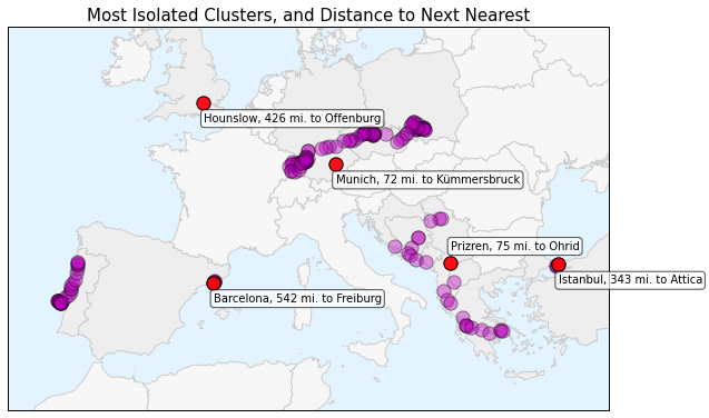
Now I can plot the most isolated clusters in the data set, using the projected country borders as a basemap. On top of that I will plot the GPS location point data and the most isolated point data. Lastly, I’ll annotate each of the most isolated clusters with the city name, the distance to the nearest neighbor, and that nearest point’s city name.
fig = plt.figure(figsize=(xdim, ydim))
ax = fig.add_subplot(111)
ax.set_axis_bgcolor(backgroundcolor)

for patch in get_patches(countries, visited_countries):
    ax.add_patch(patch)
points_scatter = ax.scatter(points['x'], points['y'], c='m', alpha=.4, s=150)
isolated_scatter = ax.scatter(most_isolated['x'], most_isolated['y'], c='r', alpha=.9, s=150)

ax.set_title('Most Isolated Clusters, and Distance to Next Nearest', fontproperties=title_font)
ax.set_xlim(xlim)
ax.set_ylim(ylim)
ax.set_xticks([])
ax.set_yticks([])

for i, row in most_isolated.iterrows():
    xytext = (row['x'], row['y'] - 120000) if row['city'] != 'Prizren' else (row['x'], row['y'] + 90000)
    ax.annotate(row['city'] + ', ' + str(int(row['nearest_dist'])) + ' mi. to ' + rs['city'][row['nearest_point']],
                 xy=(row['x'], row['y']),
                 xytext=xytext,
                 fontproperties=annotation_font,
                 bbox=dict(boxstyle='round', color='k', fc='w', alpha=0.7),
                 xycoords='data')

plt.show()
The plot above shows the projected GPS location data set in magenta and highlights the most isolated points in red: Barcelona, Hounslow (outside of London), Munich, Prizren, and Istanbul. Each point’s annotation shows how far it is from its nearest neighbor. You can see that Barcelona, Hounslow, and Istanbul are by far the most isolated points, each being over 300 miles from their nearest neighbors.
Wrap up
In my previous post, I created several simple plots of my GPS location data that didn’t bother with projection. However, the data was spatially distorted at these European latitudes. The projected plots of my most visited cities and most isolated locations that I’ve created here look much better.
I converted my point data and my shapefile basemap into the Albers equal area projection. This minimizes distortion and is pretty good at representing relative sizes without the horizontal stretching you saw in the previous post’s plots. Python’s geopandas and pyproj libraries make up a powerful toolkit for GIS analysis, spatial data projection, and simple cartography.


8 replies on “Visualizing Summer Travels Part 6: Projecting Spatial Data with Python”
Hi Geoff,
Thanks for sharing this. I’m new at the whole gis and mapping thing and found this very useful.
Following your steps in a notebook I found that iterating through rows as you do at some points is very inefficient. You could get rid of some of the loops using the apply method. For example:
Instead of
rs[‘geometry’] = None
for i, row in rs.iterrows():
rs[‘geometry’][i] = Point(row[‘lon’], row[‘lat’])
you could do
rs[‘geometry’] = rs.apply(lambda row: Point(row[‘lon’], row[‘lat’]), axis=1)
and instead of
for i, row in points.iterrows():
points[‘x’][i] = row[‘geometry’].x
points[‘y’][i] = row[‘geometry’].y
do
points[‘x’], points[‘y’] = zip(*points.apply(lambda row: (row[‘geometry’].x, row[‘geometry’].y), axis=1))
Keep up sharing more python workflows for GIS!
Best,
Pau
I am really enjoying diving into GeoPandas. I have three questions for you. Firstly if I have a GeoDataFrame and I want to plot US counties, sometimes the projection makes the eastern counties so dense that I can’t see my plotted values. What is the attribute of GDF.plot() to make the boundaries of the geometries go away when plotting. Secondly, the colormaps are cool but how can I gain more control over the binning and show a legend in my plots? Lastly, could you please offer a little more clarify on the projections how they work? I just grabbed shapefiles and plotted but what is the implied projection and how could I change it?
Excellent points Pau. I had originally developed that code to share with a class of students familiar with iteration but unfamiliar with mapping functions across a vector of data. I should re-write those sections of code to take advantage of Python’s apply and map — they are far more efficient, as you correctly pointed out.
Daniel —
1. You can see my technique for addressing this problem in the get_patches() function that I defined. In particular, note how I set the edgecolor value “ec” for each patch.
2. It depends on what you mean by binning when it comes to your shapefile. The easiest way probably is to just calculate and then set bin values in a column of the geodataframe, then use these to ascribe patch facecolors or edgecolors (for instance, like in the technique I mentioned in #1 above). Regarding a legend, this is all being plotted with matplotlib, so you can just use their legend functionality. It’s described in the matplotlib documentation.
3. Shapefile projections can be a real pain. If your data came with a .prj file like it should have, that will tell you projection. If it didn’t, there is no good or easy way to figure out the projection. I would contact the data provider/creator if possible. Or if it’s a fairly common data set (like U.S. counties), just find another shapefile that has all of the necessary attendant files (like .prj) intact. Then you can manipulate the projection and re-project it like I described in this post.
I am afraid that your suggestion on the edge colors is not what I am looking for. This is a snippet of my code
sub_dir_county = ‘cb_2013_us_county_5m/’
shapefile_county = ‘cb_2013_us_county_5m.shp’
admin_2 = geo.GeoDataFrame.from_file(data_dir+sub_dir_county+shapefile_county)
sub_dir_state = ‘ne_50m_admin_1_states_provinces_lakes/’
shapefile_state = ‘ne_50m_admin_1_states_provinces_lakes.shp’
admin_1 = geo.GeoDataFrame.from_file(data_dir+sub_dir_state+shapefile_state)
states = admin_1.ix[admin_1.admin == ‘United States of America’]
sub_dir_world = ‘ne_50m_admin_0_countries/’
shapefile_world = ‘ne_50m_admin_0_countries.shp’
world = geo.GeoDataFrame.from_file(data_dir+sub_dir_world+shapefile_world)
fig = plt.figure(figsize=(10, 10))
world[‘dummy’] = 0.5
world.plot(column=’dummy’, colormap=’gist_gray’)
states[‘dummy’] = 1.0
states.plot(column=’dummy’, colormap=’bone_r’)
map_data.plot(column=’port_loss_log’, colormap=’coolwarm’, legend=False, alpha=1)
—————-
I do not see how we can both loop through each county and assign its boundary and preserve the colormap which is dependent on the value of all the set of counties? Is there a way of assigning a colormap column to the geodataframe and then using your get_patches function and assign the facecolor that way?
If you want more fine-grained control, you might not want to use a colormap. You may want to loop through your features and set styles like I demonstrated. FlowingData also provides a tutorial for making chloropleth maps this way but isn’t quite as refined as my method. Or, check out a Python package like vincent to handle more of the syntax under the hood.
[…] scientific computing Python stack, via Anaconda: we introduce numpy, scipy, statsmodels, pandas for data analysis, and matplotlib for […]
[…] Yes. Pandas is just a data analysis library for python. It is spatially agnostic. Geopandas basically spatializes pandas. It lets you add a geometry column to your pandas dataframes so you can work with shapefiles, geojson, etc. And it supports pretty robust spatial analysis and projections. I give a run-through of some of these capabilities in my post on projecting spatial data with python. […]