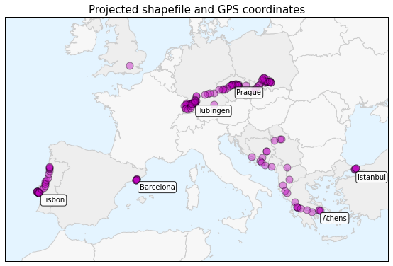
 This is a series of posts about visualizing spatial data. I spent a couple of months traveling in Europe this summer and collected GPS location data throughout the trip with the OpenPaths app. I explored different web mapping technologies such as CartoDB, Leaflet, Mapbox, and Tilemill to plot my travels. I also used Python and matplotlib to run some descriptive statistics and visualize other aspects of my trip.
Here is the series of posts:
- Part 1: introduction and data collection with OpenPaths
- Part 2: interactive web maps with CartoDB
- Part 3: interactive javascript web maps with Leaflet
- Part 4: interactive tiled web maps with Mapbox and Tilemill
- Part 5: visualizing data with Python and matplotlib
- Part 6: projecting spatial data and making beautiful maps with Python
My Python code is available in this GitHub repo. I also did some more involved work under the hood to prep the data and support these visualizations. For example, in the following posts I reverse-geocoded the spatial data set and reduced its size with clustering algorithms and the Douglas-Peucker algorithm:
- Reverse-geocoding the data set to get city and country data
- Reducing the size of the data set with DBSCAN clustering
- Reducing the size of the data set with the Douglas-Peucker algorithm
This series serves as an introduction and tutorial for these various technologies and methods. It was a rewarding exercise to explore these different web mapping platforms, write a reverse-geocoder, and practice clustering and geometry simplification. Click the links through to the individual posts for full details and lots of visualizations.
Interactive maps
Here are some brief highlights. This interactive CartoDB map displays my location data set and provides city, country, and date/time information if you hover over any point:
I also visualized this spatial data as an interactive map using the Leaflet javascript library, and by rolling my own set of web map tiles then rendering them with Tilemill and Mapbox.
Exploring the data set
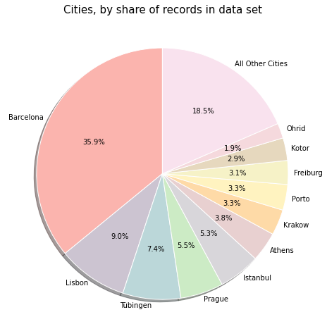
Beyond mapping my GPS location points, I also visualized other aspects of this data set. This matplotlib pie chart breaks out the cities I visited, by their share of observations in the data set:
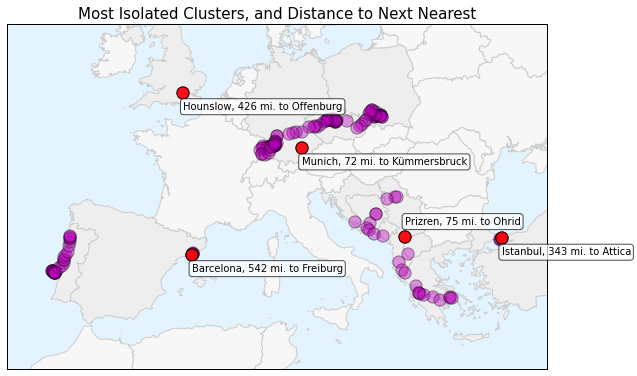
I also calculated the most isolated locations in my data set. These locations are spatially isolated from other data points either because I flew in/out of them, or because I didn’t have cell service to transmit location data anywhere else near them. This matplotlib image plots a projected shapefile and my GPS location data to show these isolated clusters:
There is much more in the full posts, along with full explanations of how I developed everything and visualized different aspects of the trip.


One reply on “Visualizing Summer Travels”
[…] Visualizing Summer Travels by Geoff Boeing. A mix of Show&Tell and visualization here. Geoff is a graduate student and as part of his current studies he’s exploring mapping and visualization techniques. If you’re interested in mapping your personal GPS data, especially OpenPaths data, Geoff has posted a variety of tutorials you can use. […]