This post is part of a series on visualizing data from my summer travels.
I’ve previously discussed visualizing the GPS location data from my summer travels with CartoDB, Leaflet, and Mapbox + Tilemill. Today I will explore visualizing this data set in Python, using the matplotlib plotting library. All of my code is available in this GitHub repo, particularly this notebook.
Getting started
First I’m going to import the necessary Python modules I’ll be working with. Then I load two location data sets: one is the original full set and the other is a clustered, reduced set of location data points. Both of these data sets have been reverse-geocoded so I have lat-long coordinates, city, and country data.
For the full data set, I’ll use its timestamp column as its index. For the reduced data set, pandas will automatically generate the index. The data files are encoded as utf-8: I need to specify this encoding to prevent matplotlib from choking on diacritics in some of the city names. Lastly, I’ll define font properties for the plot titles, axis labels, tick labels, and annotations, and the background color to use in the plots.
import pandas as pd, numpy as np, matplotlib.pyplot as plt
import matplotlib.cm as cm, matplotlib.font_manager as fm
from datetime import datetime as dt
from shapely.geometry import Polygon
from geopy.distance import great_circle
from geopandas import GeoDataFrame

df = pd.read_csv('data/summer-travel-gps-full.csv', encoding='utf-8', index_col='date', parse_dates=True)
rs = pd.read_csv('data/summer-travel-gps-dbscan.csv', encoding='utf-8')

title_font = fm.FontProperties(family='Bitstream Vera Sans', style='normal', size=15, weight='normal', stretch='normal')
label_font = fm.FontProperties(family='Bitstream Vera Sans', style='normal', size=12, weight='normal', stretch='normal')
ticks_font = fm.FontProperties(family='Bitstream Vera Sans', style='normal', size=10, weight='normal', stretch='normal')
annotation_font = fm.FontProperties(family='Bitstream Vera Sans', style='normal', size=10, weight='normal', stretch='normal')

axis_bgcolor = '#f0f0f0'
These visualizations rely on several Python packages imported for extended functionality. I’ll use pandas and numpy for data analysis. The matplotlib modules are for plotting the visualizations. The datetime module will be used to analyze the full data set based on its timestamp index. Lastly, shapely, geopy, and geopandas will perform spatial and geographic calculations and analysis.
One thing to note: when I refer to the “most visited” cities, countries, etc throughout this post, I am really referring to the cities, countries, etc with the most observations (aka records or rows) in the data set, as a proxy.
Simple bar charts
I’ll begin with some simple charts to examine which places were visited the most (or, more accurately which places have the most observations in the data set). First I’ll plot the most visited countries.
The procedure will be very similar for each subsequent bar chart, so I’ll explain it this first time. The variable countdata is a pandas series whose index is the names of all the countries in the data set, and whose values are the count of each country’s observations.
Next I use the pandas plot() function to create the plot. Then I use a lambda function to create one tick mark on the x axis for each country, and use the index (aka country name) as the label. I turn the y axis grid on and set the background color. Lastly, I set the title, x axis label, and y axis label, then show the plot.
countdata = df['country'].value_counts()
ax = countdata.plot(kind='bar', figsize=[9, 6], width=0.6, alpha=0.6, color='g', edgecolor='k', grid=False, ylim=[0, 700])

ax.set_xticks(map(lambda x: x, range(0, len(countdata))))
ax.set_xticklabels(countdata.index, rotation=45, rotation_mode='anchor', ha='right', fontproperties=ticks_font)
ax.yaxis.grid(True)
for label in ax.get_yticklabels():
    label.set_fontproperties(ticks_font)

ax.set_axis_bgcolor(axis_bgcolor)
ax.set_title('Most Visited Countries', fontproperties=title_font)
ax.set_xlabel('', fontproperties=label_font)
ax.set_ylabel('Number of GPS records', fontproperties=label_font)
plt.show()
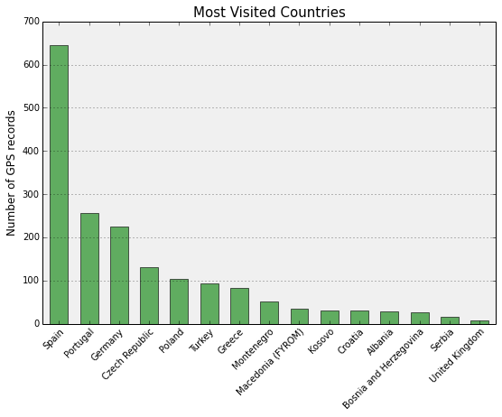
Spain is the clear winner, with about 650 records in the data set. The other countries trail off behind it. I was in Spain for about a month of the total trip and was in Portugal, Germany, and the Czech Republic for about a week each, explaining their numbers of observations and relative positions in the chart.
However, the scaling on this chart isn’t very nice because of the non-linear relationship between these countries’ number of observations in the data set. I’ll transform the data by taking the log of the counts and then re-plot:
countdata = np.log(df['country'].value_counts())
ax = countdata.plot(kind='bar', figsize=[9, 6], width=0.6, alpha=0.6, color='g', edgecolor='k', grid=False, ylim=[0, 7])

ax.set_xticks(map(lambda x: x, range(0, len(countdata))))
ax.set_xticklabels(countdata.index, rotation=45, rotation_mode='anchor', ha='right', fontproperties=ticks_font)
ax.yaxis.grid(True)
for label in ax.get_yticklabels():
    label.set_fontproperties(ticks_font)

ax.set_axis_bgcolor(axis_bgcolor)
ax.set_title('Most Visited Countries', fontproperties=title_font)
ax.set_xlabel('', fontproperties=label_font)
ax.set_ylabel('Log of number of GPS records', fontproperties=label_font)
plt.show()

That looks a bit nicer and represents the relationships between the value counts more linearly. But, it may be misleading in how it represents the relative share of observations across the data set. Next I’ll plot the most visited cities in the data set, without any log transformation:
countdata = df['city'].value_counts().head(13)
ax = countdata.plot(kind='bar', figsize=[9, 6], width=0.6, alpha=0.6, color='b', edgecolor='k', grid=False, ylim=[0, 700])

ax.set_xticks(map(lambda x: x, range(0, len(countdata))))
ax.set_xticklabels(countdata.index, rotation=45, rotation_mode='anchor', ha='right', fontproperties=ticks_font)
ax.yaxis.grid(True)
for label in ax.get_yticklabels():
    label.set_fontproperties(ticks_font)

ax.set_axis_bgcolor(axis_bgcolor)
ax.set_title('Most Visited Cities', fontproperties=title_font)
ax.set_xlabel('', fontproperties=label_font)
ax.set_ylabel('Number of GPS records', fontproperties=label_font)

plt.show()

Barcelona really dominates this chart, followed by Lisbon, Tuebingen, and Prague. Each were cities where I spent extended time.
Scatter plots to visualize spatial data with matplotlib
Now I’ll create a scatter plot of my point data to make a simple map. On it, I’ll annotate the eight most visited cities. The procedure will be very similar for each subsequent scatter plot, so again I’ll explain it a bit this first time. I’ll also provide inline Python comments throughout the coming code to explain what is happening as it moves along.
First I calculate the eight most visited cities (in terms of number of observations) in the full data set, sort by count of observations, and drop the duplicates so I get a single, representative point for each of these eight cities.
Then I create a 10 by 6 inch figure and create the scatter plot, using that lon and lat columns of my reduced data set as the x and y values, respectively. Next I set x and y axis labels, tick mark labels, and the plot’s title. Lastly, I iterate through my dataframe of most visited cities, creating an annotation on the map for each of their points. Note that these are plots of unprojected data – I explain more about this in another post.
#get a representative point from the data set for each of the most visited cities in the full set
most_index = df['city'].value_counts().head(8).index
most = pd.DataFrame(df[df['city'].isin(most_index)])
most.drop_duplicates(subset=['city'], take_last=False, inplace=True)

# plot the reduced set of coordinate points
fig, ax = plt.subplots()
fig.set_size_inches(10, 6)
rs_scatter = ax.scatter(rs['lon'], rs['lat'], c='m', edgecolor='k', alpha=.4, s=150)

# set axis labels, tick labels, and title
for label in ax.get_xticklabels():
    label.set_fontproperties(ticks_font)
for label in ax.get_yticklabels():
    label.set_fontproperties(ticks_font)
ax.set_title('Most Visited Cities', fontproperties=title_font)
ax.set_xlabel('Longitude', fontproperties=label_font)
ax.set_ylabel('Latitude', fontproperties=label_font)
ax.set_axis_bgcolor(axis_bgcolor)

# annotate the most visited cities
for i, row in most.iterrows():
    ax.annotate(row['city'],
    xy=(row['lon'], row['lat']),
    xytext=(row['lon'] + 1, row['lat'] + 1),
    fontproperties=annotation_font,
    bbox=dict(boxstyle='round', color='k', fc='w', alpha=0.8),
    xycoords='data',
    arrowprops=dict(arrowstyle='->', connectionstyle='arc3,rad=0.5', color='k', alpha=0.8))

plt.show()

The scatter plot above maps my point data and indicates the locations of Lisbon, Porto, Barcelona, Krakow, Prague, Tuebingen, Athens, and Istanbul. Let’s do the same thing, only this time annotating the eight most visited countries:
#get a representative point from the data set for each of the most visited countries in the full set
most_index = df['country'].value_counts().head(8).index
most = pd.DataFrame(df[df['country'].isin(most_index)])
most.drop_duplicates(subset=['country'], take_last=False, inplace=True)

# plot the reduced set of coordinate points
fig, ax = plt.subplots()
fig.set_size_inches(10, 6)
rs_scatter = ax.scatter(rs['lon'], rs['lat'], c='m', edgecolor='k', alpha=.4, s=150)

# set axis labels, tick labels, and title
for label in ax.get_xticklabels():
    label.set_fontproperties(ticks_font)
for label in ax.get_yticklabels():
    label.set_fontproperties(ticks_font)
ax.set_title('Most Visited Countries', fontproperties=title_font)
ax.set_xlabel('Longitude', fontproperties=label_font)
ax.set_ylabel('Latitude', fontproperties=label_font)
ax.set_axis_bgcolor(axis_bgcolor)

# annotate the most visited countries
for i, row in most.iterrows():
    ax.annotate(row['country'].decode('utf-8'),
    xy=(row['lon'], row['lat']),
    xytext=(row['lon'] - 1, row['lat'] - 1),
    fontproperties=annotation_font,
    bbox=dict(boxstyle="round", fc="1"),
    xycoords='data')

plt.show()
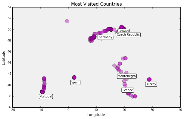
Much like the previous scatter plot, this one displays my coordinate data and indicates the locations of the eight most visited countries in the data set: Portugal, Spain, Poland, the Czech Republic, Germany, Montenegro, Greece, and Turkey.
Notice that the label for the Czech Republic overlaps that of Poland. I could write more code to move one or the other, but this kind of overlap isn’t an uncommon problem, considering the difficulty and computational complexity of automatic label placement.
Turning the scatter plot into a map
This scatter plot would like much more map-like if it had a basemap showing the geographical region and its nation’s borders. To that end, I’ll use the geopandas and shapely libraries to work with a shapefile of country boundaries and create a nicer map of my summer travels.
First I load a shapefile of world country boundaries, using geopandas. Then I get a representative point for each of my six most visited cities:
#load the shapefile of all countries in the world
all_countries = GeoDataFrame.from_file('shapefiles/countries_shp/world_country_admin_boundary_shapefile_with_fips_codes.shp')

# get a representative point for each of the most visited cities
most_index = df['city'].value_counts().head(6).index
most = pd.DataFrame(rs[rs['city'].isin(most_index)])
most.drop_duplicates(subset=['city'], take_last=False, inplace=True)
Next, I’ll define the latitude and longitude range of the coordinates in my data set, plus some buffer so they point data doesn’t run all the way to the edges of the map. Then I create a shapely rectangle from the coordinates of this spatial extent.
Next I use the geopandas intersects() method to select the borders of all the countries that appear within this spatial extent. Lastly, I remove Russia because it has just a tiny corner within this spatial extent, but is a huge country whose borders make up a huge amount of data I don’t need to map.
# define the coordinates at the extent of our point data for our map
margin_width = 4
lon_range = [rs['lon'].min() - margin_width, rs['lon'].max() + margin_width]
lat_range = [rs['lat'].min() - margin_width, rs['lat'].max() + margin_width]

# create a rectangle from these coordinates
spatial_extent = Polygon([(lon_range[0], lat_range[0]),
    (lon_range[0], lat_range[1]),
    (lon_range[1], lat_range[1]),
    (lon_range[1], lat_range[0])])

# get the shapes with geopandas intersects, which pulls the full shape, but let's remove russia because it's too big
countries = all_countries[all_countries['geometry'].intersects(spatial_extent)]
countries = countries[countries['CNTRY_NAME'] != 'Russia']
Ok, now I’ve got shapes of all the countries within the spatial extent of my coordinate data. The next step is to plot these shapes as a basemap, then scatter plot my data set on top of it.
First I set the dimensions of the plotting figure to the spatial extent I calculated earlier. Then I create the plot of the country borders and the scatter plot of my reduced data set. Next I annotate the most visited cities and limit the x and y axes to the spatial extent. Lastly, I set axis labels and the plot’s title, and I show the plot:
fig = plt.figure()

# set the figure dimensions to the extent of the coordinates in our data
ydimension = int((lat_range[1] - lat_range[0]) / 4)
xdimension = int((lon_range[1] - lon_range[0]) / 4)
fig.set_size_inches(xdimension, ydimension)

# plot the country boundaries and then our point data
countries.plot(colormap='binary', alpha=0)
rs_scatter = plt.scatter(x=rs['lon'], y=rs['lat'], c='m', edgecolor='white', alpha=.9, s=100)

# annotate the most visited cities in the data set
for i, row in most.iterrows():
    plt.annotate(row['city'],
    xy=(row['lon'], row['lat']),
    xytext=(row['lon'] + 0.5, row['lat'] - 1),
    fontproperties=annotation_font,
    bbox=dict(boxstyle='round', color='gray', fc='w', alpha=0.9),
    xycoords='data')

# limit the coordinate space shown to the extent of our point data
plt.xlim(lon_range)
plt.ylim(lat_range)

# set axis labels and title
plt.title('Map of ' + str(len(rs)) + ' GPS Coordinates in the Reduced Data Set')

plt.show()
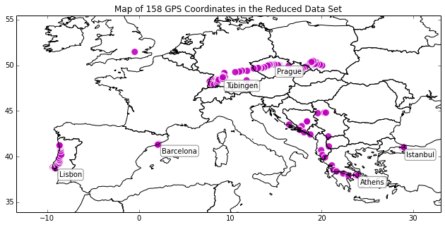
This plot above depicts a map of Europe (from my shapefile), with my location data plotted on top of it. The top six most visited cities are annotated on the map: Lisbon, Barcelona, Prague, Tuebingen, Athens, and Istanbul.
Like I mentioned earlier, this is just a simple plot of unprojected data so there is significant horizontal distortion and stretching at these latitudes. In another post, I explain how to convert point data and basemaps to a projected coordinate system in Python. I also demonstrate how to style the map to make it much more beautiful, also entirely in Python. Like this:

The most isolated locations
You can see that certain locations on the map are particularly isolated from the other places I visited – for example, London, Barcelona, and Istanbul were flown in and out of, so there aren’t other data points near them in the data set. What are the most isolated places in the data set?
To answer this question, I’ll first define a threshold distance of 20 miles to rephrase the question as: for each point in the data set, what is the distance to the nearest point that is at least 20 miles away? This will ignore all other points within this distance when identifying the nearest other point in the data set.
The value of this method is that it treats everything within the threshold distance as a single cluster, like an epsilon value in a clustering algorithm. In other words, if Barcelona is an isolated cluster of points, I want it to be considered isolated even though it contains several points within a couple of miles of each other.
For each point in the data set, I’ll loop through all other points in the data set, calculating the great circle distance between the two points using geopy’s great_circle() function. Then, for each point, I save the label of the other point that is the shortest distance (greater than 20 miles) from it:
#what is the distance to the nearest point that is at least *threshold* miles away?
threshold = 20

# nearest_point will contain the index label of the row of the nearest point from the original full data set
# nearest_dist will contain the value of the distance between these two points
rs['nearest_point'] = None
rs['nearest_dist'] = None

#for each row (aka, coordinate pair) in the data set
for i, row in rs.iterrows():
    point1 = (row['lat'], row['lon'])
    for i2, row2 in rs.iterrows():

        #don't compare the row to itself
        if(i != i2):
            #calculate the great circle distance between points
            point2 = (row2['lat'], row2['lon'])
            dist = great_circle(point1, point2).miles
            #if this row's nearest is currently null, save this point as its nearest
            #or if this distance is smaller than the previous smallest, update the row
            if pd.isnull(rs.loc[i, 'nearest_dist']) | ((dist > threshold) & (dist < rs.loc[i, 'nearest_dist'])):
                rs.loc[i, 'nearest_dist'] = dist
                rs.loc[i, 'nearest_point'] = i2
Now I know the nearest neighbor of each point in the data set. I’ll sort by distance, then drop duplicates and take the top five rows. These are representative points of the five most isolated clusters in my data set:
# sort the points by distance to nearest, then drop duplicates of nearest_point
most_isolated = rs.sort('nearest_dist', ascending=False).drop_duplicates(subset='nearest_point', take_last=False)
most_isolated = most_isolated.head(5)
most_isolated
Now I can plot these points. I’ll create one scatter plot of the entire reduced data set in blue and another of the five most isolated points in red. Then I label the ticks and axes and give the plot a title. Lastly, I annotate each of the most isolated clusters with the city name, the distance to the nearest neighbor, and that nearest point’s city name:
# plot the most isolated clusters in the data set
fig, ax = plt.subplots()
fig.set_size_inches(10, 6)
rs_scatter = ax.scatter(rs['lon'], rs['lat'], c='b', alpha=.4, s=150)
df_scatter = ax.scatter(most_isolated['lon'], most_isolated['lat'], c='r', alpha=.9, s=150)

# set axis labels, tick labels, and title
for label in ax.get_xticklabels():
    label.set_fontproperties(ticks_font)
for label in ax.get_yticklabels():
    label.set_fontproperties(ticks_font)
ax.set_title('Most Isolated Clusters, and Distance to Next Nearest', fontproperties=title_font)
ax.set_xlabel('Longitude', fontproperties=label_font)
ax.set_ylabel('Latitude', fontproperties=label_font)
ax.set_axis_bgcolor(axis_bgcolor)

# annotate each of the most isolated clusters with city name, and distance to next nearest point + its name
for i, row in most_isolated.iterrows():
    ax.annotate(row['city'] + ', ' + str(int(row['nearest_dist'])) + ' mi. to ' + rs['city'][row['nearest_point']],
                xy=(row['lon'], row['lat']),
                xytext=(row['lon'] + 0.75, row['lat'] + 0.25),
                fontproperties=annotation_font,
                bbox=dict(boxstyle='round', color='k', fc='w', alpha=0.7),
                xycoords='data')
plt.show()

The plot above shows the data set in blue and highlights the most isolated points in red: Barcelona, Hounslow (outside of London), Munich, Prizren, and Istanbul. Each point’s annotation shows how far it is from its nearest neighbor. As mentioned earlier, in another post I explain how to convert point data and basemaps to a projected coordinate system in Python, and how to style the map to make it much more beautiful. Like this:

You can see that Barcelona, Hounslow, and Istanbul are by far the most isolated points, each being over 300 miles from their nearest neighbors (where the nearest neighbor must be at least 20 miles away).
Pie charts with matplotlib
Let’s take a step back for a second. At the beginning of this post, I plotted some bar charts showing which countries and cities were the most visited during my travels. Let’s revisualize this data with pie charts, to show relative shares of the data set. First, I’ll plot the cities I visited by each’s share of the total records in the data set:
countdata = df['city'].value_counts()
gbplot_pie(fractions = countdata,
           labels = countdata.index,
           title = 'Cities, by share of records in data set',
           grouping_threshold = 30,
           grouping_label = 'All Other Cities')

As we saw earlier, Barcelona was the most visited city, followed by Lisbon, Tuebingen, and Prague. Cities with fewer than 30 rows in the data set are grouped into the miscellaneous “all other cities” pie wedge.
But what, oh what is this wonderful gbplot_pie() function that produces such beautiful matplotlib pie charts? That will be a tale for another post, but in short, it’s a function I wrote to make matplotlib pie charts look nice, and to group lots of minuscule wedges into one “all other values” wedge. This pie-charting function appears in its entirety, with comments, in the full IPython notebook.
The pie chart above uses percentages as its values. Next I’ll plot the countries I visited by how many total observations each has in the data set. I first need to write a short formatting function to convert the percentage value from each wedge back into its original count value:
countdata = df['country'].value_counts()

# convert the pie wedge percentage into its count value
def my_autopct(pct):
    total = sum(countdata)
    val = int(round(pct*total)/100.0)
    return '{v:d}'.format(v=val)

gbplot_pie(fractions = countdata,
           labels = countdata.index,
           title = 'Countries, by number of records in data set',
           autopct=my_autopct,
           grouping_threshold = 30,
           grouping_label = 'All Other Countries')

As we saw earlier, Spain was the most visited country, followed by Portugal, Germany, and the Czech Republic. All countries with fewer than 30 rows in the data set are grouped into the “all other countries” pie wedge.
The values displayed in this pie chart are the number of observations for each country in the data set – you can cross reference these counts against the bar chart at the beginning of this post.
Visualizing by date and time
We’ve been visualizing this data so far based on geographical attributes like city, country, or lat-long coordinates. Let’s change gears slightly now to visualize the data set by date and time. The full data set is a pandas dataframe indexed by its timestamp, making date and time operations simple.
First, I’ll plot a bar chart of all of the observations in the data set, grouped by the hour of the day. Did I produce more GPS data in the morning, afternoon, or at night?
# plot a histogram of observations grouped by hour
countdata = df.groupby(df.index.hour).size()
countdata.index = [s + ':00' for s in countdata.index.astype(str)]

ax = countdata.plot(kind='bar', figsize=[9, 6], width=0.6, alpha=0.5, color='c', edgecolor='gray', grid=False, ylim=[0, 120])

ax.set_xticks(map(lambda x: x, range(0, len(countdata))))
ax.set_xticklabels(countdata.index, rotation=45, rotation_mode='anchor', ha='right', fontproperties=ticks_font)
ax.yaxis.grid(True)
for label in ax.get_yticklabels():
    label.set_fontproperties(ticks_font)

ax.set_axis_bgcolor(axis_bgcolor)
ax.set_title('Records in the data set, by hour of the day', fontproperties=title_font)
ax.set_xlabel('', fontproperties=label_font)
ax.set_ylabel('Number of GPS records', fontproperties=label_font)

plt.show()

It looks like the OpenPaths app on my phone was transmitting more location data points between mid-afternoon and early evening. My phone would sometimes be turned off or set to airplane mode at night, preventing it from sending or receiving any signals. But during the day, my phone was on and transmitting while I was out and about.
Did my GPS data volume vary by day of the week?
# plot a histogram of the GPS records by day of week
countdata = df.groupby(df.index.weekday).size()
countdata.index = ['Sunday', 'Monday', 'Tuesday', 'Wednesday', 'Thursday', 'Friday', 'Saturday']

ax = countdata.plot(kind='bar',
                       figsize=[9, 6],
                       width=0.6,
                       alpha=0.5,
                       color='c',
                       edgecolor='gray',
                       grid=False,
                       ylim=[200, 280])

ax.set_xticks(map(lambda x: x, range(0, len(countdata))))
ax.set_xticklabels(countdata.index, rotation=35, rotation_mode='anchor', ha='right', fontproperties=ticks_font)
ax.yaxis.grid(True)
for label in ax.get_yticklabels():
    label.set_fontproperties(ticks_font)

ax.set_axis_bgcolor(axis_bgcolor)
ax.set_title('Records in the data set, by day of the week', fontproperties=title_font)
ax.set_xlabel('', fontproperties=label_font)
ax.set_ylabel('Number of GPS records', fontproperties=label_font)

plt.show()

Interesting. Thursday has by far the fewest observations in the data set. However, I was producing about 30 records per day and my trip ended on a Wednesday – it could just be a fluke of timing. Another full day of location data would have pushed Thursday up into the same range as the other days of the week.
Lastly, I’ll plot the number of observations by date. The trip lasted for about two months, so there are approximately 60 days represented in the data set. However, the number of records should fluctuate greatly by date. OpenPaths could only record my location when I had WiFi or cell data, so some dates/locations will be better represented than others.
I had cell data everywhere in Europe except for Albania and the countries of the former Yugoslavia. Accordingly, I’d expect the dates that I was in these countries to have fewer observations in the data set.
To visualize this, I will group my data set by date and count the number of observations for each date. Then I’ll create a line graph of these counts, annotating when I left the European Union to spend time in Albania and the former Yugoslavian countries, and when I returned to the E.U. at the Greek border. On the x axis, I’ll create one tick mark per inch and label it with the date. Then I’ll set the tick labels, axis labels, and plot’s title:
# plot a chart of records by date
countdata = df.groupby(df.index.date).size()
fig, ax = plt.subplots()

# create the line plot
ax = countdata.plot(kind='line', figsize=[10, 5], linewidth='3', alpha=0.5, marker='o', color='b')

# annotate the points around the balkans, for explanation
ax.annotate('Left the EU',
                 xy=('2014-06-20', 60),
                 fontproperties=annotation_font,
                 bbox=dict(boxstyle='round', color='k', fc='w', alpha=0.7),
                 xycoords='data')

ax.annotate('Had WiFi',
                 xy=('2014-06-23', 40),
                 fontproperties=annotation_font,
                 bbox=dict(boxstyle='round', color='k', fc='w', alpha=0.7),
                 xycoords='data')

ax.annotate('Return to EU',
                 xy=('2014-07-01', 53.5),
                 fontproperties=annotation_font,
                 bbox=dict(boxstyle='round', color='k', fc='w', alpha=0.7),
                 xycoords='data')

# set the x-ticks/labels for every nth row of the data - here, 1 tick mark per horizontal inch
n = len(countdata) / int(fig.get_size_inches()[0])
xtick_data = countdata.iloc[range(0, len(countdata), n)]
ax.xaxis.set_ticks(xtick_data.index)
ax.set_xlim(['2014-05-13', '2014-07-10'])

# set tick labels, axis labels, and title
ax.set_xticklabels(xtick_data.index, rotation=35, rotation_mode='anchor', ha='right', fontproperties=ticks_font)
for label in ax.get_yticklabels():
    label.set_fontproperties(ticks_font)
ax.set_title('Number of records in the data set, by date', fontproperties=title_font)
ax.set_xlabel('', fontproperties=label_font)
ax.set_ylabel('Number of GPS records', fontproperties=label_font)
ax.set_axis_bgcolor(axis_bgcolor)

plt.show()

As expected, the line chart above shows major fluctuations in the number of observations by date. At the very beginning of the trip, I had OpenPaths recording my location every 15 minutes, before reducing the frequency to every 30 minutes to prevent excessive battery drain (yeah, this wasn’t a very scientifically controlled data set).
I used matplotlib to annotate when I left and returned to the European Union (and cell phone service) to explain the big trough in the latter third of the graph. However there is one sharp peak in the middle of this trough. Where was I then? What was happening?
# lots of observations from this date in the balkans - why?
date = dt.strptime('2014-06-28', '%Y-%m-%d').date()
day_records = df[df.index.date==date]
print len(day_records), 'observations from this date:'
day_records.head()
38 observations from this date:
                           lat        lon   city     country
date
2014-06-28 00:09:00  42.423405  18.771601  Kotor  Montenegro
2014-06-28 02:39:00  42.423401  18.771603  Kotor  Montenegro
2014-06-28 03:09:00  42.423368  18.771646  Kotor  Montenegro
2014-06-28 03:39:00  42.423407  18.771575  Kotor  Montenegro
2014-06-28 05:09:00  42.423295  18.771617  Kotor  Montenegro
Ah, June 28th was when I was in Kotor and I had WiFi throughout most of the town. Thus, my OpenPaths app was able to gather and transmit my GPS location data even though I didn’t have cell phone service in Montenegro.
Wrap up
That’s it for my visualizations in Python and matplotlib. To summarize, I created some bar charts showing which cities and countries were the most visited. I also created some pie charts showing their relative shares of the number of observations. I did scatter plots of my spatial data and made a map using a shapefile of country borders. Lastly, I plotted the data set by date and time to show trends over the duration of the trip.
Python is a powerful language for data analysis and there is a lot of visualization work that you can do natively in it using matplotlib. In another post, I explain how to project lat-long point data and shapefiles to make create beautiful, spatially-accurate maps in Python.
One reply on “Visualizing Summer Travels Part 5: Python + Matplotlib”
[…] The scientific computing Python stack, via Anaconda: we introduce numpy, scipy, statsmodels, pandas for data analysis, and matplotlib for visualization. […]